
The best physiotherapy website design makes services, clinic details and booking options easy to find.
These 16 Australian physiotherapy websites offer useful examples of service navigation, clinic branding and appointment booking. If you want a site like these for your clinic, see our physiotherapy website design service or check website design pricing.
Someone looking for a physio needs to know what the clinic treats, where it is and how to book.
They want to find someone who looks competent, book an appointment, and move on with their day. The useful test is whether a visitor can quickly identify your services, location and booking route.
Physio websites have a particular challenge. They need to feel clinical enough to be credible but warm enough that people actually want to visit.
Real clinic photography and clear service descriptions help visitors get a feel for the practice before booking.
The best physio sites thread that needle by leading with real photography, clear service descriptions, and a booking button you cannot miss.
We looked at physiotherapy websites across Australia and found 16 that do it well. Some are sports physio specialists, some are general practice, some focus on NDIS or specific conditions. The common thread is a website with a clear route from reading about the clinic to booking an appointment.
Here are the best physiotherapy website designs in Australia, and what makes each one worth studying.
This is a design comparison, not a ranking of clinical care or verified conversion rates. The screenshots capture the versions reviewed; live websites can change. Use each example for its specific design lesson, then test that idea against your own clinic’s patients and services.
Best Physiotherapy Website Design Examples in Australia
1. PHYXIT Physio and Injury Clinic Wollongong

PHYXIT leads with “Illawarra’s Trusted Physiotherapists” and “Helping You Move Better. Live Pain-Free.” in a lime green and dark grey palette.
Dual CTAs for booking and a new patient offer sit side by side in the hero. Service tiles below cover physio, sports rehab, movement assessment, and dry needling.
Testimonial carousel and blog section round out the homepage.
The lime green branding is bold for a physio clinic. Most go blue or teal, so PHYXIT has a recognisable identity on its homepage.
The “New Patient Offer” gives new visitors a second option beside booking an appointment. The local positioning gives the bold branding a clear context.
Good model for any Wollongong physio website.
2. Perth Physio Precinct Perth

Perth Physio Precinct uses a teal and navy palette on white backgrounds. The hero runs a dark semi-transparent overlay on a wellness background image with Montserrat font throughout. Card-based service presentation below the fold with clean separation between sections.
The independently owned positioning made explicit early gives visitors information about who runs the clinic.
The teal colour scheme with card-based service layout is crisp and well-organised. A clean starting point for any Perth physio website.
3. Powerhouse Physio Canberra
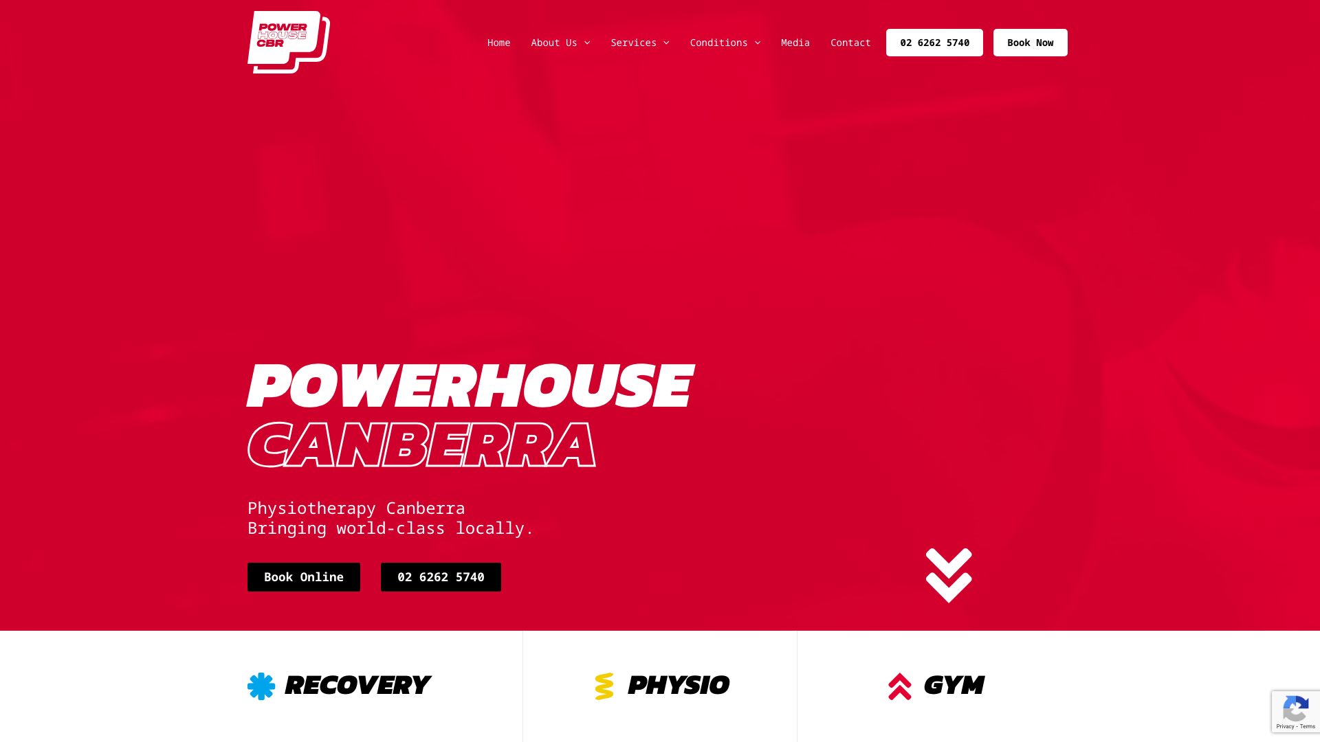
Powerhouse Physio goes bold with red, yellow, and sky blue accents. The hero spans 85% of the viewport with a massive Kanit Black italic headline.
Modular grid below with icon boxes for services. Hover animations lift elements 10px on interaction.
This is the most visually distinctive physio site on this list. The red, yellow, and blue palette paired with oversized italic typography gives it a gym and strength brand feel that breaks completely from the typical soft-blue physio aesthetic.
The oversized italic type is worth considering for a clinic with a sports focus. A bold reference for any Canberra physio website.
4. Hinterland Physio Group Sunshine Coast

Hinterland Physio Group leads with a nature scene hero in sage green, white, and charcoal with teal accents. Three-column grid on desktop with a testimonial slider and FAQ accordion.
Rounded CTA buttons. Four locations across Palmwoods, Woombye, Kenilworth, and Kilkivan.
The sage green colour scheme tied to the hinterland identity is what makes this site feel intentional rather than templated. The nature imagery in the hero reinforces the brand rather than defaulting to the usual stock treatment photos.
It feels like a Sunshine Coast business, not a physio chain that could be anywhere. Good approach for a Sunshine Coast physio website.
5. Melbourne Sports Physiotherapy Melbourne

Melbourne Sports Physiotherapy uses clean white backgrounds with blue accents for CTAs and navigation. The hero features a treatment-in-progress image with a bold uppercase headline.
Prominent “Book Online” button top-right. Grid layouts for services and injury types with icons.
The affiliate logos from major sporting organisations do the heavy lifting here. Tennis Australia, North Melbourne, and other AFL team logos woven throughout the site give the sporting connections a prominent place in the layout.
If you treat professional athletes, showing that is worth more than any design trend. A strong model for any Melbourne physio website targeting sports patients.
6. Movement for Life Physiotherapy Darwin
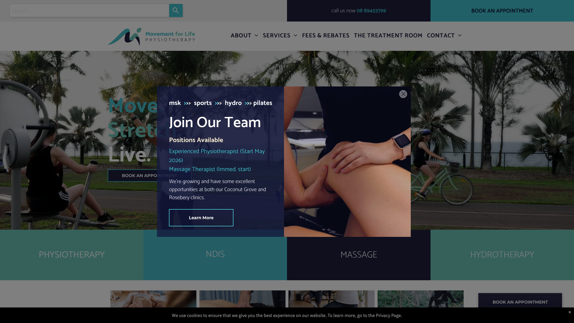
Movement for Life Physiotherapy opens with “Move. Stretch. Live.” in large type over a treatment session hero image. Teal and coral accents against dark navy.
Service cards below for physio, NDIS, massage, and hydrotherapy. Multiple booking CTAs throughout with a clean grid layout.
The teal-to-coral colour contrast gives the site energy without feeling clinical. They also lead with their QIP accreditation, as another piece of information about the practice.
Offering hydrotherapy alongside standard physio broadens the appeal. A distinctive approach for any Darwin physio website.
7. POGO Physio Gold Coast

POGO Physio hits with a bold blue-to-green gradient hero and “GET BACK TO YOUR PHYSICAL BEST” in large type. Montserrat headings with Helvetica Neue body text.
Clean modular sections with icon boxes for services. Google rating widget embedded on the homepage.
The blue-to-green gradient hero is striking and energetic, matching the clinic’s sports focus. It avoids the generic stock photo approach that most physio sites rely on, using bold colour and typography to make the first impression instead.
The embedded review widget is visually prominent; its content needs checking against the Ahpra guidance below before copying that approach. Worth studying for any Gold Coast physio website.
8. Newington Physiotherapy Ballarat

Newington Physiotherapy leads with “Providing expert care to Ballarat since 1980” over side-by-side clinic imagery. Neutral whites and greys with a clean, understated palette.
Dual CTAs for booking and locations. Custom SVG icons for each service type.
Insurance provider badges for Medibank and Bupa.
The heritage angle combined with modern design puts the clinic’s history alongside a simple service layout. “Since 1980” makes the practice’s history explicit.
The custom SVG icon set for services is polished rather than generic, and keeps the service options easy to scan. A solid benchmark for any Ballarat physio website.
9. Barefoot Physiotherapy Brisbane

Barefoot Physiotherapy uses soft dusty rose tones with white backgrounds and dark grey text. The hero features “Move with confidence” over a full-width building photo.
Generous whitespace with constrained content widths. A scrolling marquee text effect reinforces their core message.
The dusty rose colour palette gives the clinic a recognisable style. Most default to blue or green, so Barefoot immediately reads as different.
The team bios and clinic photography give the site warmth that clinical stock imagery cannot. If your clinic’s personality is a selling point, this is how you show it.
A warm reference for any Brisbane physio website.
10. The Injury Clinic Geelong

The Injury Clinic keeps things minimal with white backgrounds and purple accents. Three service pillars presented as cards: Physiotherapy, Strength Training, and Sports Dietetics.
Instagram feed integration and a T.I.C. methodology visualisation (Train, Improve, Consolidate). Lazy-loaded images throughout for performance.
The T.I.C. methodology branding turns the business name into a framework: Train, Improve, Consolidate. That kind of conceptual device gives the site depth beyond “we do physio” and connects the initials to its stated approach.
The purple accent separates buttons and headings from the white background. Smart branding for any Geelong physio website.
11. Coast Sport Central Coast

Coast Sport runs a deep blue and warm gold colour scheme with a hero carousel and captions positioned bottom-left. Sticky navigation that darkens on scroll.
Icon-based feature blocks with hover effects. Service sections use image overlays with semi-transparent treatments and scale-on-hover animations.
The blue-and-gold palette is polished and confident without looking corporate. The hover animations on service cards give the cards a visible response to the pointer.
The sticky nav that transitions on scroll is a small detail that makes the browsing experience feel considered. One of the more refined Central Coast physio websites we found.
12. BODYSYSTEM Hobart
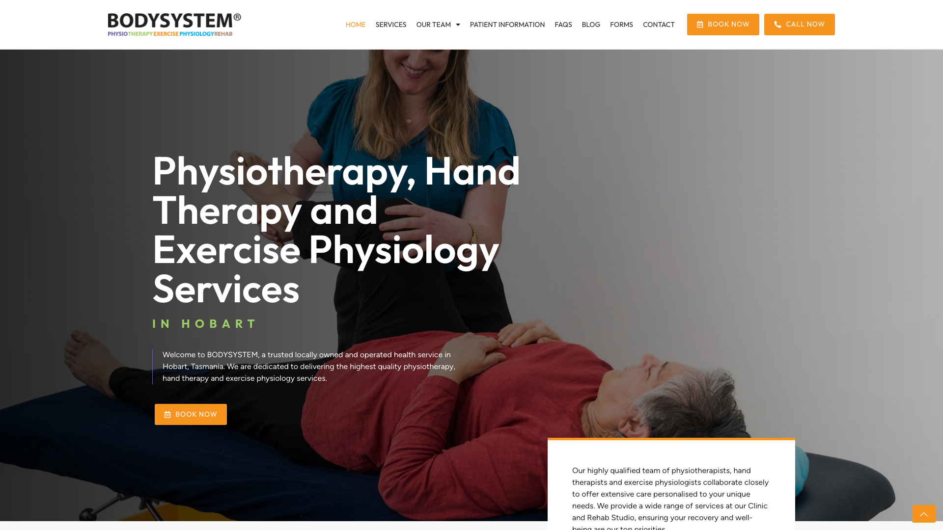
BODYSYSTEM uses a dark charcoal base with purple, warm orange, and lime green accents. Full-height hero with a treatment photo under a dark overlay.
Large 80px serif headlines. Prominent orange “Book Now” button.
The overlapping service cards with coloured backgrounds create an overlapping layout. Purple, green, and orange cards with circular icon overlays that extend above card boundaries give the homepage a layered, three-dimensional feel.
The multi-colour accent system is cohesive and modern. A strong reference for any Hobart physio website that wants to look different from the rest.
13. Evoker Physiotherapy Sydney

Evoker Physiotherapy pairs deep teal with warm khaki and beige, creating an upmarket feel. The hero leads with bold “GET. BETTER. FASTER.” over professional photography.
Clean, minimalist layout with alternating full-width sections. A badge row beneath the hero gives supporting information its own space.
The teal, khaki and beige colour palette gives this site an almost boutique-hotel feel rather than a typical clinical aesthetic. The restrained colours contrast with the bold headline.
The badge row beneath the hero gives supporting information a compact place in the layout. A premium approach for any Sydney physio website.
14. 3D Physio Health Group Bendigo

3D Physio Health Group now leads with “Do life well.” and an introduction to its approach to care. Teal accents on white.
A scrolling marquee banner highlights specialties like ONERO for Osteoporosis, NDIS support, and GLA:D sessions. Google Reviews widget and Instagram gallery embedded on the homepage.
The scrolling marquee banner is an unusual choice that works. It communicates specialty programs without cluttering the layout, cycling through ONERO, NDIS support and GLA:D sessions.
The homepage pairs its introduction with a direct appointment link and keeps the programme messages in a separate banner. Good reference for any Bendigo physio website.
15. Newcastle Performance Physiotherapy Newcastle

Newcastle Performance Physiotherapy opens with “UNDERSTAND YOUR PROBLEM, REACH YOUR POTENTIAL” in bold type on a dark charcoal and white palette. Three service cards (Pain Treatment, Performance Rehab, Injury Management) below the fold. Extensive collapsible FAQ section and blog integration with thumbnails.
The messaging-first hero approach is the standout. Instead of leading with a generic treatment photo, they lead with a philosophy statement that tells you exactly what kind of clinic this is.
The extensive FAQ section gives visitors practical information before booking. A content-driven approach for any Newcastle physio website.
16. Therapia Sports & Spine Adelaide

Therapia Sports & Spine uses a professional white and blue palette in the example shown. Multiple calls to action and service icons divide the page into clear choices. The layout places booking prompts alongside information about the clinic.
The prominent appointment prompts are the design detail to study here. They give visitors a next step without requiring a search through the navigation.
Before borrowing an offer-led layout, check that any eligibility conditions are visible beside the offer. A practical reference for any Adelaide physio website.
What Makes a Good Physiotherapy Website?
Across all 16 examples, the same patterns keep showing up. These are useful criteria for comparing the designs; the screenshots alone do not establish booking performance.
- A booking button you cannot miss. The primary action on a physio website is booking an appointment. The best sites put the button in the header, the hero, and at multiple points throughout the page. A visible phone option also helps visitors who need to ask a question before booking.
- Real clinic photography. Photographs of your own rooms and team show visitors what to expect. The stronger sites on this list show their actual treatment rooms, their team, and their equipment. Parents want to see where they are sending their kid for ACL rehab.
- Clear service descriptions. Do not make visitors guess whether you treat their condition. The best physio sites break services into specific tiles or cards: sports rehab, post-surgery, chronic pain, women’s health, NDIS. Let people self-select.
- Credibility visitors can check. Named practitioners, accurate qualifications and clear clinic details help visitors understand who they would see. Review widgets need a separate advertising check: Ahpra’s advertising guidelines prohibit testimonials about clinical aspects of regulated health services in advertising.
- A distinct visual identity. The strongest sites on this list have a colour palette and design language that feels intentional. Purple, lime green, dusty rose, blue-gold. When every physio site in town looks the same, a consistent visual identity gives visitors something to recognise.
- A booking system that fits the clinic. Some of these sites embed Cliniko or Nookal calendars directly on the page. Others link out to a third-party booking widget or rely on a phone number and contact form. The right choice depends on how the clinic’s reception works. If patients can self-select appointment types and times, an embedded calendar saves phone calls. If bookings need triage first, a short enquiry form with a visible phone option may be the better route.
You do not need to reinvent the basics of web design. You just need a site that loads fast, books appointments easily, and looks like a clinic that takes itself seriously.
Physiotherapy web design: which examples should you compare?
Choose examples that solve the same design problem as your clinic. Powerhouse’s bold sports identity and Barefoot’s softer presentation offer different starting points; neither colour palette proves that a website books more patients.
| Design decision | Examples to revisit | What to assess |
|---|---|---|
| A visible booking route | Melbourne Sports Physiotherapy; BODYSYSTEM | Can visitors find the appointment button without opening the menu? |
| Several services | The Injury Clinic; Movement for Life | Can a visitor distinguish the services from the card labels? |
| A recognisable clinic identity | Powerhouse; Barefoot | Do the colours, type and photography suit your practice? |
| Questions before booking | Newcastle Performance Physiotherapy | Can a new patient find practical answers before contacting reception? |
| Booking system integration | PHYXIT; Hinterland Physio Group | Does the booking flow let patients pick a time without phoning reception? |
Pages every physiotherapy website needs
The examples above show different homepage treatments. Behind each homepage, the sites that work best share a common page structure built around how patients actually look for physiotherapy.
Service pages that name what you treat
The Injury Clinic separates its services into three clear pillars: pain treatment, performance rehab, and injury management. Movement for Life breaks out physiotherapy, NDIS, massage, and hydrotherapy as distinct cards. Patients searching for a specific treatment need a page that confirms you offer it and explains what to expect at the appointment.
A single "Our Services" page that lists everything in paragraph form makes it harder for search engines to match your clinic to a specific query. One page per service type gives each treatment its own URL and its own chance to appear when someone searches for "dry needling" or "NDIS physiotherapy" in your area.
Team pages with verifiable practitioner details
Barefoot and Evoker both feature their practitioners with photographs and names. On a physiotherapy website, team pages carry clinical weight that they do not on most business sites. A visitor checking qualifications wants the practitioner’s name, their registration status, and the conditions they treat. Making that information text rather than an image means it stays accessible and findable.
Under Ahpra’s advertising guidelines, the details shown need to be accurate and current. A stale team page with a practitioner who left six months ago is not just a poor experience for a prospective patient.
A booking and contact route on every page
Melbourne Sports Physiotherapy and BODYSYSTEM both place booking buttons in the header, the hero, and within the page body. The pattern across all 16 examples is consistent: the booking route should be reachable from any section without scrolling back to the top. A sticky header button or a repeated inline CTA handles this. For clinics where appointments need triage first, a visible phone number beside the booking button keeps both options available.
Location pages for multi-site clinics
Hinterland Physio Group runs four locations across the Sunshine Coast hinterland and places them in the hero area. Each location on a physiotherapy website needs its own page with the address, parking and access details, opening hours, and the practitioners available at that branch. Without separate location pages, the clinic misses searches like "physio near Palmwoods" or "physiotherapy Woombye" entirely.
Conditions and treatment information
Newcastle Performance Physiotherapy’s FAQ section answers practical questions before a visitor needs to call. Condition pages take this further: a page explaining what happens during ACL rehabilitation at your clinic, or what a chronic pain assessment involves, gives a patient the information they need to book with confidence. These pages also give your site additional ways to appear when someone searches for a condition rather than a service name.
Building those pages well is where search engine optimisation for physiotherapy clinics begins: matching the questions patients type to the pages your site provides.
Physio clinic website essentials: check beyond the screenshot
A useful physio clinic website needs readable service information, identifiable practitioners, clear location details and a workable booking route. Those overlap with the fundamentals of any good website, but physio sites add a clinical trust layer on top. The examples above show different ways to present those essentials, but a desktop screenshot cannot tell you whether the full journey works.
Start with these checks when comparing a shortlisted design:
- Follow a service card through to its page. Check that it explains the appointment and gives a relevant next step.
- Find the practitioner’s name, qualifications and clinic location without relying on an image of text.
- Look for practical arrival information, including parking and access details where relevant.
Then open the site on a phone and check the booking route. If you are unsure what to look for, understanding responsive design explains how layouts shift between screen sizes:
- Open the menu and locate the booking button with the page at its normal size.
- Follow it to the appointment selector. Check that the clinic location and appointment type remain clear.
- Stop before submitting. Confirm whether the process offers an actual appointment or only sends a request, and whether a phone alternative is visible.
Finally, test details that a polished screenshot can hide:
- Move through links and form fields with a keyboard; check that you can see which item is selected.
- Enlarge the text and check for cut-off labels or overlapping buttons.
- Check that a sticky header or review widget does not cover the booking controls.
Keeping those journeys working belongs in ongoing website management for your clinic, especially after changes to opening hours, staff or the booking provider.
Questions about these physiotherapy website examples
Which example is best for a sports physio clinic?
Powerhouse is worth studying for bold visual identity, while Melbourne Sports Physiotherapy offers a reference for service and injury navigation. Choose based on the problem you need to solve, rather than copying a whole homepage.
Which example has a warmer visual style?
Barefoot’s dusty rose palette and team photography are a useful reference. Compare the treatment of people and space as well as the colours; replacing blue with pink alone will not reproduce that feel.
Can physiotherapy website templates achieve a similar result?
A template can provide the layout, but the clinic details, service structure and booking journey still need to fit your practice. Compare the template’s mobile pages and appointment route with the examples here before judging its homepage styling.
Should I copy a booking button or embed a booking form?
Start by checking how your appointment provider lets patients book. A clear button to the correct booking page can be useful; an embedded form needs testing for readability and navigation on a phone. Cliniko, Nookal and Jane each handle embedded calendars differently, so test the actual widget your clinic uses before committing to a page layout around it.
What should I borrow from the service cards?
Borrow the clear separation between services, as shown in The Injury Clinic example. Each card should lead to information about that service, rather than sending every visitor to the same general enquiry page.
How should a clinic with several locations use these examples?
Keep the clinic choice clear before an appointment is selected. Compare how a location is identified on the homepage, contact page and booking screen so visitors do not have to start again when they choose a branch. Hinterland Physio Group runs four locations and puts them in the hero area; that is worth studying if your clinic has more than one site.
Do review widgets make a design worth copying?
A widget’s presence is not evidence that its content is suitable for your website. Check the Ahpra guidance linked above before reproducing reviews, and give accurate practitioner information space in the design.
Can screenshots prove which website converts best?
No. Screenshots show presentation, not completed appointments or the quality of enquiries. A meaningful comparison would need analytics and booking data that this list does not have.
How do I turn these examples into a design brief?
Choose a few examples and record the exact feature you want to adapt, such as service navigation or the booking button’s placement. For a broader way to prioritise the work, use the process for auditing a business website before commissioning changes.
When you are ready to discuss the build, compare website design services for your clinic’s requirements against that brief, including the service pages and booking journey you need.
How do these examples compare to dental or medical website design?
Physio sites share some patterns with other healthcare websites, particularly the need for booking access and practitioner credibility. The key difference is that physio clinics tend to lead with service specialisations (sports, NDIS, chronic pain) rather than a single treatment menu. Compare our lists of dental website design examples and medical website design examples if your clinic sits across more than one health discipline.
What happens to a physio website after it launches?
A physio website needs regular attention after launch. Staff changes, new services, updated opening hours and booking provider updates all need reflecting on the site. The examples on this list look polished in their current screenshots, but a neglected site drifts out of date quickly. Budget for ongoing website management alongside the initial build.
Does mobile design matter more for physio websites?
Most people searching for a local physio are on their phone, often in pain and looking for a quick booking option. A physio site that works on desktop but fumbles the mobile booking flow loses those visitors. Every example on this list was checked on a phone screen as part of the review. If your current site is hard to use on mobile, that is the first thing to fix.
Need a Physiotherapy Website?
Use the examples to identify what your own clinic website makes difficult. Start with the booking route, service navigation and information a new patient needs before visiting.
Talk to us about physiotherapy web design with clear service pages, online booking and a straightforward route from first visit to appointment. See our physiotherapy website design service or view pricing to get started.
Need a physio website that actually books appointments? Talk to us about physiotherapy website design.