
When someone needs a dentist, they Google it. The first thing they see is your website. If it looks outdated, loads slowly, or makes it hard to book, they click the back button and pick someone else.
Dental websites have a specific job that most business websites don’t. They need to make nervous people feel comfortable enough to book an appointment. That means clear information about treatments, real photos of the practice and team, easy online booking, and proof that other patients had a good experience.
We looked at dental clinic websites from across Australia to find the ones doing it right. Here are 14 that stood out, and what makes each one worth paying attention to.
Already know you need a dental website? See our dental website design page or check pricing to skip ahead.
Our top picks at a glance
- Smile Solutions (Melbourne), best before-and-after gallery. Real patient photos that sell cosmetic work better than any paragraph of text.
- Bite Dental (Brisbane), best patient-first navigation. “I need help with…” categories put the patient’s problem first.
- Identity Dentistry (Canberra), best trust signals. Health fund logos on the homepage remove a friction point before patients call.
- Sundial Dental (Mid North Coast), best multi-location layout. Five clinics, each with its own booking link and contact details.
- Sydney Dental Group (Sydney), best pricing transparency. First-visit cost displayed on the homepage.
- Dental O So Gentle (Perth), best for anxious patients. Name, design, and messaging all built around comfort.
- Figtree Dental (Wollongong), best treatment information. Detailed individual pages for every procedure.
How we selected these dental websites
We reviewed dental clinic websites from 14 cities across Australia, judging each on design quality, mobile experience, booking flow, and how well the site actually serves patients looking for information before they book. Every site was manually checked and is live at the time of writing. Selection by Kyle Crisp, KC Web Design. Last updated: October 2026.
Best dental website design examples in Australia
| Practice | City | Best for | Standout feature |
|---|---|---|---|
| Smile Solutions | Melbourne | Before-and-after galleries | Real patient photos for cosmetic work |
| Bite Dental | Brisbane | Patient-first navigation | “I need help with…” service categories |
| Avenue Dental | Sunshine Coast | Team presentation | Individual dentist bios with real photos |
| Identity Dentistry | Canberra | Trust signals | Health fund logos on the homepage |
| Sundial Dental | Mid North Coast | Multi-location practices | Per-clinic booking links and addresses |
| Dental On Clarendon | South Melbourne | Design restraint | Calm, consistent branding that builds trust |
| Salamanca Dental | Hobart | Family practices | After-hours online booking |
| Cairns Dental | Cairns | Booking integration | In-site appointment system with no redirect |
| Sydney Dental Group | Sydney | Pricing transparency | First-visit cost on the homepage |
| Dental Pearls | Brisbane CBD | Simplicity | Streamlined homepage focused on booking |
| Pacific Smiles | Gold Coast | Location finder | Clinic search for a 110+ location network |
| Geelong Dental Group | Geelong | No-fuss design | Booking button front and centre |
| Figtree Dental | Wollongong | Treatment information | Detailed individual pages per procedure |
| Dental O So Gentle | Perth | Anxious patients | Calming design and complimentary consultations |
We picked these 14 dental practice websites from cities around Australia. Some are big multi-location practices, others are single-clinic operations. Each one does at least one thing really well, and we’ve broken down what that is so you can take away the ideas that make sense for your own practice.
1. Smile Solutions, Melbourne
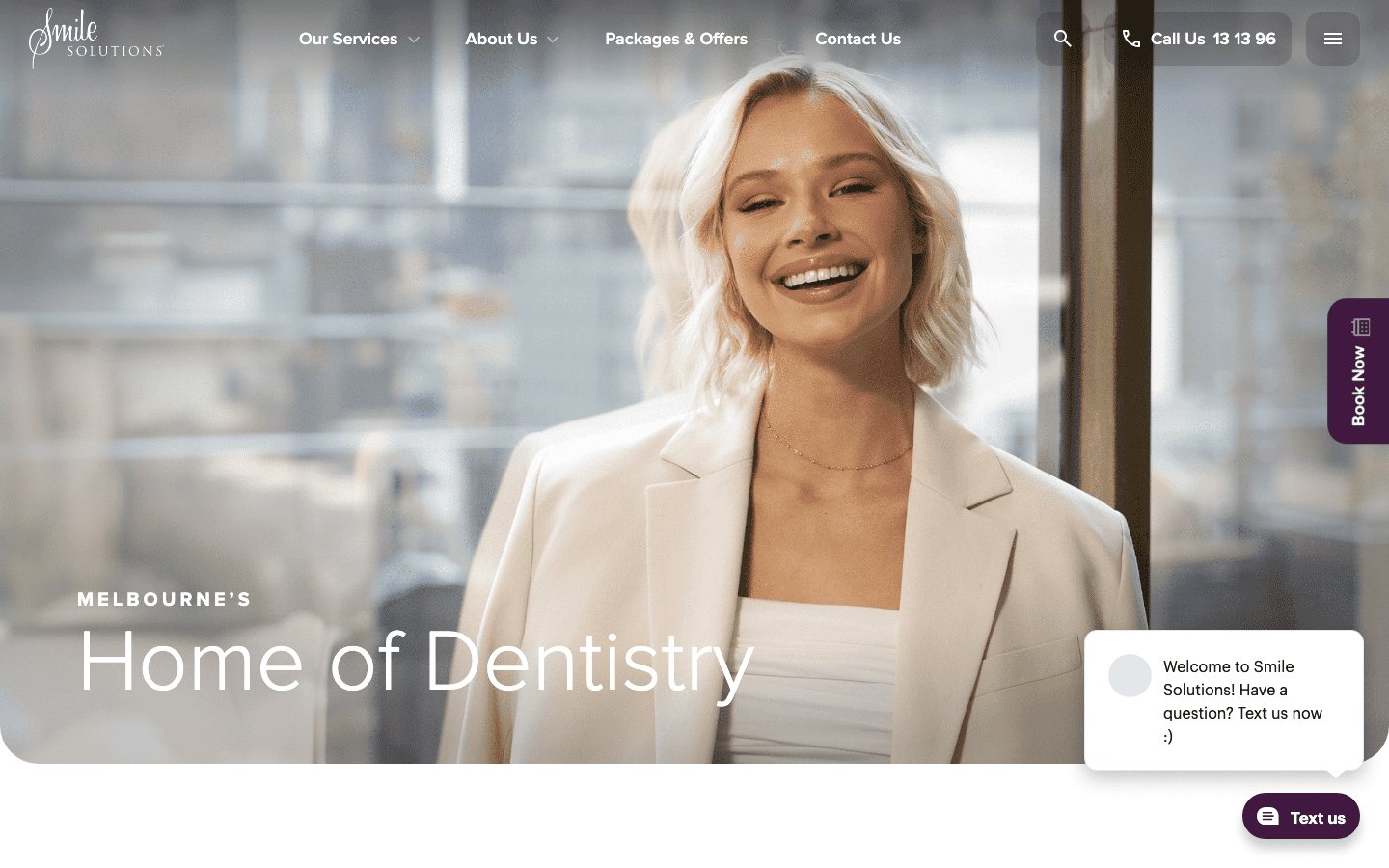
Smile Solutions is a large multi-dentist practice in the Melbourne CBD and one of the strongest dental web design examples in Australia for cosmetic work. The homepage opens with “Home of Dentistry” and immediately shows the breadth of what they offer, from general checkups to cosmetic and surgical work.
What sets this site apart is the before-and-after gallery. Dental work is visual, and Smile Solutions leans into that with real patient photos showing actual results. For a prospective patient deciding between clinics, seeing what a veneer or implant actually looks like is worth more than any paragraph of text.
The site also has individual profile pages for every dentist, which builds trust before you walk through the door. If you’re a dental practice in Melbourne looking for a new website, this kind of before-and-after gallery is worth considering.
2. Bite Dental, Brisbane
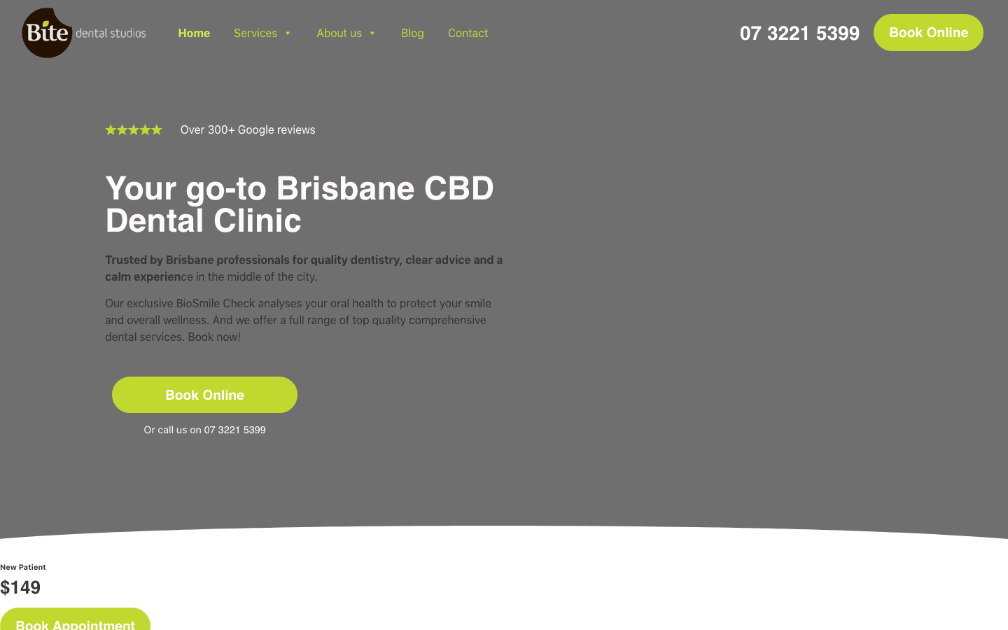
Bite Dental in Brisbane takes a patient-first approach to their homepage. Instead of listing services, they organise everything around what the patient needs help with: “I need help with…” followed by categories like Maintenance and Care, Cosmetic Dentistry, and Advanced Repair. It puts the patient’s problem first, not the clinic’s service list.
The design is clean without being sterile. There’s enough colour and personality to feel approachable, and the booking button sits in the header so it follows you down the page. For a Brisbane CBD clinic competing with dozens of others within walking distance, making it easy to book in two clicks is the right call.
3. Avenue Dental, Sunshine Coast
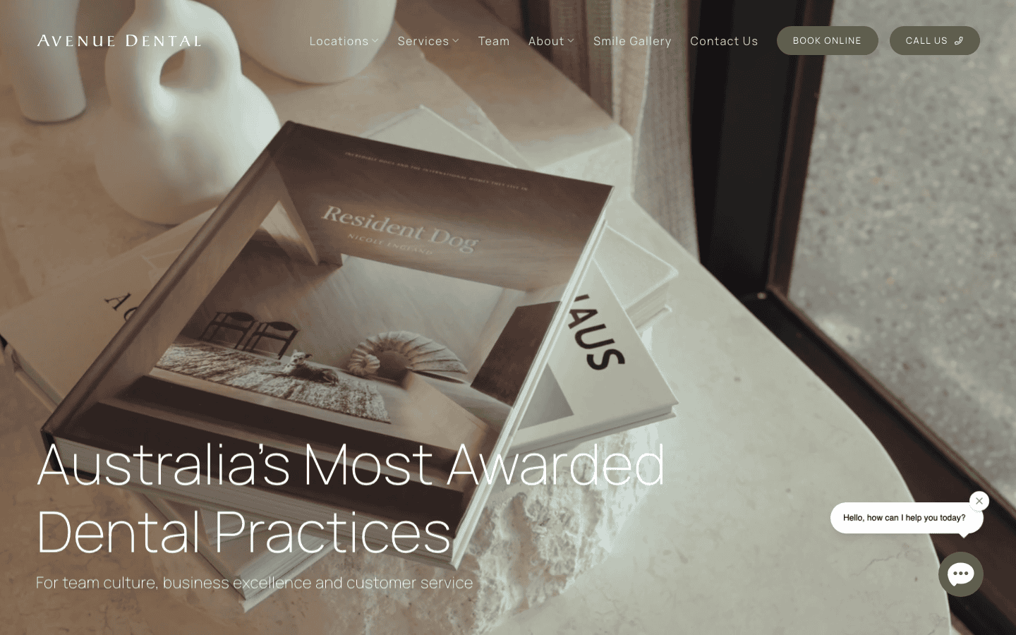
Avenue Dental on the Sunshine Coast leads with a bold claim: “Australia’s Most Awarded Dental Practices”. Whether that resonates or not, the website backs it up with award badges, team photos, and a clear layout showing their multiple locations across the Sunshine Coast, Brisbane, and Adelaide.
The thing this site does better than most is the team section. Each dentist has a proper photo and bio, not a stock image and a one-liner. For a practice with multiple locations, showing that real people work at each one helps patients feel like they’re choosing a dentist, not a chain.
A good approach for any Sunshine Coast dental practice thinking about how to stand out from the competition.
4. Identity Dentistry, Canberra
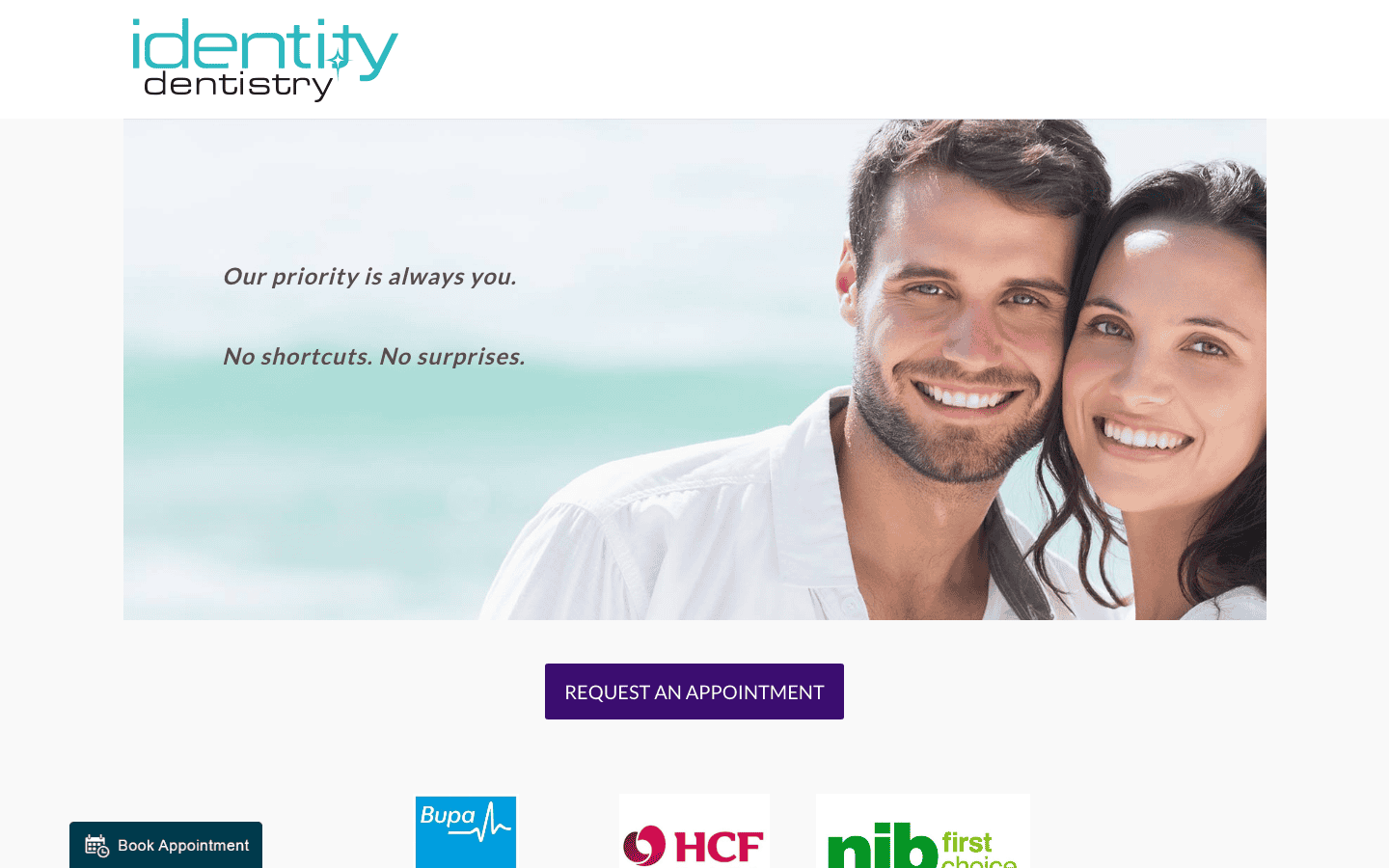
Identity Dentistry in Canberra takes a softer approach. The site emphasises empathy and a collaborative approach to dental care, which works well for a city full of professionals who want to feel heard, not processed.
They’ve done something practical that many dental sites miss: listing themselves as preferred providers for BUPA, HCF, and NIB right on the homepage. Health fund compatibility is one of the first things patients check, and putting it front and centre removes a friction point before the patient even picks up the phone.
5. Sundial Dental, Mid North Coast
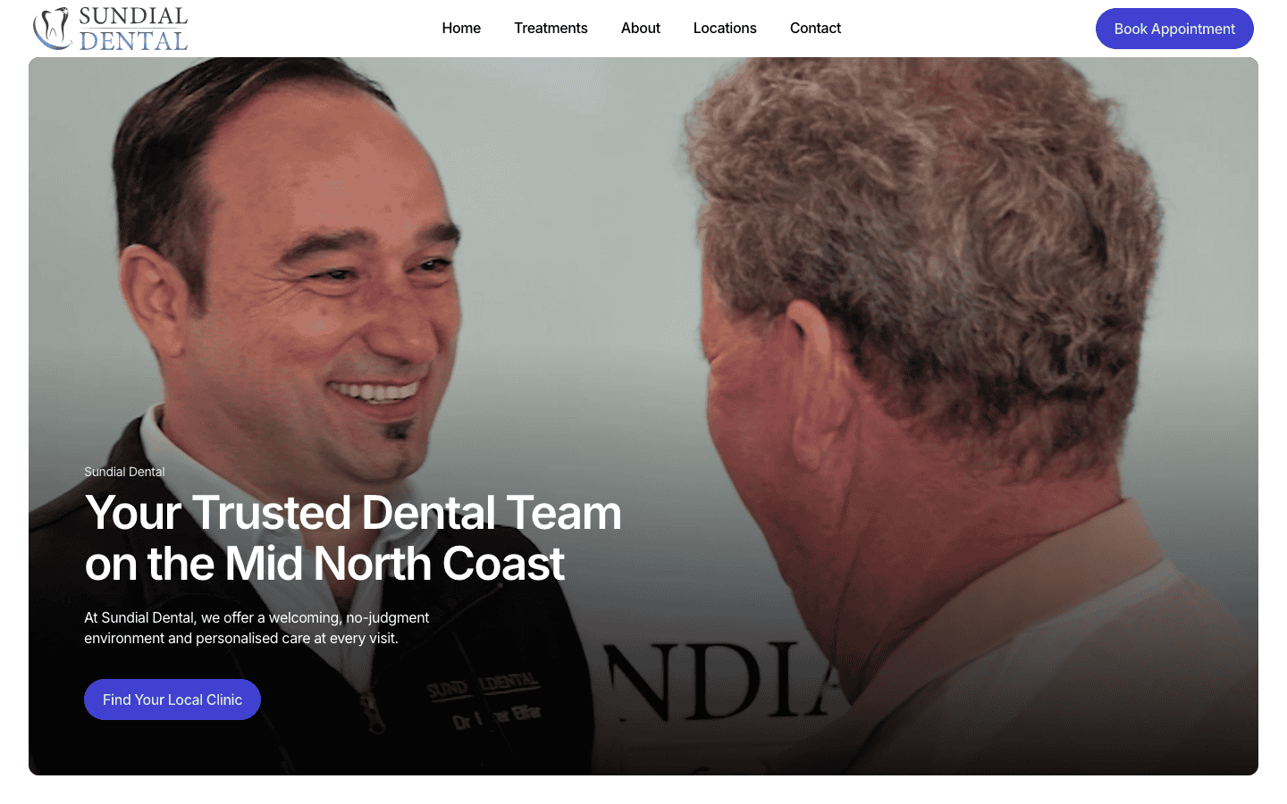
Sundial Dental runs five clinics across the Mid North Coast, covering towns from Taree to Kempsey. Their website handles the multi-location challenge well, with each clinic getting its own section showing the address, phone number, and a direct booking link.
The homepage is structured around what patients actually want to know: treatments, locations, testimonials, team, and FAQs. Nothing is buried. The testimonials feel genuine rather than curated, which makes a difference.
For a regional dental practice serving a spread-out area, making it obvious which clinic is closest and how to book there is exactly the right priority. We built Sundial’s 35-page website and structured it around those five locations.
6. Dental On Clarendon, South Melbourne
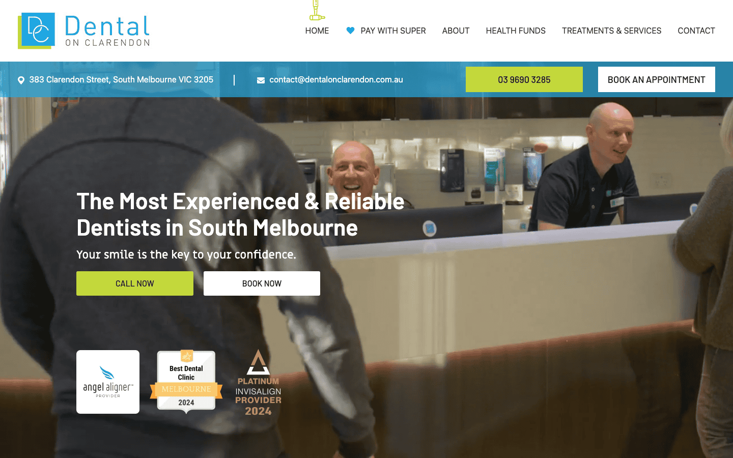
Dental On Clarendon in South Melbourne leads with experience and reliability. Their headline is “The Most Experienced and Reliable Dentists in South Melbourne”, and the rest of the site supports that positioning with team credentials, patient testimonials, and before-and-after galleries.
What works here is the consistency between the brand promise and the design. The colours are calm, the layout is straightforward, and nothing tries too hard.
For a dental clinic website, that restraint actually builds more trust than a site full of animations and bright colours. Patients want to feel like they’re in safe hands, not on a tech startup’s landing page.
7. Salamanca Dental, Hobart
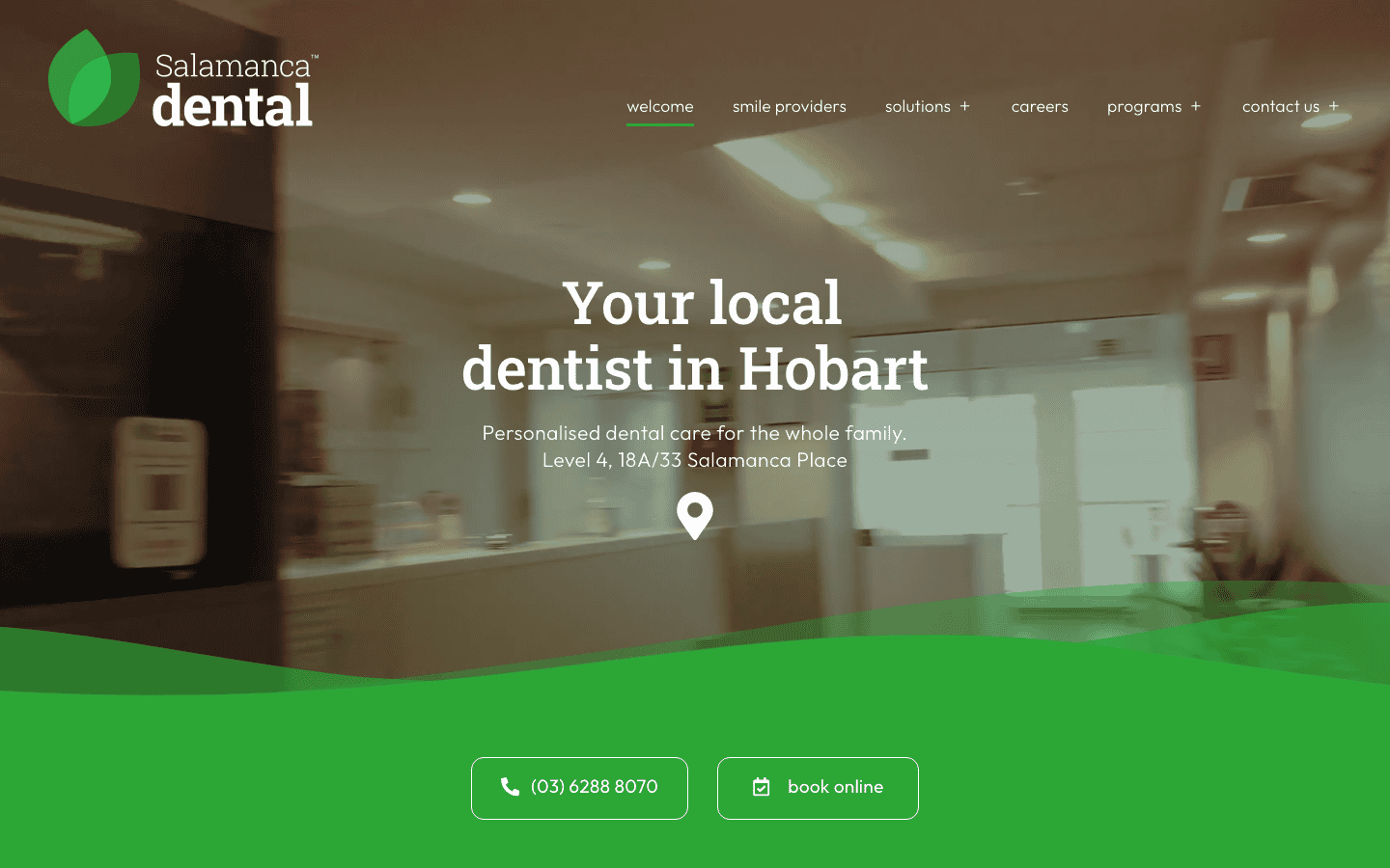
Salamanca Dental positions itself as the friendly, affordable option for Hobart families. The homepage cycles through the words “local, friendly, affordable” in the hero section, which immediately tells you what they’re about.
The site makes online booking obvious with a call to action to book “anytime, day or night”. That matters for a family dental practice where parents are often booking after bedtime. The services section is clearly laid out with individual pages for each treatment type, so patients can read about what they need before committing.
8. Cairns Dental, Cairns
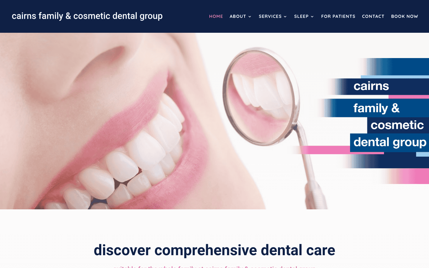
Cairns Dental in Cairns opens with a wide range of treatments listed clearly. The before-and-after gallery is prominently placed, which works well for a practice doing cosmetic work in a regional city.
The booking system is integrated directly into the site rather than linking to a third-party platform. That keeps the patient on the site and reduces the chance of them dropping off. For a regional city where there are fewer clinic options, keeping the booking process smooth turns browsers into patients.
9. Sydney Dental Group, Sydney
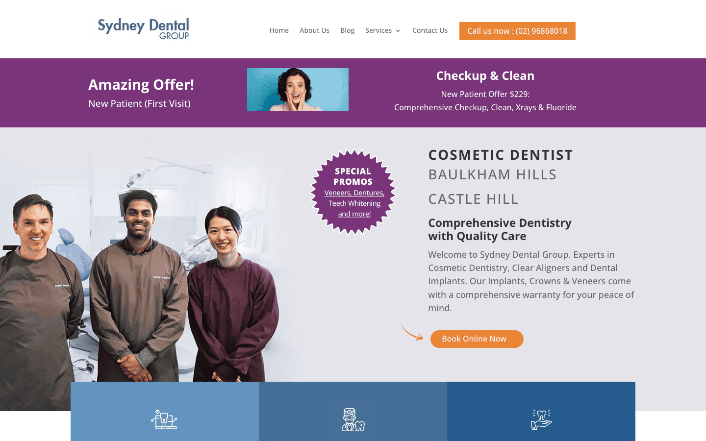
Sydney Dental Group‘s homepage takes a direct approach, leading with a new patient offer and clear pricing for a first visit, checkup, and clean. In a city with hundreds of dental clinics, putting the price right on the homepage is a genuine differentiator.
Most dental websites are vague about cost, which forces patients to call and ask. Putting a number on the homepage removes that barrier entirely. The services section breaks down treatments into clear categories with dedicated pages for each.
If you’re running a dental practice in Sydney, this approach to pricing transparency is worth looking at.
10. Dental Pearls, Brisbane CBD
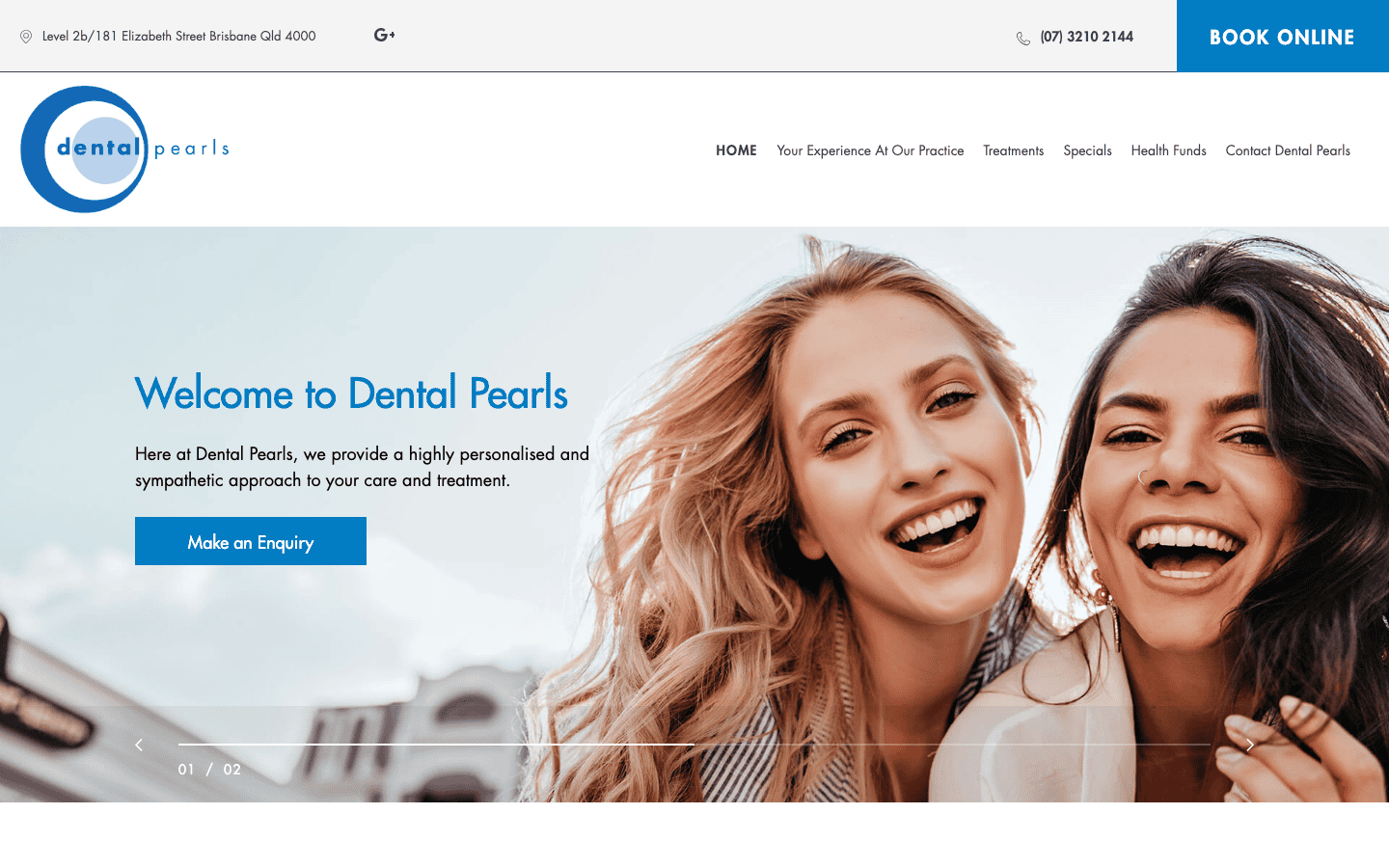
Dental Pearls in Brisbane CBD keeps things simple. The site is focused on their location and makes it clear what they do, where they are, and how to book. No clutter, no unnecessary pages.
For a single-location practice, this streamlined approach works. The homepage has a welcome section, a service overview, and a booking pathway. Sometimes the best dental website is the one that gets out of the patient’s way and lets them book.
A good reference for any Brisbane dental practice that wants to keep things simple and focused.
11. Pacific Smiles, Gold Coast
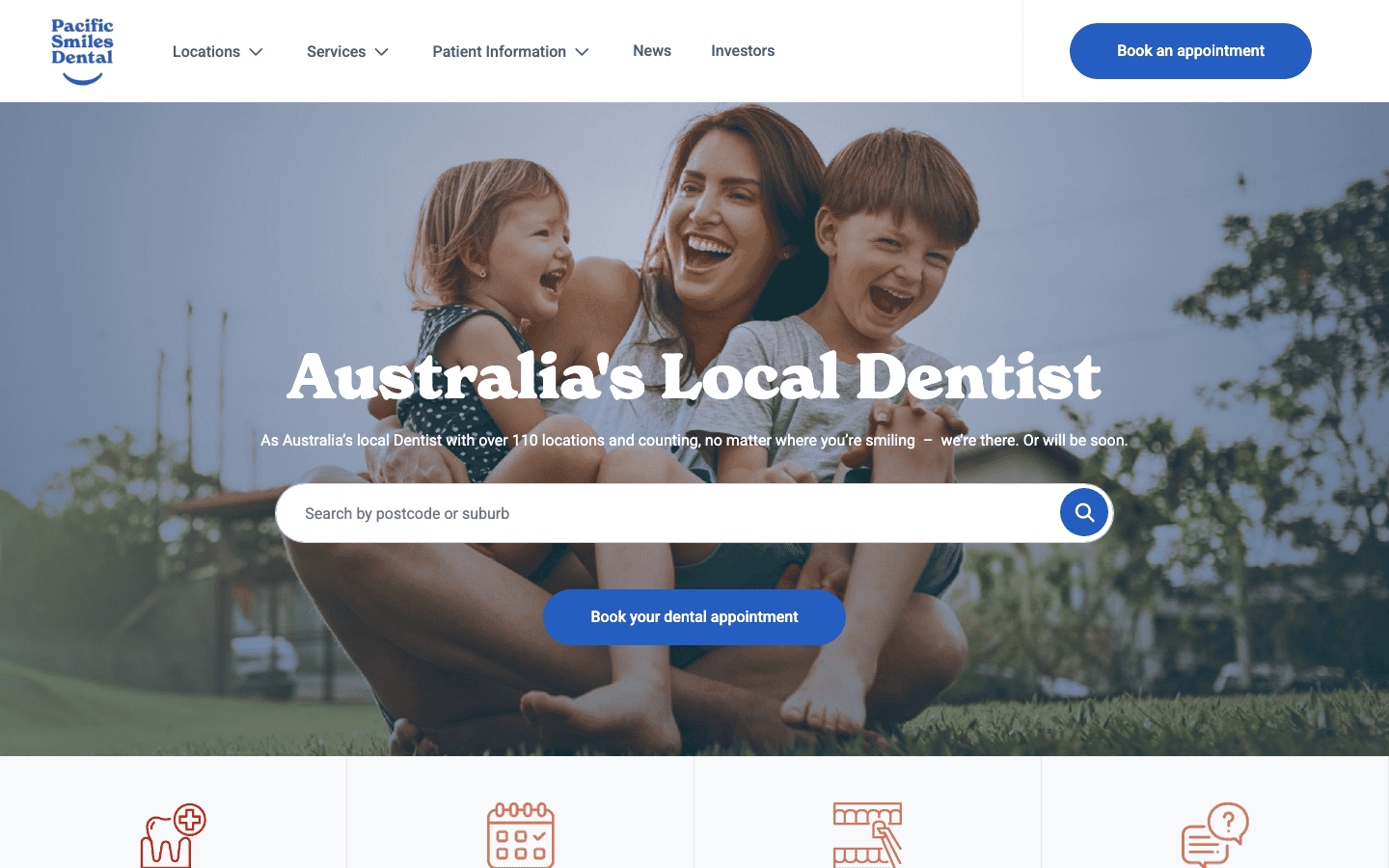
Pacific Smiles is a larger group with 110+ clinics across Australia, including several on the Gold Coast. Their website has to work differently from a single-location practice, so the homepage focuses on finding your nearest clinic with a location search front and centre.
The “all health funds welcome” messaging is prominent, which removes a common objection before it forms. The site also has a news section with dental health content, which helps with search visibility. For a multi-location brand, the challenge is making each clinic feel local despite being part of a group, and the location finder handles that reasonably well.
12. Geelong Dental Group, Geelong
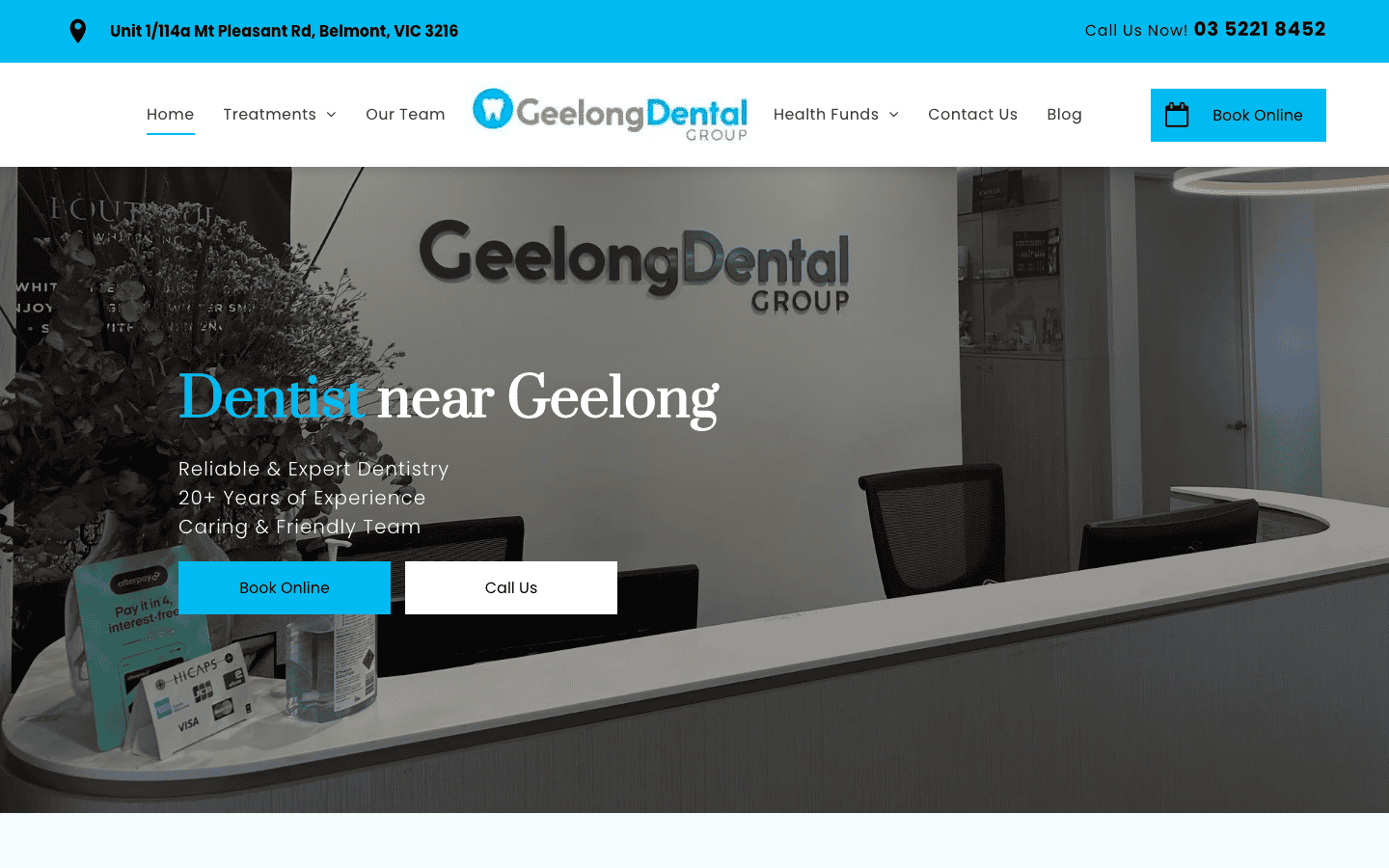
Geelong Dental Group has a straightforward site that puts booking first. The online booking button is prominent, and finding services, team information, and contact details takes seconds rather than scrolling through walls of text.
For a regional practice in Geelong, this no-fuss approach works well. Patients aren’t comparing 50 clinics. They want to know the clinic is professional, the dentists are qualified, and they can book easily. This site delivers all three.
13. Figtree Dental, Wollongong
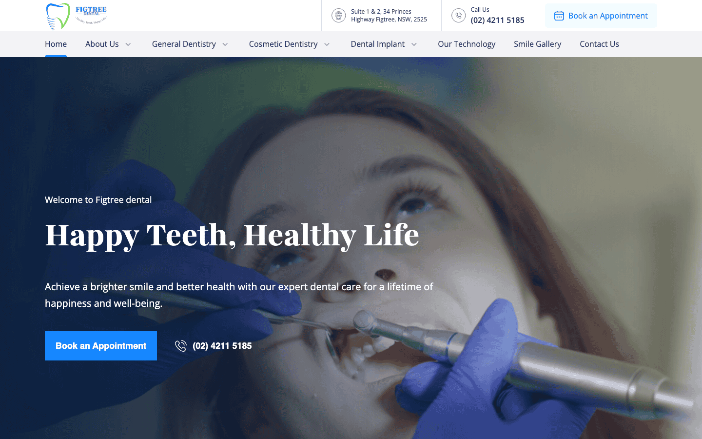
Figtree Dental serves the Wollongong area with a modern WordPress site that includes an integrated booking system. The site loads quickly, which matters for mobile users looking up a dentist on their phone.
Each treatment has its own page with enough detail for a patient to understand what’s involved without needing to call first. That level of information is useful for treatments like implants or root canals where patients want to know what they’re signing up for before making an appointment.
14. Dental O So Gentle, Perth
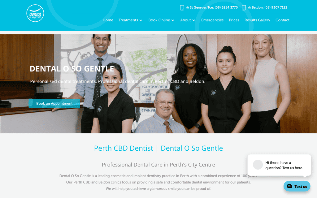
Dental O So Gentle is a Perth CBD practice that leads with exactly what nervous patients want to hear. The name itself does half the marketing, and the website follows through with a calming design, complimentary consultation offers, and clear information about gentle treatment options.
The site has a strong focus on cosmetic work, particularly veneers, with dedicated sections and before-and-after content. For a CBD practice competing on aesthetics as much as general dentistry, that specialisation comes through clearly. The booking system is easy to find and the overall feel is calm and professional without being clinical.
What makes a good dental website?
Looking across these 14 sites, the same things come up again and again. We’ve written a separate analysis of how top-ranking dental websites are structured, but here’s a quick summary of the features that matter most.
| Feature | Why it matters | Who does it well |
|---|---|---|
| Online booking above the fold | Patients want to book immediately, not hunt for a button | Smile Solutions, Bite Dental, Salamanca Dental |
| Real team photos | Stock images don’t build trust. Real faces do. | Avenue Dental, Dental On Clarendon |
| Detailed treatment pages | Patients Google symptoms before booking. Answer their questions. | Figtree Dental, Bite Dental |
| Health fund info on homepage | Patients check fund compatibility before calling | Identity Dentistry, Pacific Smiles |
| Fast mobile loading | Most dental searches happen on phones | Figtree Dental, Dental O So Gentle |
| Transparent pricing | Removes the biggest friction point for new patients | Sydney Dental Group |
| Before-and-after galleries | Cosmetic work is visual. Real photos outperform any written description. | Smile Solutions, Cairns Dental |
| Multi-location handling | Patients need to find the right clinic fast, not wade through a corporate site | Sundial Dental, Pacific Smiles |
You don’t need all of these on day one. But if your dental practice website is missing most of them, it’s probably costing you patients. Here are some things you can check right now:
- Can a patient book an appointment without scrolling? If the booking button isn’t visible when the page loads, move it up.
- Are the photos on your site real? If you’re still using stock images, swap them for actual photos of your clinic and team.
- Can someone find out if their health fund is accepted without calling? If not, add that to your homepage.
- Does every treatment you offer have its own page? Patients search for specific procedures, and a single “Services” page won’t rank for any of them.
- Does your site load in under three seconds on a phone? If it doesn’t, that’s worth fixing before anything else.
If you’re a dental practice that lives on phone bookings, prioritise the booking button and your phone number. If you do a lot of cosmetic work, invest in a before-and-after gallery. The right features depend on how your patients actually find and choose you.
Common mistakes on dental clinic websites
After reviewing hundreds of dental websites over the years, the same problems keep showing up. These aren’t minor design preferences. They’re the things that quietly cost clinics bookings without anyone realising.
- Burying the phone number. If a patient has to scroll or click through to a contact page to find it, some of them won’t bother. The phone number should be tappable from the header on every page.
- One giant “Services” page. Listing every treatment on a single page means none of them rank individually. Each procedure should have its own page so it shows up when a patient searches for it specifically.
- Stock photography everywhere. Patients can tell. A stock image of a model pretending to be a dentist doesn’t build the same trust as a real photo of the actual team. Every example on this list that performs well uses real photography.
- No Google Business Profile connection. The website and the Business Profile should reinforce each other. If the hours, address, or services don’t match between the two, Google treats that as a trust issue.
- Ignoring mobile speed. Most dental searches happen on phones. A site that takes five seconds to load on 4G is losing patients to the next clinic in the search results, regardless of how good it looks on a desktop.
Dental website design FAQ
What should a dental practice website include?
At minimum, a dental practice website needs:
- A booking button visible without scrolling
- Individual pages for each treatment
- Real photos of the team and practice
- Address, phone number, and opening hours
- Patient reviews or testimonials
- Health fund compatibility information
The dental practice websites on this list that convert best tend to have all of these on the homepage or within one click. Identity Dentistry in Canberra is a good example of getting health fund info right, while Figtree Dental shows what strong treatment pages look like. We go into more detail in our guide on what a dental website should include.
How much does dental web design cost in Australia?
It depends on whether you use a template or have something custom-built. A template site might cost a few hundred dollars upfront but often looks like every other dental clinic website on the internet. A custom dental web design built around your practice is a bigger investment, but it tends to convert more bookings and last longer without needing a redesign.
See our website design services for what’s typically included, or our breakdown of web design costs in Australia for specific numbers.
Does a dental clinic need a custom website?
A single-location general dentist can get by with a well-set-up template. But if you offer cosmetic work, run multiple locations, or want to rank in Google for your suburb, a custom dental clinic website gives you the structure and speed that templates struggle with. Most of the 14 websites on this list are custom builds.
If you’re not sure where to start, our guide on how to find a web designer near you walks through the process.
What makes a professional dental website stand out?
Three things keep showing up across the best examples:
- Real photography of the team and practice, not stock images
- Individual treatment pages with enough detail to answer patient questions before they call
- A clear path from landing on the site to booking an appointment
The professional dental websites on this list all avoid generic stock imagery and instead lean into what makes their practice specific. Smile Solutions uses real before-and-after patient photos. Avenue Dental has genuine team bios. That specificity is what separates a site that builds trust from one that looks like a template.
Does a dental surgery need its own website?
Yes. Even if you share a building with other practitioners, your dental surgery should have a dedicated website with its own domain. Patients search for dentists by suburb, and a focused site ranks better for local searches than a listing on a shared practice page.
Figtree Dental and Geelong Dental Group are both good examples of single-surgery dental websites that keep things focused and still rank well for their area.
Should a dental website show pricing?
It depends on your positioning. Sydney Dental Group puts their first-visit price right on the homepage, and it works because it removes a common friction point. Most dental clinics avoid listing specific prices because treatment costs vary by patient.
A middle ground is showing starting prices for common procedures like checkups and cleans, and inviting patients to book for a full quote. Either way, being upfront about cost builds more trust than hiding it. We cover this in more detail in our dental website cost FAQ.
Does a dental website need online booking?
For most practices, yes. Patients increasingly expect to book online, especially outside business hours. Salamanca Dental in Hobart lets patients book “anytime, day or night”, and Cairns Dental keeps its booking system built into the site rather than redirecting to a third-party platform.
The practices on this list that handle booking best keep the button visible in the header and the process to two or three clicks. A booking system that requires registration or redirects to an external page loses patients along the way.
How important is mobile design for a dental website?
It’s the most important thing after having a site at all. The majority of people searching for a dentist do it on their phone, often while they’re in pain or squeezing it in between other things. A dental website that’s slow or hard to navigate on mobile will lose those patients to the next result.
Figtree Dental and Dental O So Gentle both load quickly on mobile with clear tap targets for booking. If you’re investing in a new dental practice website, test it on a phone before anything else.
What’s the difference between a template and a custom dental website?
A template is a pre-built design you fill in with your own content. It’s cheaper and faster to launch, but it limits what you can do with layout, booking integration, and search optimisation. A custom dental website is built around your practice’s specific needs, from the treatment pages to the booking flow.
Most of the 14 dental websites on this list are custom builds. The ones that stand out (Smile Solutions’ before-and-after gallery, Sundial’s multi-location structure, Bite Dental’s patient-first navigation) would be difficult or impossible to replicate with a template.
Need a dental website?
We build websites for dental clinics across Australia, from single-practice sites to multi-location builds like Sundial’s. If you’re after a new site or want to replace an existing one, have a look at our dental website design page or check our pricing to see what’s included.