
Choosing a GP is personal. People want to know who they’re seeing, what it’ll cost, and whether they can book without picking up the phone. Your website is where those decisions start.
Medical practice websites have a harder job than most business sites. They need online booking, clear fee information, individual doctor profiles, and service pages covering everything from skin checks to chronic disease management. AHPRA’s advertising guidelines add another layer: health practitioners cannot claim to be “the best” or use patient testimonials about clinical outcomes, so the usual marketing language does not work.
We looked at GP clinics and medical centres from every state and territory in Australia to find the ones doing it well. Here are 15 that stood out, and what each one gets right.
Most patients search online before booking a medical appointment. If you want a site like these, see our medical website design service or check pricing.
Best medical website design examples in Australia
The 15 medical practice websites below come from cities around Australia. Some are large multi-location groups, others are single GP clinics. Each one does something genuinely well.
1. East Canberra GP, Canberra

East Canberra GP opens with “Inclusive & personalised medicine for every journey” over a blue-and-gold landscape photo. Two hero buttons link to HotDoc booking and the practice phone number. The navigation highlights specialist services like skin health, LGBTIQA+ care, ear microsuction, and digital health rather than burying them under a generic “Services” dropdown.
Most GP websites hide specialist services three clicks deep. East Canberra gives niche offerings the same homepage prominence as general practice, helping patients find the right doctor faster. A smart model for a Canberra practice looking to attract beyond walk-ins.
2. Northbridge Medical Centre, Perth

Northbridge Medical Centre uses a teal and orange colour palette that breaks from the blue-and-white look most GP clinics default to. The hero features “Trusted Perth GPs Since 2012” in large white text. Three pill-shaped buttons offer quick paths to the doctors, opening times, and services, with a bright orange “Book Online” button below.
The colour choice makes this site instantly recognisable in a sea of blue-and-white medical websites. Chinese-language medical services sit in the main navigation rather than a footer link, a practical choice for the Perth CBD demographic. For a clinic competing with dozens of nearby practices, looking different is half the battle.
3. Human Care GP, Adelaide
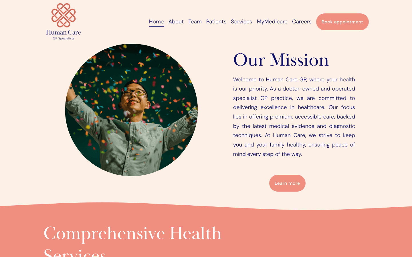
Human Care GP in Kent Town is doctor-owned, and the website reflects that pride. Warm cream backgrounds, a coral accent band, circular hero photo, and serif typography give it the feel of a wellness brand rather than a typical medical centre. The navigation covers Home, About, Team, Patients, Services, MyMedicare, Careers, and a “Book appointment” button.
The photography sets this apart. Every image feels intentional, not the generic stethoscope-on-desk stock photos you see on most GP sites. For an Adelaide practice trying to attract younger families, this design makes the clinic feel modern and worth the visit.
4. Territory Medical Group, Darwin

Territory Medical Group is the Northern Territory’s largest private practice, with locations in Nightcliff and Mitchell Centre. Blue and green palette with four icon-based service categories: telehealth, family health, travel health, and occupational health. The header puts “Contact Us” and “Book Online” front and centre.
The digital infrastructure stands out: a patient app for iOS and Android, online script renewals, and telehealth built into the booking flow. The occupational health section covers diving and oil-and-gas medicals, practical for Darwin‘s industry base where remote workers and FIFO crews need multi-channel access to their GP.
5. Mingara Medical, Central Coast
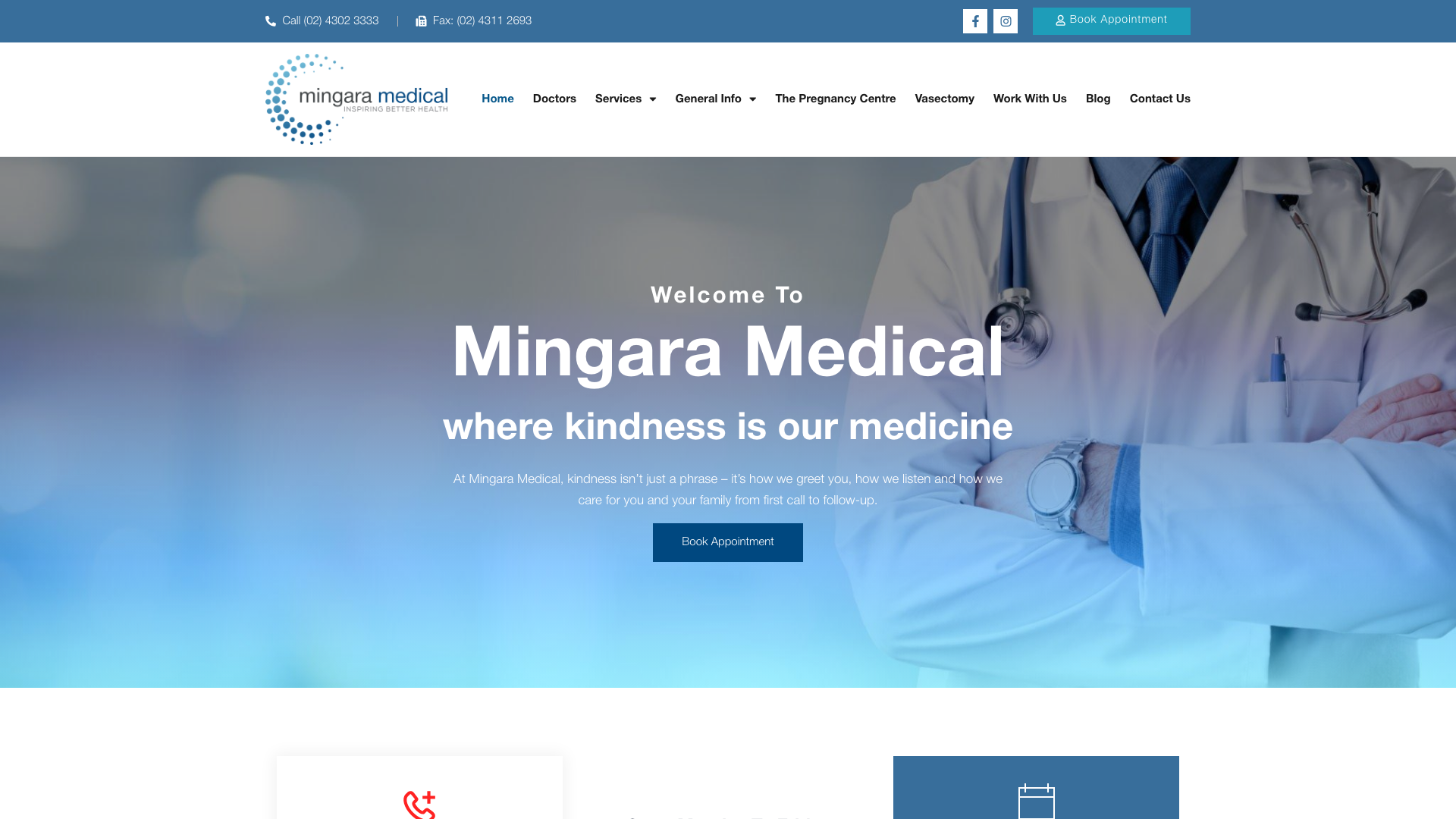
Mingara Medical in Tumbi Umbi uses a clean blue and teal palette with “where kindness is our medicine” as the tagline. Sticky header with phone number and booking links. Service cards with professional medical photography.
Affiliated specialist services under one roof set this apart from standalone GP clinics. Paediatrics (KidsPoint), allied health (HealthPoint), and general practice on the same site mean patients do not need referrals to separate locations. A strong approach for a Central Coast practice competing with bulk-billing clinics.
6. Cornwall Street Medical Centre, Brisbane

Cornwall Street Medical Centre in Woolloongabba runs a purple gradient colour scheme from magenta to deep violet. That is genuinely unusual for a medical practice. The hero promotes MyMedicare and telehealth with a “Book online” button linking to HotDoc, and a welcome section introduces a new GP registrar, giving the homepage a personal feel.
This is a multi-service health hub near Princess Alexandra Hospital: GPs, pathology, physiotherapy, pharmacy, psychology, and specialists under one roof. The inclusive care messaging for Indigenous and LGBTQ+ patients is woven naturally into the site. For a Brisbane medical centre, the purple branding gives it an identity patients remember.
7. Yarra Medical, Melbourne

Yarra Medical in Abbotsford takes a darker, modern approach with a full-bleed photograph and “Modern GP services for the inner Melbourne community” in white text. A left sidebar lists service categories that stay visible as you scroll: general practice, women’s health, men’s health, sexual health, skin clinic, and travel clinic.
The travel vaccination mega-menu is exceptional. Instead of one “Travel Medicine” page, it lists over 20 individual vaccines from cholera to yellow fever. Thirteen practitioners have individual profiles with specialties and direct booking links. For an inner-city Melbourne clinic serving a young, internationally mobile population, that detail turns the site into a genuine self-service tool.
8. Ocean Medical Practice, Bondi

Ocean Medical Practice in Bondi uses a teal-and-white design with a carousel showing the actual practice interior: reception desk, waiting room, and consultation spaces. Real interior photos tell patients what to expect before they arrive. Phone number, “Book Online Now” button, and Bondi Road address sit in the header without scrolling.
Fee transparency makes this site worth noting. Children under 15 are bulk billed between 10am and 2:45pm on weekdays, and the gap fees for standard consultations and for overseas student health cover are published on the site. For a medical practice in Sydney where patients have dozens of clinics within walking distance, answering the cost question upfront is a genuine booking advantage.
9. Suncoast Health Centre, Sunshine Coast
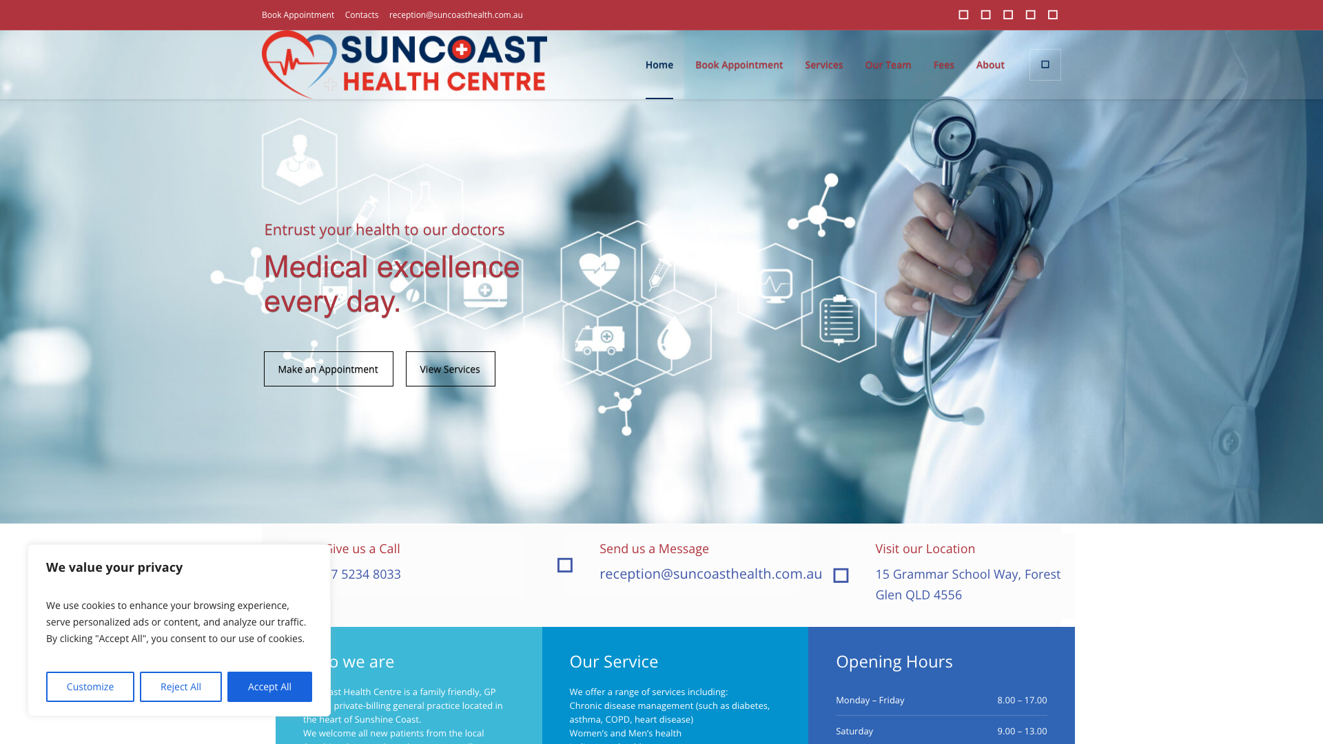
Suncoast Health Centre in Forest Glen runs a full-width hero slider with “Exceptional people. Great quality care.” Professional blue palette with a red accent header, sticky contact info, and HotDoc booking.
Doctor profile cards displayed on the homepage with photos, credentials, and specialties build trust before the patient even clicks through. Most GP sites hide their team on a separate page. For a private-billing Sunshine Coast practice, showing the team with pride is exactly what patients comparing clinics want to see.
10. Newcastle Medical Hub, Newcastle

Newcastle Medical Hub leads with a hero photo of their actual team in matching uniforms, immediately more trustworthy than stock images of models in lab coats. Orange accent buttons against a blue header make the booking call to action pop. Email, phone, and “Book Now” all sit in the header.
A floating booking widget on the right stays visible as you scroll through 19+ services, from antenatal care to workers’ compensation. Nine GPs and several registrars are listed with full credentials. For a multi-disciplinary Newcastle practice, keeping the booking pathway one click away at all times is the right call.
11. Geelong Medical & Health Group, Geelong

Geelong Medical & Health Group operates three locations: Myers Street in Geelong, The Cottage in Grovedale, and Torquay Medical. The header puts all three front and centre with individual phone numbers and green “Book Online” buttons. The hero leads with “Save time, book online” and lists all three centres with direct HotDoc links.
This multi-location header is the best execution on this list. A patient can see all three options, identify the closest, and book without digging through subpages. For a Geelong group practice covering multiple locations, that one-page clarity converts browsers into bookings.
12. Wollongong Family Practice, Wollongong

Wollongong Family Practice gets the emotional tone right. Teal and golden-coral tones with a lifestyle photograph and “Better health for the whole family” in elegant white text. A “Make Online Appointment” button sits centrally below the tagline.
Teal and coral feels welcoming for a family practice appealing to parents with young children. The pricing page lists bulk billing eligibility, gap fees, and Medicare rebate details, so patients know what to expect before arriving. For a Wollongong family practice, this design says “we’re friendly and we’re transparent” before anyone reads a word of copy.
13. The Lindisfarne Clinic, Hobart

The Lindisfarne Clinic on Hobart’s Eastern Shore has been around since 1948. The hero shows the HIA award-winning purpose-built facility with the address and phone number in bold white text. Map pin icon, “Book Appointment” button, and phone number give patients three contact options without scrolling.
The “since 1948” positioning gives this practice something no new clinic can compete with: decades of trust. Rather than looking dated, they have built a modern site with HotDoc booking, clear service listings, and professional photography. For a Hobart practice, combining heritage with modern booking technology is the right formula for attracting patients who want experience and convenience.
14. Carn-Brae Clinic, Ballarat

Carn-Brae Clinic in Ballarat uses a deep red and blue colour scheme on white backgrounds. Service cards with icons, prominent “Book Appointment” and “Call Us” buttons, and extensive dropdown navigation organised by specialty.
Over 60 years of history combined with a contemporary layout is the contrast that works here. “Proudly Servicing Greater Ballarat for Over 60 years” carries weight that no amount of design polish can replicate. A strong approach for a Ballarat medical practice that has kept pace with patient expectations.
15. The GP Clinic, Bendigo
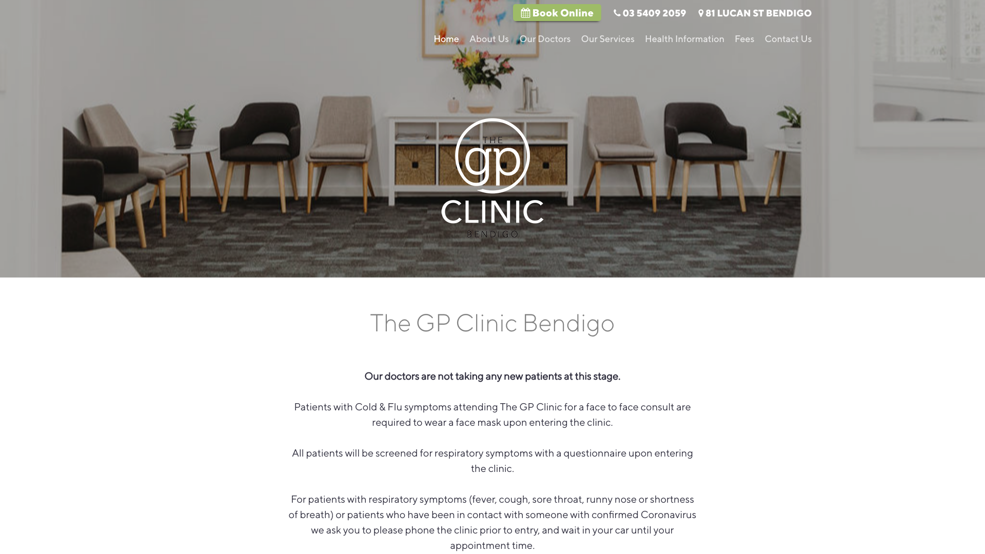
The GP Clinic Bendigo uses a muted green and dark grey palette on white. Horizontal navigation for Doctors, Services, Fees, and Health Information. Prominent booking button and phone number in the header.
Muted green is distinctive for a medical practice where most default to blue. It reads as calm and approachable rather than clinical. Fee transparency upfront and purpose-built rooms in the hospital precinct add credibility. A refreshing approach for a Bendigo practice.
What makes a good medical website?
Looking across these 15 sites, the same patterns keep showing up.
| Feature | Why it matters | Who does it well |
|---|---|---|
| Online booking on the homepage | Patients expect to book instantly. Making them call is a conversion killer. | East Canberra GP, Suncoast Health Centre, Geelong Medical Group |
| Fee transparency | Patients check cost before booking. Hiding fees creates distrust and wastes reception time. | Ocean Medical, Wollongong Family Practice, The GP Clinic |
| Real team photos | Patients want to know their doctor before walking in. Stock photos do the opposite. | Newcastle Medical Hub, Human Care GP, Yarra Medical |
| Service-specific navigation | Patients searching for a specific service need to find it in one click. | Yarra Medical, East Canberra GP, Cornwall Street Medical |
| Multi-channel patient access | Telehealth, mobile apps, and online scripts keep patients in your practice when they cannot visit. | Territory Medical, Mingara Medical |
| Bulk billing and health fund info | Knowing what is covered determines which clinic a patient chooses. | Ocean Medical, Wollongong Family Practice |
Four things to check on your own medical website
You do not need everything on this list from day one. But if your practice website is missing most of these, patients are probably choosing the clinic down the road. Here are four things to check now, or run a full 30-minute website audit for the complete picture.
- Booking visibility. Can a patient book online without scrolling past the first screen? If the booking button is not visible when the page loads, move it up.
- Fee information. Are your fees listed anywhere on the site? If a patient has to call to ask whether you bulk bill, add a pricing section.
- Real photography. Do you have actual photos of your doctors and clinic? Replace stock images with photos of your real team and waiting room.
- Service findability. Can patients find specific services quickly? If everything sits behind one “Services” dropdown, break out your most-searched services into their own pages.
The same principles apply to other healthcare verticals. We have done a similar analysis for dental website design if your practice crosses into that space.
Web design for doctors and medical clinics
A solo GP clinic and a 10-doctor medical centre have different website needs, but the fundamentals are the same:
- Online booking visible on the homepage
- Clear fee and bulk billing information
- Individual doctor profiles with photos and credentials
- Dedicated pages for your main services
- AHPRA-compliant copy throughout
If your current site looks dated or lacks online booking, a medical website redesign does not mean starting from scratch. The best approach keeps what already works (your domain authority, existing content, and any search rankings) while upgrading the design and functionality patients expect.
When choosing the right web design company for a medical site, look for someone who has built sites for doctors and clinics specifically. They will already understand AHPRA compliance, how to integrate booking platforms like HotDoc or Cliniko, and which pages a medical practice actually needs.
Frequently asked questions
How much does a medical website cost?
It depends on the number of pages, booking integrations, and whether you need ongoing management. A solo GP practice with five pages will cost less than a multi-location group needing 30+ service pages and a patient portal. Website costs in Australia vary widely, so get quotes from designers who have built medical sites before.
Does my medical website need to comply with AHPRA?
Yes. AHPRA’s advertising guidelines apply to all registered health practitioners in Australia. Key restrictions include:
- No patient testimonials about clinical outcomes
- No superlatives like “the best” or “number one”
- No guarantees about treatment results
Your web designer needs to understand these rules, because a non-compliant site risks a formal complaint.
Can I redesign my medical website without losing search rankings?
Yes, if done correctly. Keep the same URLs or set up 301 redirects, preserve content that already ranks, and maintain your domain. A redesign that updates the visual design and adds functionality without restructuring URLs will usually keep or improve rankings.
Should each doctor have their own profile page?
Individual doctor pages help patients choose a GP before booking and create additional pages that can rank for “[doctor name] + [suburb]” searches. Every practice on this list that displays detailed team information builds more trust with patients browsing the site.
What booking system works best for medical websites?
The most common platforms for Australian medical practices are:
- HotDoc for GP clinics (most sites on this list use it)
- Cliniko for allied health and specialist clinics
- Halaxy and Power Diary for multi-practitioner practices
The booking system matters less than where you place it. If the “Book Online” button is not visible without scrolling, you are losing appointments.
Need a medical website?
Our website design services cover medical practices across Australia, from solo GPs to multi-location groups. See our medical website design page for examples of what we build, or check pricing to see what is included.