The best school website design makes a school’s identity clear and helps families find their next step.
A school website has to serve families choosing a school and those already enrolled. Tour bookings, campus information and term dates need clear paths through the same site.
These 16 Australian examples show different ways to organise that information and express a school’s character. The comments focus on visible design choices, not a ranking of educational quality or measured enrolment results.
Best School Website Design Examples in Australia
1. The Essington School Darwin
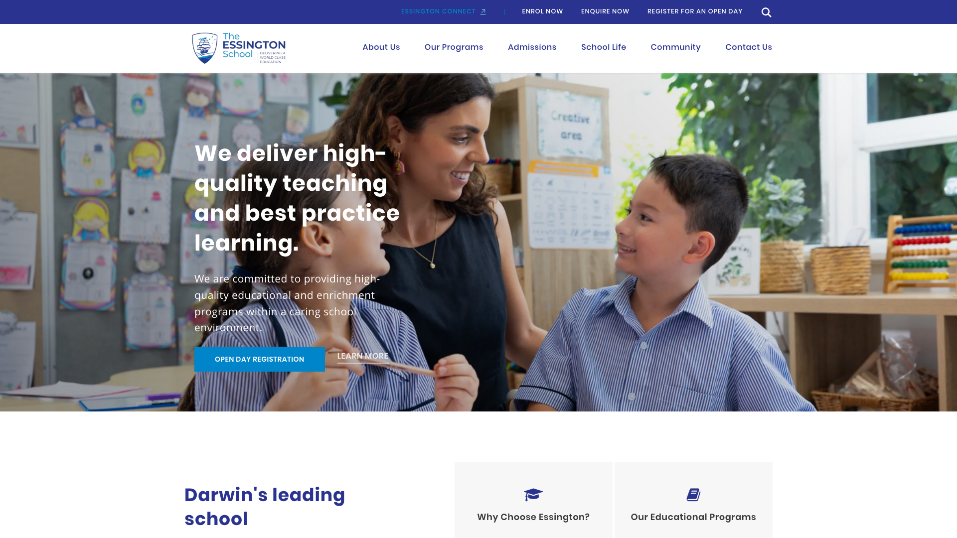
The Essington School opens with “driven by local expertise and global thinking.” The site features a full-width hero with campus photography, a warm colour palette, and an acknowledgment of the Larrakia people front and centre. Navigation is split by school stage with a clear enrolment pathway.
The Larrakia acknowledgment woven into the main navigation shows how a school can embed its values into the site’s structure rather than burying them in a footer. The Essington School has been Darwin’s independent school since 1982, serving students from early years through Year 12. Use that relationship between heritage and presentation when briefing school web design in Darwin.
2. Newcastle Grammar School Newcastle
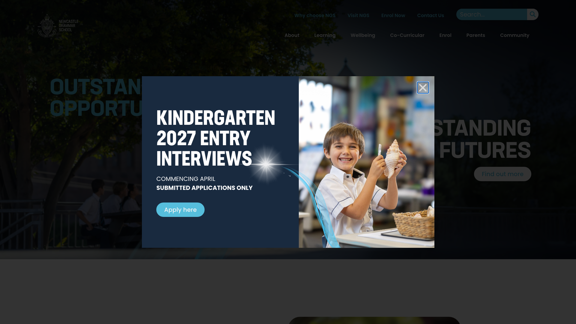
Newcastle Grammar School uses a confident navy, teal, and burgundy palette with neusa-next-std typography. The Round Square badge sits in the header, signalling their international network membership. Hero images rotate through campus life, and the navigation organises content by audience: prospective families, current families, and students.
The Round Square international network badge in the header immediately communicates global credentials without needing a paragraph of explanation. A co-educational school from preschool to Year 12, with a design that balances tradition and forward thinking.
The colour palette alone sets this apart from the typical school blue-and-white. A brief for school web design in Newcastle can specify where memberships belong and what they mean to families.
3. Scotch College Perth
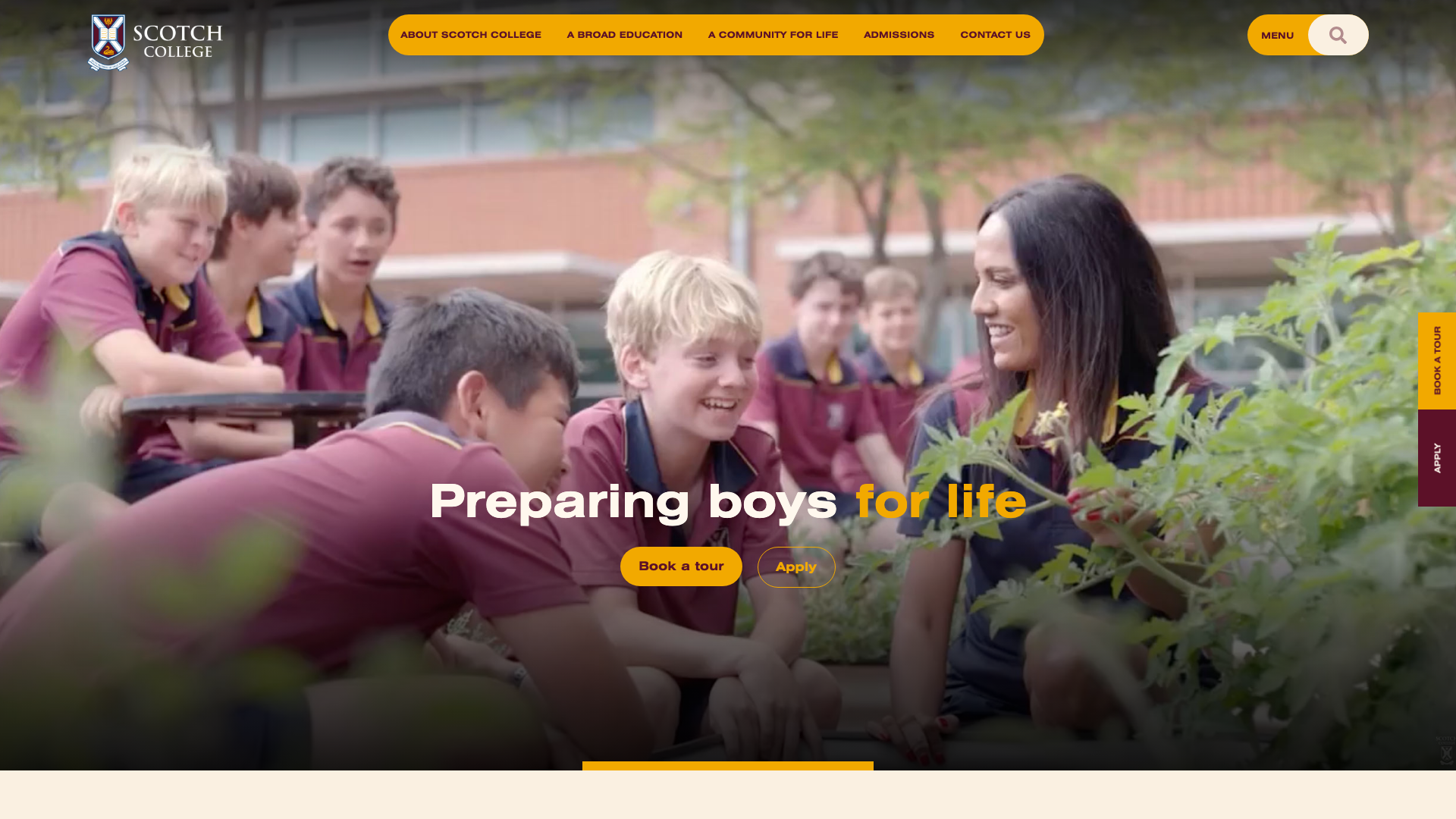
Scotch College leans into its heritage with burgundy and cream tones, gold thistle imagery, and scroll animations that reveal content as you move down the page. The hero features cinematic campus photography, and the site uses scroll-triggered transitions rather than static sections.
The scroll animations give the site a premium, almost cinematic feel as sections come into view. Load times still need separate testing. The gold thistle motif ties the digital experience to the school’s crest and history.
Founded in 1897, Scotch College lets its history speak through the design rather than just listing dates. For school web design in Perth, ask how animation will work on slower connections before adopting it.
4. Geelong Grammar School Geelong
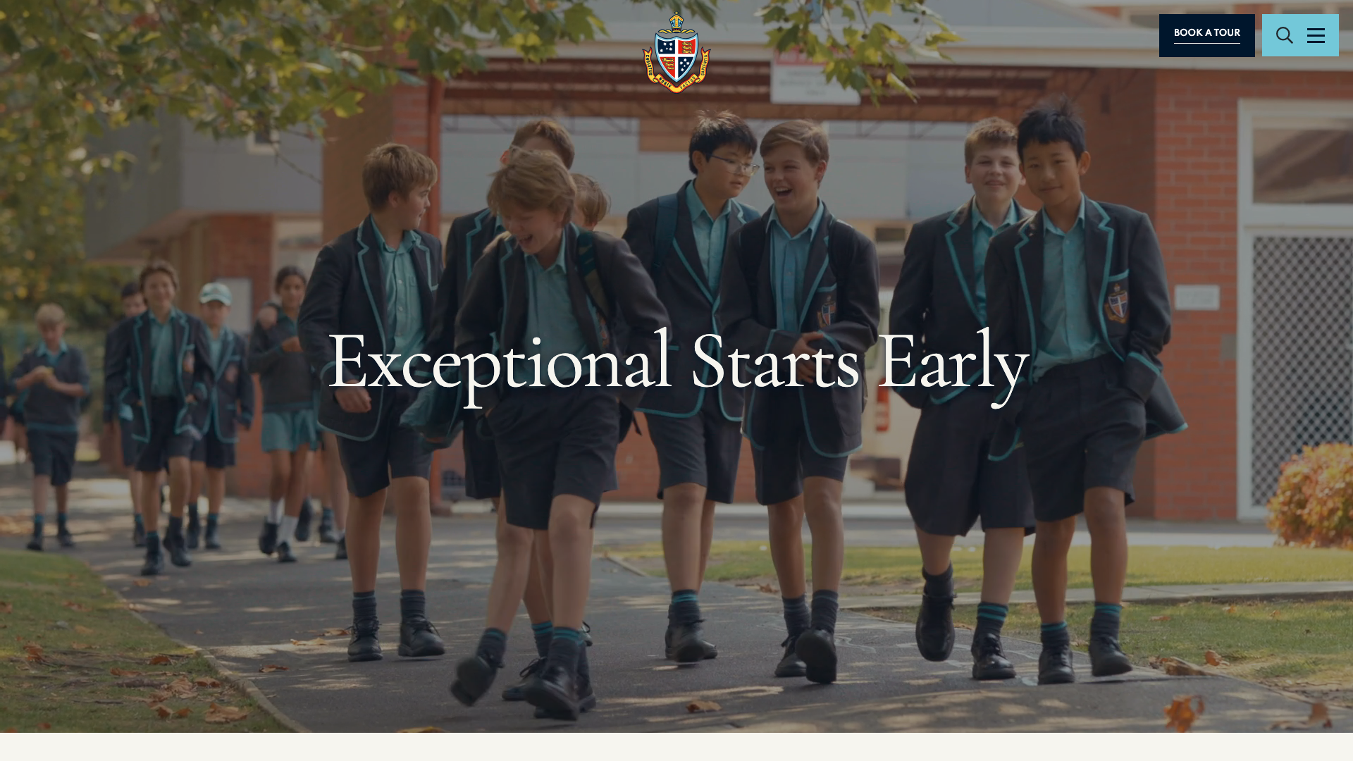
Geelong Grammar School structures its identity around three educational pillars: Adventure, Positive, and Creative education. Each pillar has its own visual treatment and dedicated section. The design uses warm, earthy photography and generous whitespace to let the content breathe.
The three-pillar framework woven through the entire site organises the school’s educational approach into sections families can explore. Rather than listing programs, the site shows a philosophy.
The layout gives each theme space for explanation. Schools considering school web design in Geelong can map their educational approach to page sections in the same way.
5. Haileybury Melbourne
Haileybury has to distinguish its Melbourne campuses, online school and affiliated schools, and the site handles it well. A campus selector in the navigation lets visitors filter by location. The hero section rotates through campus-specific imagery, and the overall design uses deep navy with bright accent photography.
The multi-campus selector in the main navigation gives families a starting point for choosing a location. Parents can find their specific campus without wading through irrelevant content.
Haileybury’s own site identifies Pangea as its online school and Tianjin as its partner school in China. Keeping those options distinct helps families choose the right pathway. When planning school web design in Melbourne, make campus selection part of the initial content brief.
6. Ballarat Clarendon College Ballarat
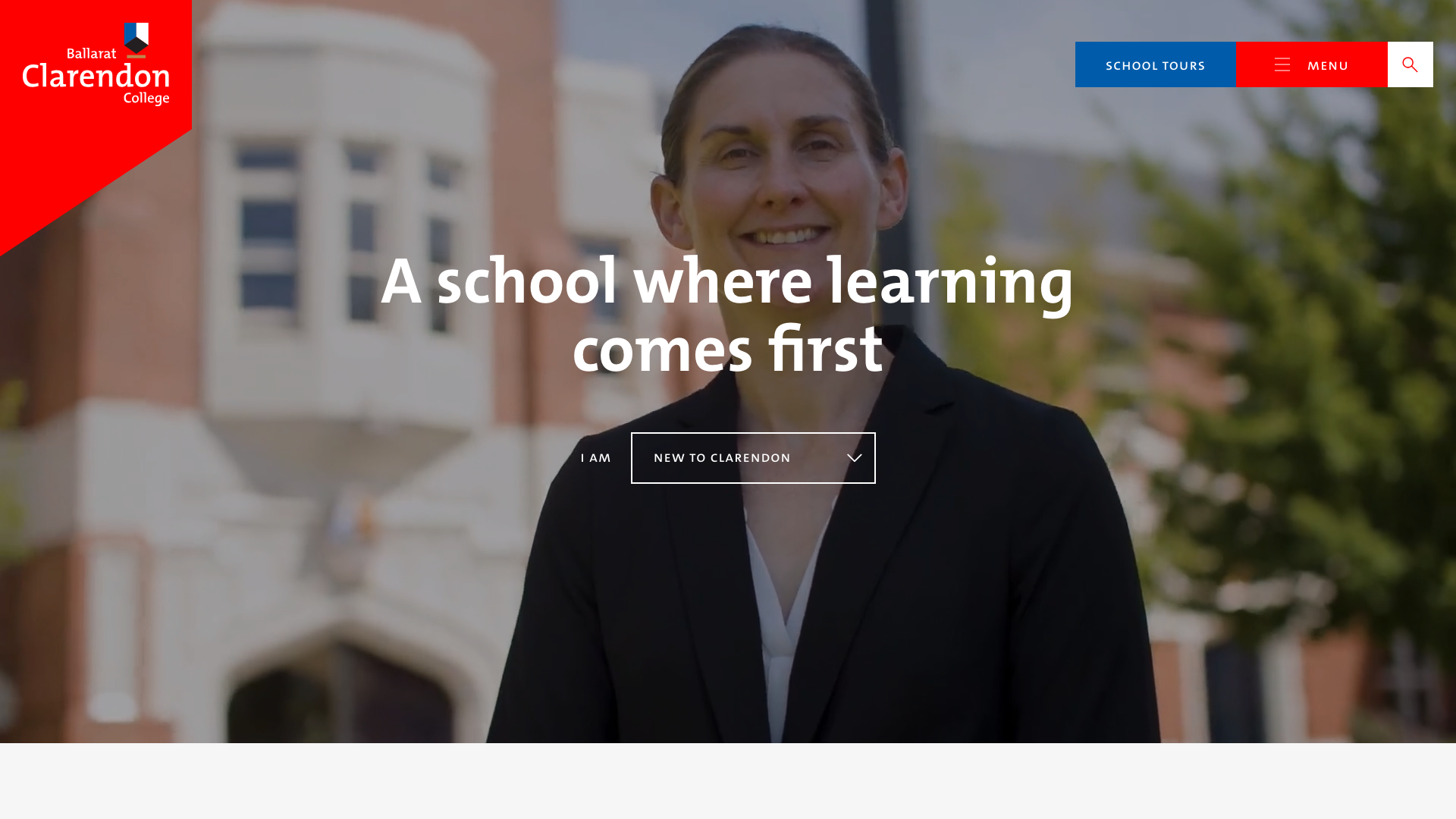
Ballarat Clarendon College opens with an introductory video and the statement “every child can learn.” The site pairs traditional school colours with modern web design principles, using full-width video sections and card-based content layouts for programs and news.
The opening video combined with “every child can learn” immediately tells parents what this school believes. It puts the school’s teaching philosophy near the start of the visit.
Its heritage sits alongside video and clear content cards. That balance of heritage and modernity is what good school web design looks like. That link between a belief and a visible example is useful when planning school web design in Ballarat.
7. Stuartholme School Brisbane
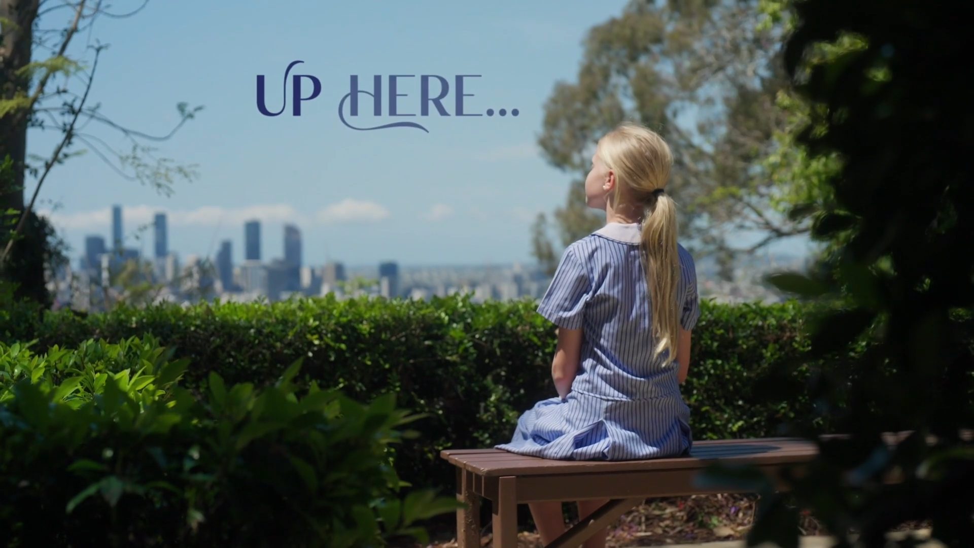
Stuartholme School uses a distinctive navy and sage green palette with Hello Paris Medium and Optima LT typography. The serif lettering contrasts with the restrained colours. The layout is editorial in style, with large feature images and structured content blocks.
The Hello Paris Medium and Optima LT font pairing makes headings stand apart from body text. The pairing gives headings and body copy visibly different roles.
A Sacred Heart school in Toowong with a design that feels more like a premium editorial publication than a typical school site. For school web design in Brisbane, compare a proposed font pairing in body copy as well as large headings.
8. Central Coast Grammar School Central Coast
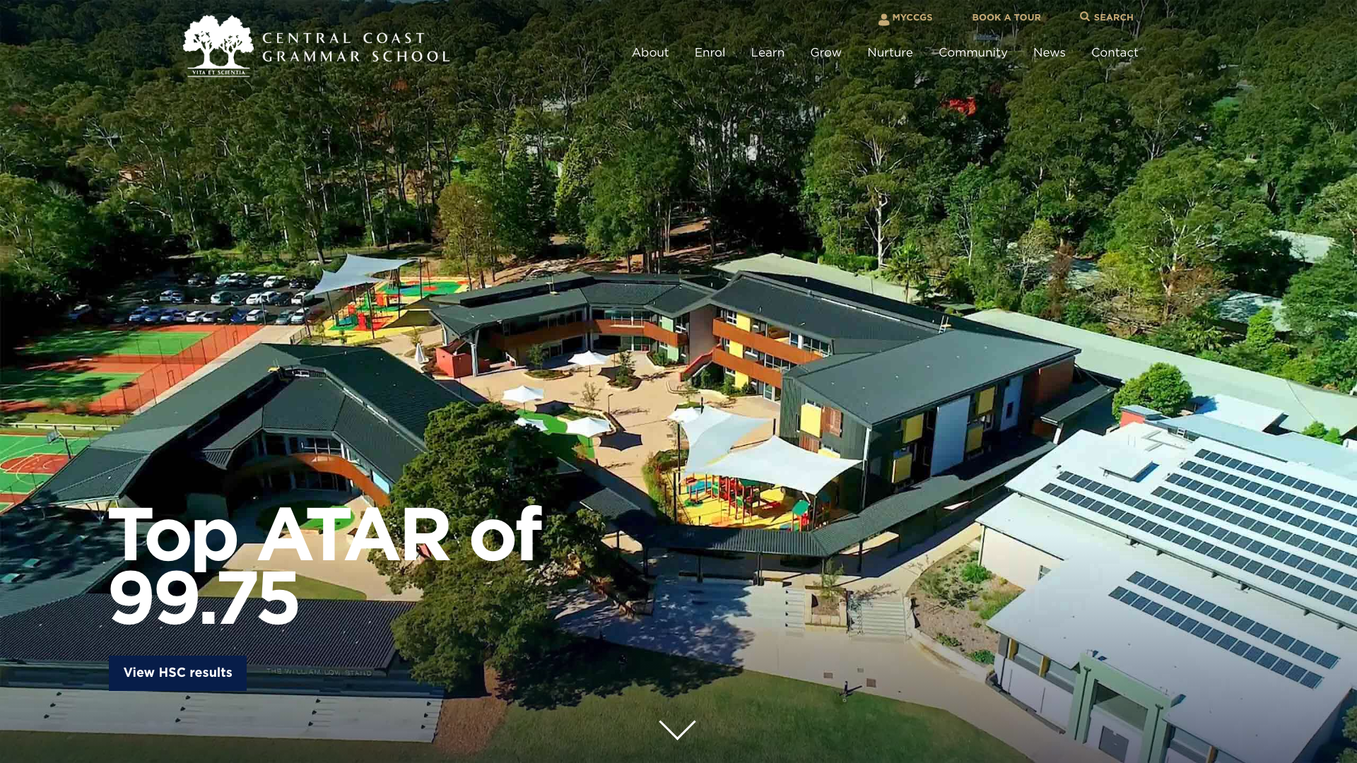
Central Coast Grammar School uses a clean green and white palette with a live chat widget and virtual tour option built into the navigation. The homepage hero cycles through student photography, and the layout prioritises enrolment pathways and upcoming events.
The live chat and virtual tour in the main navigation give prospective parents two immediate ways to engage without filling in a form. These options suit parents who are still gathering information.
The virtual tour is a genuine differentiator for parents who cannot attend an open day in person. Include remote visits in a brief for school web design on the Central Coast if families often enquire before travelling.
9. All Saints Anglican School Gold Coast
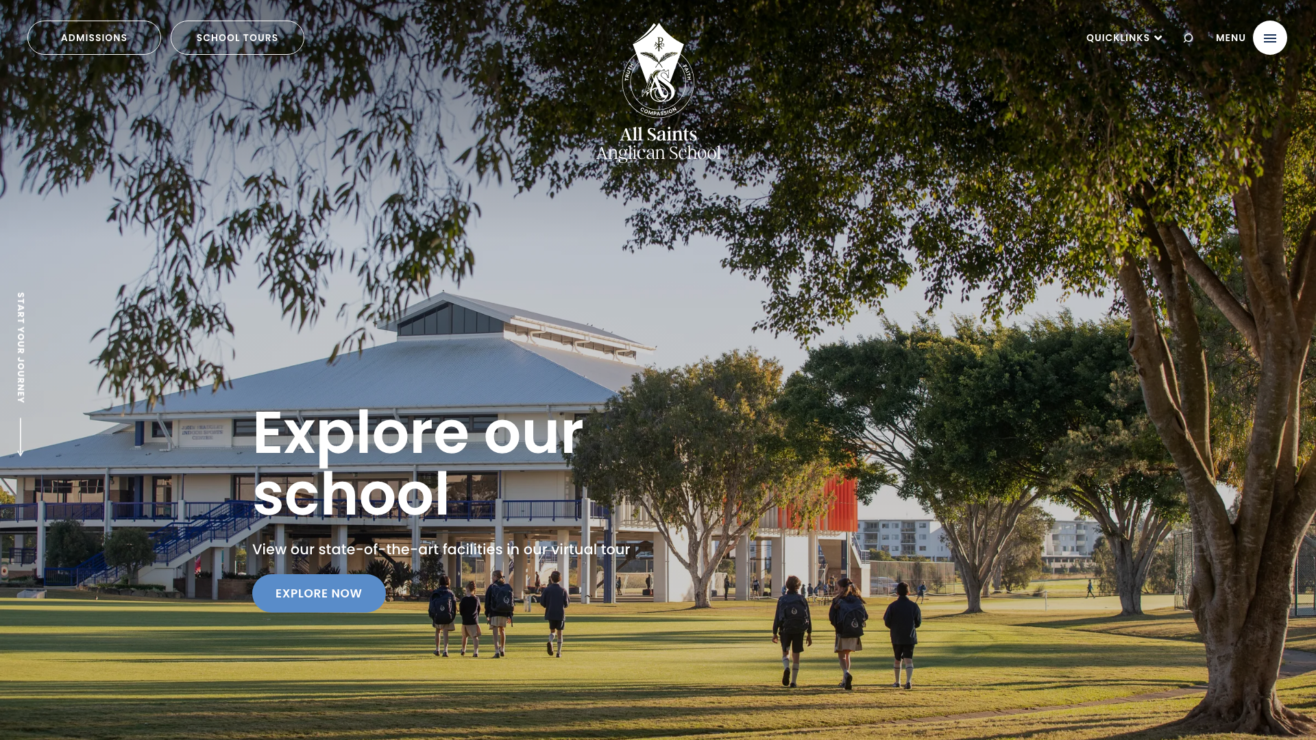
All Saints Anglican School leads with a dark gradient hero that gives the site a premium, immersive feel. The homepage highlights alumni achievements and student success stories front and centre, with a results-oriented messaging approach throughout.
The alumni achievements featured on the homepage do something clever: they show parents what their children could become. The alumni stories add context beyond the program descriptions.
Combined with the dark gradient hero, the site feels confident and established. An alumni section is worth discussing as part of school web design on the Gold Coast, provided the school can maintain it.
10. Redlands Sydney
Redlands leads with campus photography. The site includes a virtual tour feature, detailed program pages, and a design that balances open green spaces with modern learning environments. Navigation is clean with clear audience pathways.
The virtual tour of the campus lets families explore facilities before arranging a visit.
Interstate and international families can use the tour while deciding whether to arrange a visit. For school web design in Sydney, consider which facilities families need to understand before booking a visit.
11. Canberra Grammar School Canberra

Canberra Grammar School builds its site around the “5Cs” mission: Curious, Creative, Confident, Compassionate Citizens. As an IB World School, the international credential is prominent in the header. The design uses structured content sections with clear calls to action for enrolment and events.
The “5Cs” framework visible throughout the site gives the school a consistent set of themes to use across its pages.
IB World School status, boarding facilities, and a co-educational program from pre-school to Year 12. The site organises all of that complexity without feeling cluttered. A brief for school web design in Canberra can use this example to connect a school’s stated values with its page structure.
12. The Friends’ School Hobart
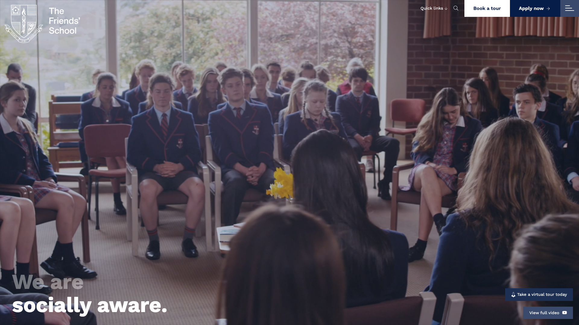
The Friends’ School opens with a video hero and a rotating values statement that cycles through its Quaker principles. The site has a warm, inviting palette that reflects the school’s inclusive philosophy. Navigation splits content between prospective and current families.
The rotating Quaker values statement in the hero immediately tells visitors what kind of school this is. Families can read those values before exploring the school’s programs.
The design pairs that heritage with a welcoming feel. Keep those audience routes distinct when planning school web design in Hobart.
13. Matthew Flinders Anglican College Sunshine Coast
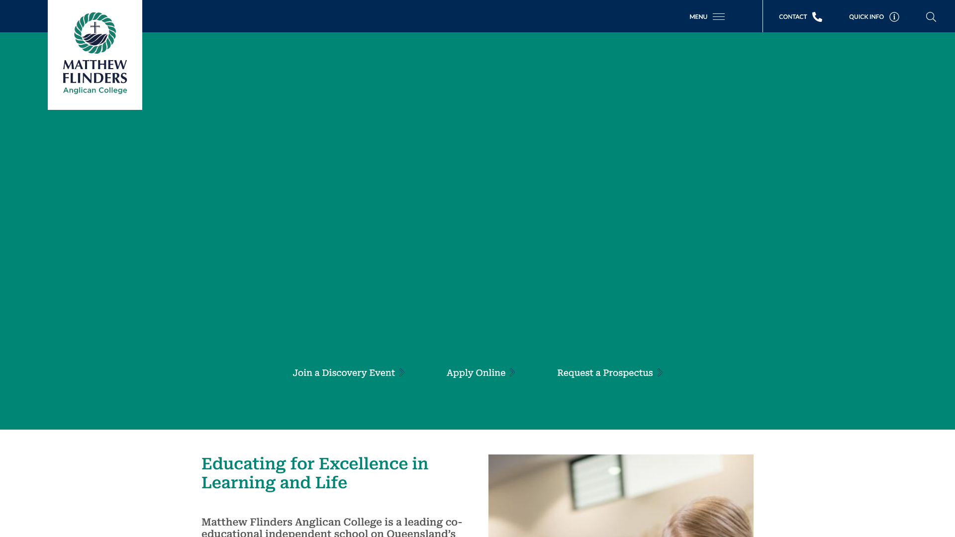
Matthew Flinders Anglican College uses a crisp navy and white palette with lightbox galleries that open directly from the homepage. The design is clean and functional, with campus photography featured throughout and a straightforward navigation structure.
The lightbox galleries integrated into the homepage let parents browse campus life without leaving the page. Visitors can inspect several views of school life in one place.
A prep-to-Year-12 college at Buderim with a site that does not try to be flashy. It just presents the school clearly. When briefing school web design on the Sunshine Coast, decide where a gallery answers a question better than a paragraph.
14. Immanuel College Adelaide
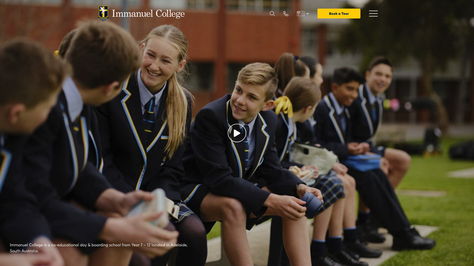
Immanuel College highlights its Discovery Centre and provides dedicated pathways for international students. The site uses a structured layout with program cards, campus facility galleries, and clear enrolment steps for both domestic and international families.
The dedicated international student pathway gives overseas families a clear place to start. Immanuel builds it into the main navigation, not as an afterthought buried in a submenu.
For a school actively recruiting from overseas, this is a smart design decision that removes friction for international families researching schools. Schools discussing school web design in Adelaide should identify whether overseas families need a separate admissions route.
15. Edmund Rice College Wollongong

Edmund Rice College weaves its centenary celebration throughout the site, using heritage photography alongside contemporary campus imagery. The design honours 100 years of history while keeping the user experience modern and clean.
The heritage photography integrated throughout the site shows how the campus has changed over time. Old photos alongside new ones show continuity and tradition.
For a school celebrating its centenary, the design choice of blending eras visually is more effective than simply writing “established in 1926” in the footer. For school web design in Wollongong, an archive can give the designer useful material for telling the school’s history.
16. Girton Grammar School Bendigo
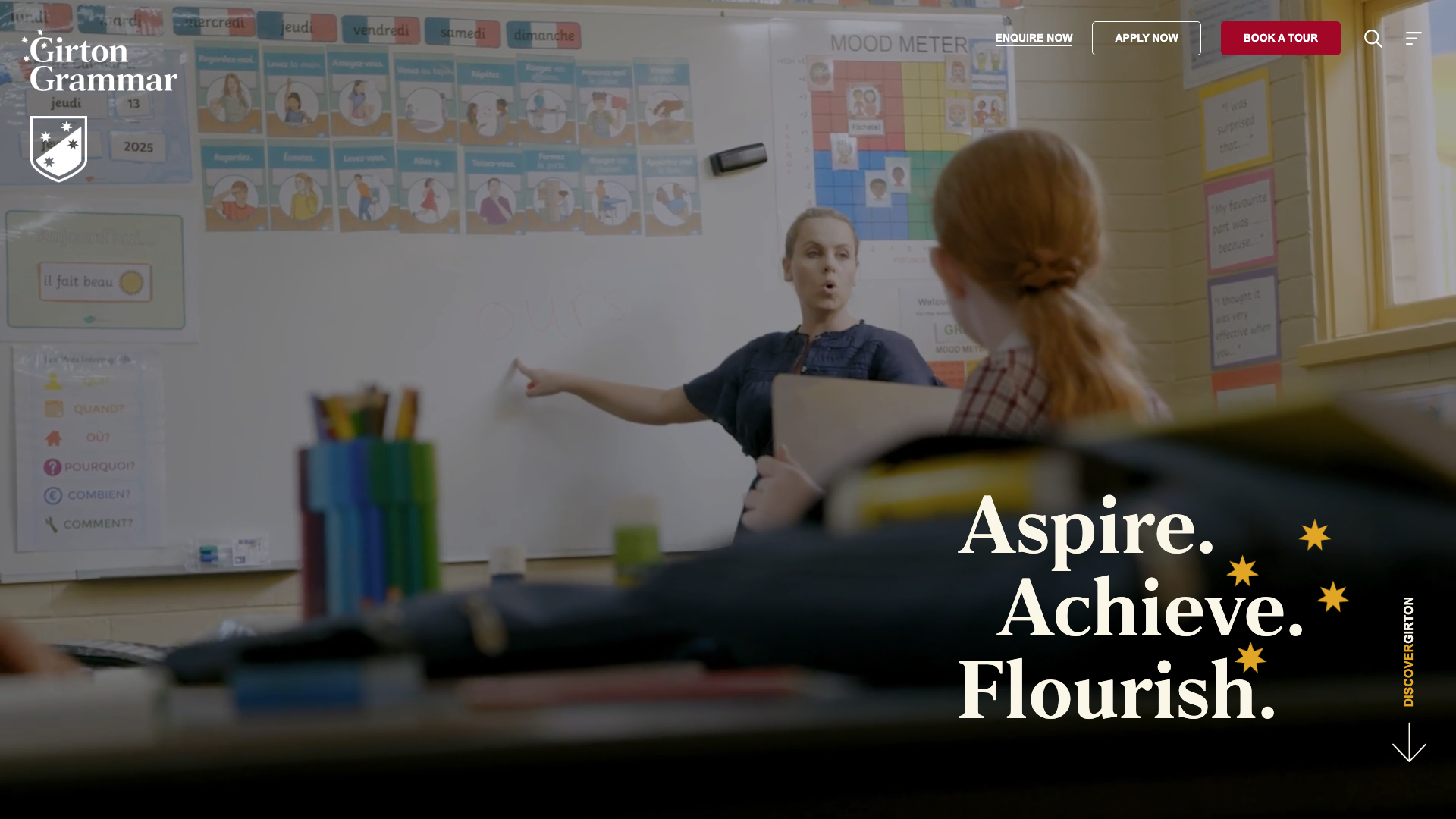
Girton Grammar School uses a burgundy and gold palette on a cream background with the “Than” font giving the site a distinctive typographic identity. The layout is structured and easy to scan, with program information and news updates organised in card-based sections.
The “Than” typeface on a cream background creates a visual identity that feels entirely its own. A distinctive typeface is worth considering only if it remains easy to read.
The typeface gives headings a recognisable style, but admissions information still needs readable body text. Consider the same reading checks when commissioning school web design in Bendigo, especially for long admissions pages.
What Makes a Good School Website?
Looking across all 16 sites, a few patterns stand out.
- Values-first design. The strongest school websites lead with what they believe, not what they offer. Geelong Grammar’s three pillars, Canberra Grammar’s 5Cs, and The Friends’ School’s Quaker values all give parents a reason to keep reading.
- Audience-split navigation. Prospective families and enrolled families often arrive with different tasks. The best sites separate these pathways from the top-level menu so nobody has to dig.
- Campus photography over stock imagery. Every strong school site on this list uses real photos of their students, teachers, and facilities. Parents want to see the actual school, not a stock photo of children in uniforms.
- Virtual tours and video. Redlands, Central Coast Grammar, and The Friends’ School all use video or virtual tours. Families who cannot visit in person can use these features to explore the campus before contacting the school.
- Typography that reflects the school. Stuartholme, Girton and Newcastle Grammar use noticeably different typefaces. Compare how their headings, navigation labels and body text work together.
School website design ideas to take from these examples
Start with the task a family needs to complete, then choose the design idea that helps them do it. Haileybury’s campus choices are useful for a multi-site school; a single-campus school may need only a clear tour booking route.
- Sketch separate menu paths for a prospective parent and an enrolled family. Ask each to find one useful page without prompting.
- Put campus-specific details beside the relevant campus choice, so families can check location before making an enquiry.
- Give video and virtual tours a text alternative that explains the facilities and links to the next step.
- Check headings and buttons on a phone before choosing decorative animation.
For a practical way to examine those paths, use Kyle’s website audit process and apply the checks to your school’s admissions pages.
School web design: questions about the examples
What makes a school website a useful design example?
A useful example solves a recognisable problem. Check campus selection, the school’s approach and the route to a tour enquiry.
Which example helps with a multi-campus school?
Haileybury is a useful starting point because its site distinguishes Melbourne campuses, online learning and affiliated schools. Use that separation as a reference when your own locations offer different year levels or enrolment options.
Should a school copy the colours and fonts shown here?
Discuss the feel you want, then use your school’s own identity. Check readability in menu labels, body text and forms before adopting an unusual typeface.
Does a school website need a virtual tour?
A tour can help families who cannot visit easily, as the Redlands example illustrates. It should sit alongside practical information and a contact option; a family should not have to watch it to find admissions details.
What should we check on a school website’s mobile version?
Try opening the menu, finding fees and completing a tour enquiry on a phone. Check that text remains readable and buttons are usable without zooming; a desktop screenshot cannot establish that.
How should existing families find everyday information?
Give parent portals, term dates and routine notices a clearly labelled route. Edmund Rice College’s Quick Links separate these tasks from its enrolment menu, which contains tours, fees and the application process.
Do these designs prove that a school gains more enrolments?
No. A public website shows its content and navigation, but it does not reveal the school’s conversion data. Assess tour enquiries and completed applications separately before attributing an enrolment change to design.
How can a school keep its new design useful?
Assign someone to review fees, tour dates and admissions contacts, and agree who fixes broken forms. Include ongoing website management for the school’s site in the plan so those responsibilities continue after launch.
What should we take into a school website design brief?
Choose a few examples and explain the problem each would solve for your families. Include your campus structure, admissions steps and the pages staff need to update.
Need a School Website?
A useful school website lets a family understand the school and act on that interest. Check whether your own site makes the next step clear, whether that is finding fees or booking a visit.
Our website design services for schools cover school identity, content organisation and the steps families take to book a tour. See our school website design service or compare website design pricing to get started.