
The best childcare websites help parents understand the centre, trust it and book a tour.
Parents use a centre’s website to compare its approach, spaces and next steps before they make contact. We reviewed childcare and early learning websites across major Australian cities to find 16 examples that make that decision easier.
The list includes independent centres and small groups, judged on the relationship between their design, content and enquiry path. If you are planning a similar project, our childcare website design service explains how we approach the work.
How we assessed these childcare websites
This is a design review, not a popularity ranking. We looked for choices a centre owner could inspect on the page rather than relying on awards or broad claims.
- Does the site use real centre photography and show the learning environment clearly?
- Can a parent understand the programs, philosophy and age groups without digging?
- Is the tour, enrolment or enquiry path obvious on both desktop and mobile?
- Do the colours, type and layout fit the centre’s stated approach?
For the practical issues behind the visuals, our audit of 20 Australian childcare centre websites examines what parents can actually find and do on each site.
Best childcare website design examples in Australia
1. Imagination Garden Geelong

Imagination Garden wraps everything in teal and sage green on a cream background, with leaf vector patterns layered behind sections. The hero sits over an exterior photo of the centre with “Nurturing growing imaginations” in bold Poppins type. Navigation is sticky with the logo left and menu right, and the layout scrolls through programs, philosophy, and an enrolment CTA without feeling cluttered.
The garden theme continues beyond the logo. Leaf patterns frame the sections, while the earthy palette and outdoor photography support the centre’s nature focus. For a Geelong childcare website, it is a useful example of matching the page design to the experience described in the copy.
2. Top End Early Learning Centre Darwin

Top End Early Learning Centre leads with earthy greens and warm yellows, a dragonfly logo, and a hero image of kids in a nature setting under the heading “Sustaining our Future.” The typography uses Heebo and Montserrat at large sizes, with illustrated icons for each service area. Full-width layout with generous spacing between sections.
The environmental program is visible in the design. The dragonfly mark and nature photography support copy that explains what the program involves. That specificity is part of what makes a childcare website feel trustworthy, and it gives this Darwin childcare website a clear position.
3. Canopy Early Education Brisbane

Canopy Early Education opens with a dark blue gradient hero and generous whitespace, using a palette of deep forest green, sage, warm peach, and dusty rose. Poppins headings sit over Open Sans body text. The layout is deliberately asymmetrical, with content shifted off-centre to create visual tension. Leaf imagery threads through every section.
Curved image frames soften the page without obscuring the content. Canopy repeats the same shapes across its photography and section edges, so the effect feels deliberate. The result gives this Brisbane childcare website its own visual language without making the layout difficult to scan.
4. Grandma Rosie’s Quality Long Day Care Wollongong

Grandma Rosie’s runs a purple and pink palette with Varela Round headings that give everything a friendly, rounded feel. The hero shows an image overlay with “Safe & Supportive Learning Environments” in white. Three-column cards below break out Early Learning, School Readiness, and Learning Environment. Five centre locations appear as cards in the footer.
The purple and magenta palette avoids the greens and primary colours common in this category. Rounded type keeps the stronger colours from feeling severe. The same treatment carries across the five centre cards, giving this Wollongong childcare website a consistent way to present multiple locations.
5. The Akidamy School of Early Learning Perth
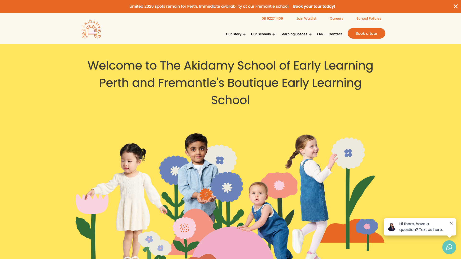
The Akidamy uses a soft yellow background with orange call-to-action buttons and teal accents. Poppins font throughout. The hero features a warm, high-quality photograph with generous whitespace around it. Dropdown navigation covers “Our Story,” “Our Schools,” and “Learning Spaces.” Two locations: Perth CBD and Fremantle.
Calling the centre a “School of Early Learning” shapes the rest of the page. The .edu.au domain and photographs of the learning spaces reinforce that positioning without making a price claim. A Perth childcare website could use the same principle: choose a position first, then make the visual decisions support it.
6. Little Miracles Central Coast
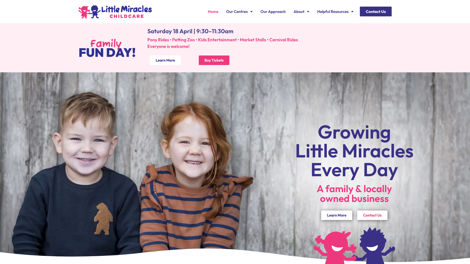
Little Miracles opens with “Growing Little Miracles Every Day” over a warm, soft-toned hero image. Pink and neutral tones dominate the palette. A card-based grid shows six centre locations, each with an “Explore” button. The Elementor build uses WebP-optimised images and a horizontal nav with dropdowns for centres, approach and resources.
The parent decision-making UX is well thought through. A “Why Choose Us” module highlights nine differentiators, and the Kinderloop integration explains how parents can receive updates about their child. Six family-owned centres, all on the Central Coast, and the site makes it easy to compare them.
7. St Nicholas Preschool Canberra
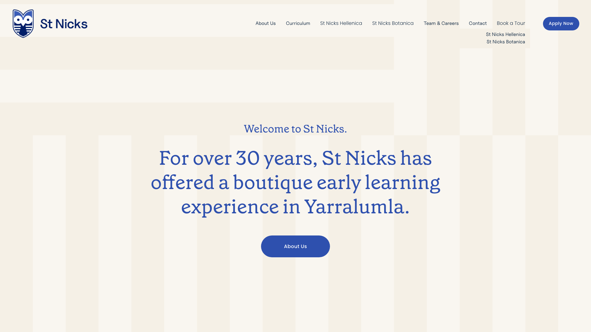
St Nicholas Preschool uses soft blue backgrounds, white text and nature imagery. The header separates its Hellenica and Botanica campuses, with prominent “Book a Tour” and “Apply Now” buttons. Campus pages also include integrated Google Maps.
Hand-drawn children’s illustrations sit alongside the centre photography. The combination gives St Nicholas recognisable page elements without hiding the practical campus information. It is a useful reference for a Canberra childcare website serving more than one location.
8. Little Assets Early Learning Melbourne
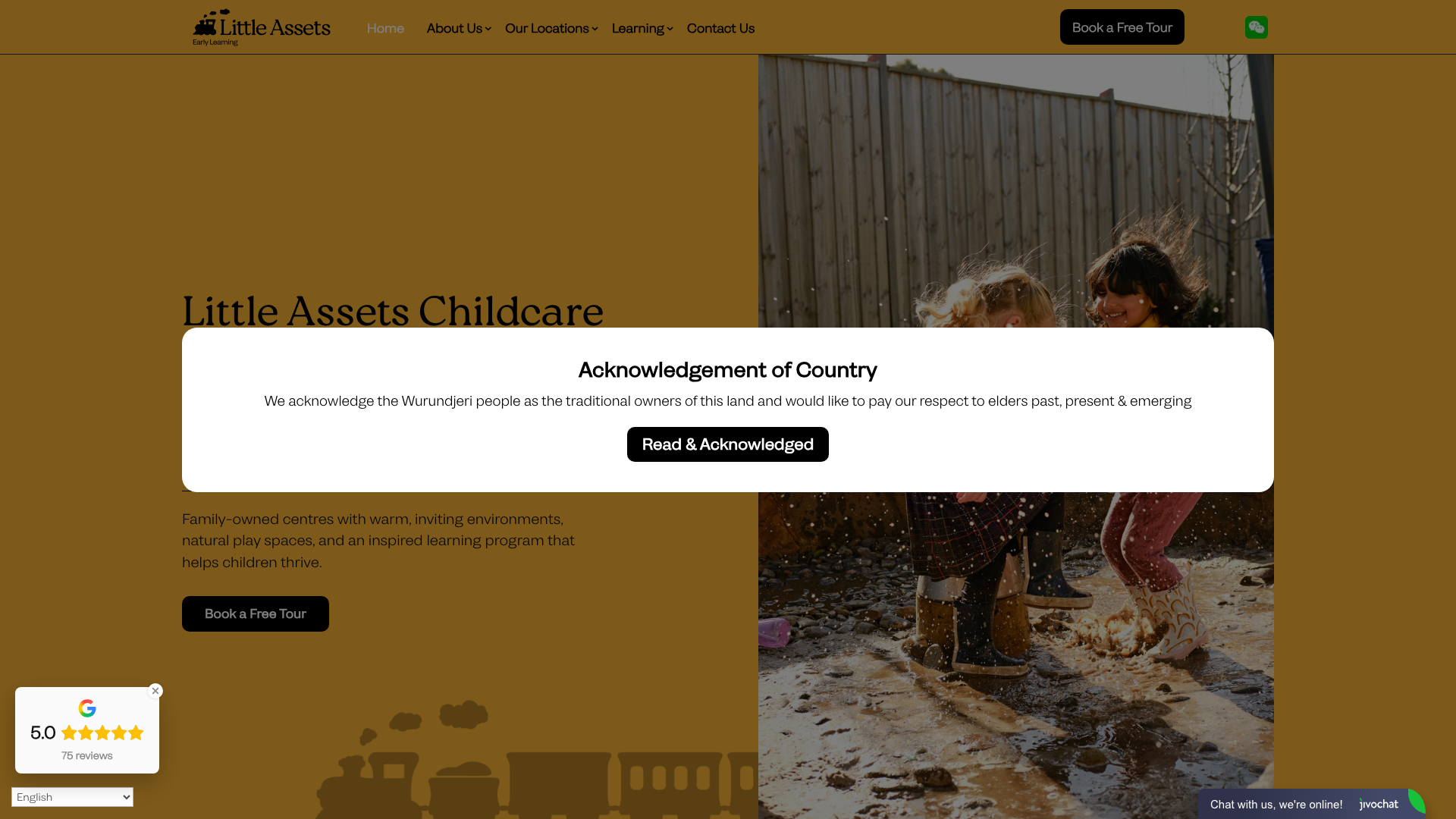
Little Assets Early Learning uses blue as its primary accent on a clean white layout. The homepage shows their Reggio Emilia-inspired philosophy with photography of natural outdoor play spaces, wooden furniture, and open-plan rooms. Mobile-optimised navigation and structured schema markup for “ChildCare” show attention to both UX and technical SEO.
The Reggio Emilia philosophy reflected in the design is what makes this site work. The natural materials, open spaces, and home-like environments photographed on the site mirror the educational approach they describe in the copy. When the design and the philosophy tell the same story, parents get it immediately. A smart move for a Melbourne childcare website in a crowded market.
9. Little Apple Tree Gold Coast
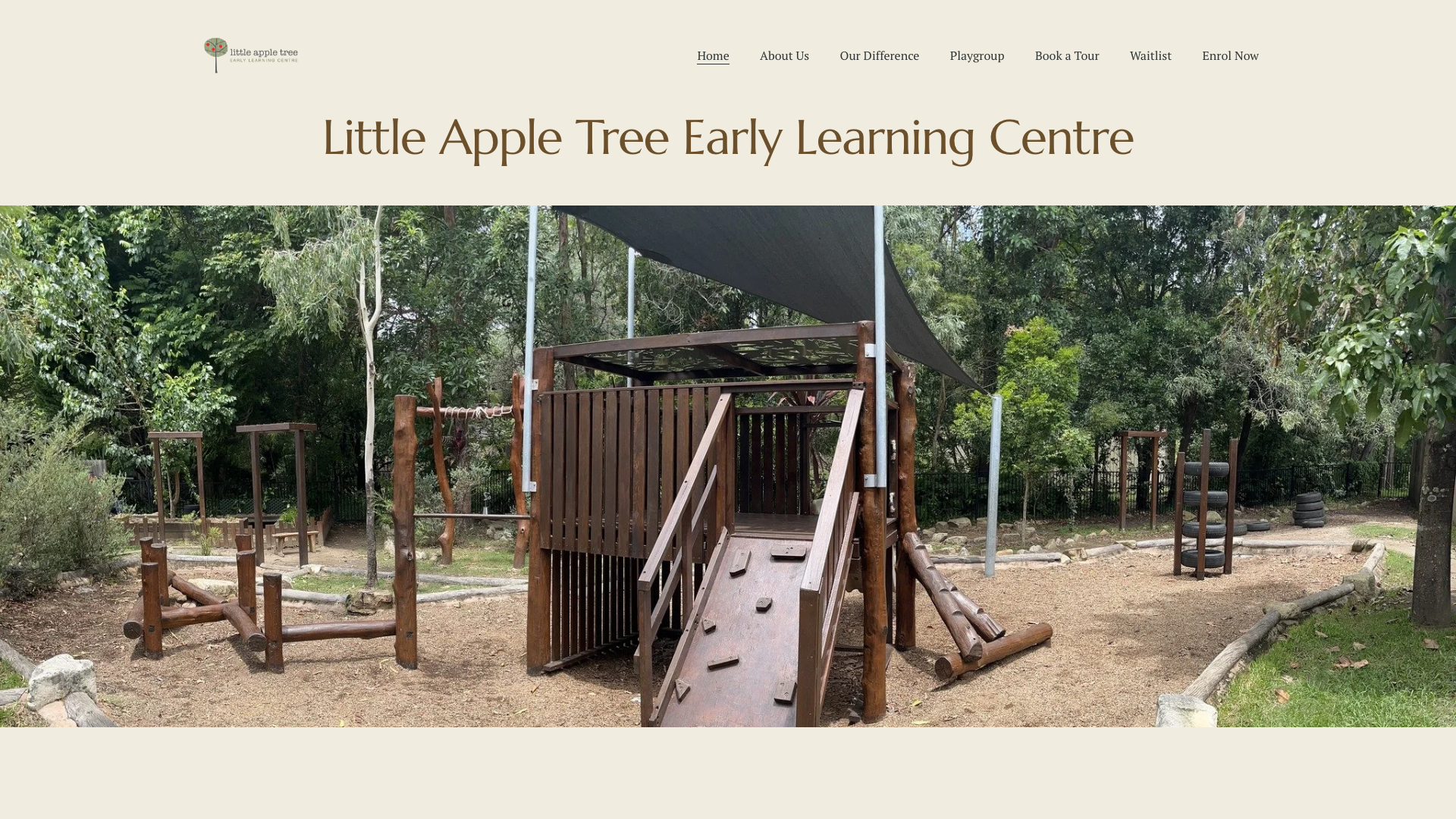
Little Apple Tree leads with a full-width nature photograph and the tagline “Growing Curious Minds, Nurturing Strong Hearts.” Earthy palette with soft greens, natural wood tones, and white. Minimal navigation includes “Book a Tour,” “Enrol Now,” and “Waitlist” buttons. Grid layout with generous whitespace gives it a calm, unhurried feel.
Full-width photographs show the bush playground, gardening and water play. Those scenes demonstrate the outdoor curriculum described in the copy. The narrow focus suits a single-centre Gold Coast childcare website because parents see the actual environment they would visit.
10. Brady Bunch Early Learning Centre Ballarat

Brady Bunch Early Learning keeps things clean with white and grey backgrounds and a bold green accent for buttons. The hero runs “LEARNERS TODAY… LEADERS Tomorrow” over an illustrative image. Elementor build with bold sans-serif headings and a structured sections grid. Parent testimonials with photographs add social proof.
The “belonging, being and becoming” section makes the learning approach scannable. Square photographs give each concept a visual reference, while the founders’ story explains how the group developed. A Ballarat childcare website can borrow that structure when its educational approach needs more than a short mission statement.
11. Sage Early Education Centre Sydney

Sage Early Education opens with a warm, pink-coral palette and the headline “The Best Childcare Centre In Sydney.” Decorative illustrations (stars, hearts, rainbows) add personality without looking childish. Prominent “Book A Tour” CTAs repeat throughout. Icons for security, meals, and daily schedules sit in a row below the hero.
Custom illustrations help organise the practical information. Icons for security, meals and daily schedules use the same visual treatment, so parents can scan those details quickly. That is a stronger takeaway for a Sydney childcare website than decoration for its own sake.
12. Evolution Early Learning Sunshine Coast

Evolution Early Learning is built on Webflow, which immediately sets it apart from the WordPress and Squarespace builds that dominate childcare. “Rainforest Green” primary colour with neutral backgrounds. The hero pairs “A Space to Play, Learn and Grow” with a family image and a secondary enrolment banner. Custom SVG icons for each program area.
Marquee movement and custom interactions add energy to the page. The effects are used around the program content rather than replacing it, and the two locations remain easy to identify. This Sunshine Coast childcare website shows how motion can support a design when the navigation stays clear.
13. The Little Unicorn Newcastle
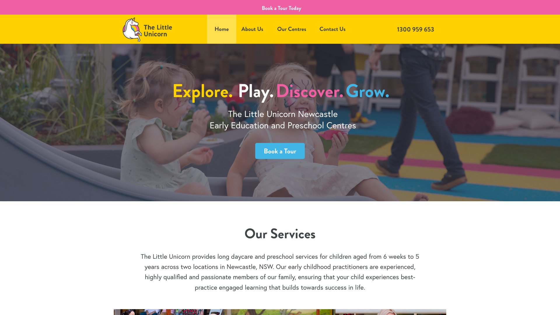
The Little Unicorn uses light blue as its primary accent on a white background. The homepage scrolls through high-quality images of children in learning activities, with motivational anchor words like “Grow,” “Discover,” “Play,” and “Explore” as large-format section dividers. Minimalist navigation with the phone number displayed prominently. Multiple “Book a Tour” CTAs.
Single-word section dividers create a distinct reading rhythm. “Grow”, “Discover”, “Play” and “Explore” introduce the longer content without adding another layer of navigation. For a two-location Newcastle childcare website, the device adds personality while the phone number and tour buttons handle the practical work.
14. Burnside Advanced Early Learning Centre Adelaide

Burnside AELC opens with a hero carousel rotating through three slides: “Sparking curiosity,” “Encouraging connections,” and “Inspiring creativity.” Each slide pairs with authentic photography of children rather than stock images. Navy and white palette with sticky navigation showing “Register Online” and “Book a tour” buttons plus the phone number.
The photography shows children in Burnside’s own rooms. It gives parents information about the environment that stock images could not provide. The Portrush Road address and tour action remain prominent, which is a practical pattern for a local Adelaide childcare website.
15. Gaia’s Nest Hobart

Gaia’s Nest leads with a forest green and warm cream palette, using a native bush photograph as the hero background with large italicised welcome text over the top. Two-column layout with serif and sans-serif font combinations. Horizontal navigation with social media icons and a clear enrolment CTA. Aboriginal acknowledgment messaging in the footer.
The bush photography as a hero image immediately tells you what this centre is about. Set in native bush in Mornington, Tasmania, Gaia’s Nest draws on Steiner and Montessori principles, and the restrained, organic design reflects that. No flashy animations or bright colours, just calm, natural imagery and considered typography. A thoughtful example for any Hobart childcare website.
16. Village Early Education Bendigo

Village Early Education runs a teal and neutral palette on white backgrounds. Card-based modular layout shows learning programs by age group. Sticky navigation with “Why Choose Us,” “Locations,” “Learning Journey,” and “Knowledge Hub” sections. Prominent “Enquire Now” CTA throughout. Professional photography of educators and facilities.
The tour booking tool lets parents choose a time directly. The “Learning Journey” section also separates four age-based programs into comparable cards. Together, those features give a multi-location Bendigo childcare website a clear path from research to a centre visit.
What should an early childhood program website include?
An early childhood program website should explain what children experience at each age and give parents enough detail to decide whether the centre suits their family. The strongest examples connect that information to real rooms, educators and daily routines.
- Programs grouped by age or stage, with plain-English descriptions
- The centre’s learning philosophy shown through specific activities and spaces
- Practical information such as opening hours, location, meals and enrolment steps
- A clear path to book a tour, join a waitlist or ask a question
Brady Bunch makes its learning framework easy to scan, while Little Assets connects its Reggio Emilia approach to photographs of the environment. Those examples work because the program is visible in the design rather than confined to a vague mission statement.
What makes daycare website design effective?
Effective daycare website design helps a parent understand the service and take the next step without hunting through the site. In Australia, centres usually use “childcare” or “early learning” in their copy, but the design job is the same: show the place, explain the program and make enquiries simple.
A bright palette or playful illustration can support that job, but decoration alone is not enough. Little Apple Tree works because its photography demonstrates outdoor learning, and Village Early Education pairs its program information with a direct tour-booking path.
What does childcare website development involve?
Childcare website development turns the centre’s information and visual identity into a fast, accessible site that staff can keep accurate. The work extends beyond the homepage design.
- Map the pages and decide what parents need before they enquire.
- Plan the photography, copy and program information around those decisions.
- Build and test the site across common phone and desktop screen sizes.
- Connect forms, tour bookings or waitlist tools and check that enquiries reach the right person.
Our website design services for Australian businesses cover that planning, build and launch process.
What makes a good childcare website?
Across these 16 examples, the same practical choices keep appearing. They help a parent understand the centre before deciding whether to enquire.
- Real photography of your centre. Stock images of smiling children in a studio do nothing for trust. Parents want to see your actual rooms, your outdoor area, and ideally your educators. Every strong site on this list uses genuine photos.
- A visible booking or tour CTA. Most centres in this review guide parents towards a tour, enrolment or waitlist form. The action stays visible instead of appearing only at the bottom of the page.
- A colour palette that matches your philosophy. Nature-based centres using earthy greens and creams. Boutique centres using soft pinks and custom illustrations. The design should reflect what walking into your centre actually feels like.
- A layout that works on a phone. Program details, locations and enquiry buttons should remain easy to find on a small screen.
- A clear point of difference. Whether it is a Reggio Emilia approach, a bush setting, architecturally designed spaces, or a family story, the best sites lead with what makes them different rather than listing the same features every centre offers.
A centre does not need every feature on this list. It does need a few well-executed choices that fit the way its families compare care options.
Childcare website design FAQs
Should a childcare website use real photos or stock images?
Use photographs taken inside the actual centre wherever consent and privacy requirements allow. Parents are trying to understand the rooms, outdoor areas and people they may visit, which stock images cannot show.
What is the most important call to action?
For many centres, it is “Book a tour”, “Join the waitlist” or “Enquire”. Choose the action that matches the centre’s real enrolment process and keep its wording consistent across the site.
What information belongs on the homepage?
The homepage should quickly identify the centre, location, age groups, learning approach and next step. Detailed policies can sit on their own pages, provided they are easy to reach.
How should multiple childcare locations be presented?
Give each location its own page with the address, contact details, programs, local photographs and enquiry option. Little Miracles and Village Early Education show how cards can help parents compare locations before opening the detail page.
How often should a childcare website be updated?
Update the site whenever programs, hours, staff details, vacancies or enrolment steps change. A regular content check also catches broken forms and old photographs before families encounter them.
Need a childcare website?
If your centre’s website no longer represents the experience families receive in person, it can make the first enquiry harder than it needs to be.
We build custom childcare websites with clear program information and practical enquiry paths. See our childcare website design service or review our website design pricing to get started.
Want to discuss a childcare website for your centre? Contact KC Web Design about your project.