
We reviewed tourism websites across every major Australian city and picked the 16 that do it best. If you want a site like these for your business, see our tourism website design service or check pricing.
Tourism websites have one job that most business websites do not: they need to sell an experience before the visitor has had it. A physio or a plumber can describe a service. A tour operator has to make someone feel something. The photography, the layout, the booking flow, all of it needs to answer the question “will this be worth my time and money?” before anyone hands over a credit card.
The best Australian tourism websites understand this. They lead with visuals, make booking frictionless, and show enough social proof that hesitant visitors feel confident clicking “Book Now.” They also know their audience: someone planning a weekend trip searches differently from someone booking a corporate team event, and the site needs to serve both without confusing either.
We looked at tourism websites across Australia, from whale watching operators to ghost tours to wine trail experiences, and picked 16 that stand out. Here is what each one does well.
Best Tourism Website Design Examples in Australia
1. Eerie Tours Ballarat
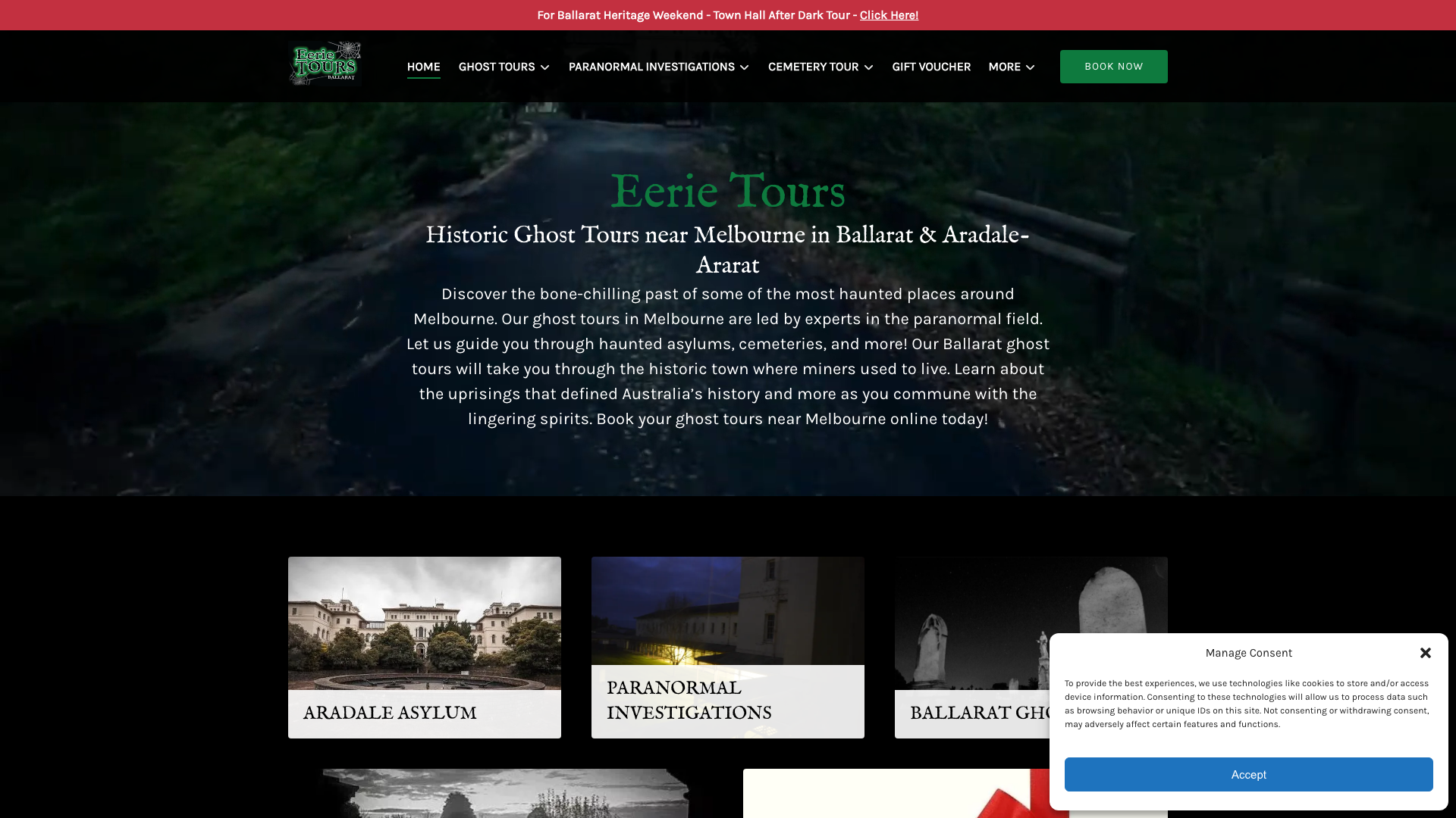
Eerie Tours commits fully to a dark, atmospheric palette with black backgrounds and a primary red accent. The hero runs a video background with a headline about historic ghost tours. Sticky header with dropdown navigation for tours, paranormal investigations, and cemetery experiences. White text for contrast throughout.
The full video background hero sets the moody tone immediately. The dark theme is perfectly on-brand for ghost tours, and the site commits to it throughout rather than defaulting to a generic tourism template. When your product is atmosphere, your website needs to deliver it before the visitor even arrives. Proof that a Ballarat tourism website can go all-in on a niche.
2. Sea Darwin Darwin
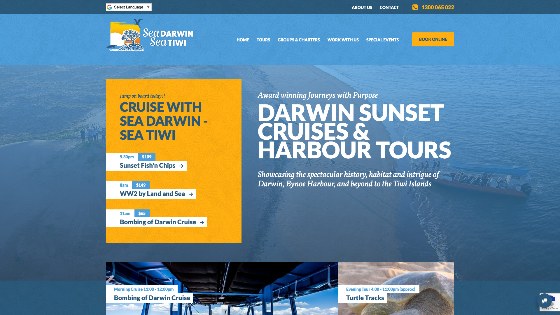
Sea Darwin uses a maritime palette of dark navy, lighter blue, and golden yellow with a full-width hero showing the Darwin waterfront and gradient overlay. “Award winning Journeys with Purpose” as the heading. Grid-based tour cards with pricing. Sticky floating booking button throughout.
The eco-tourism and Indigenous ownership certifications displayed prominently are the standout. Advanced Eco Certification, Tiwi ownership, and Respecting Our Culture accreditation all sit front and centre, alongside 300+ Facebook and 600+ TripAdvisor review counts. In a market where sustainability claims are cheap, third-party badges carry weight. A strong model for any Darwin tourism website.
3. CoastXP Newcastle
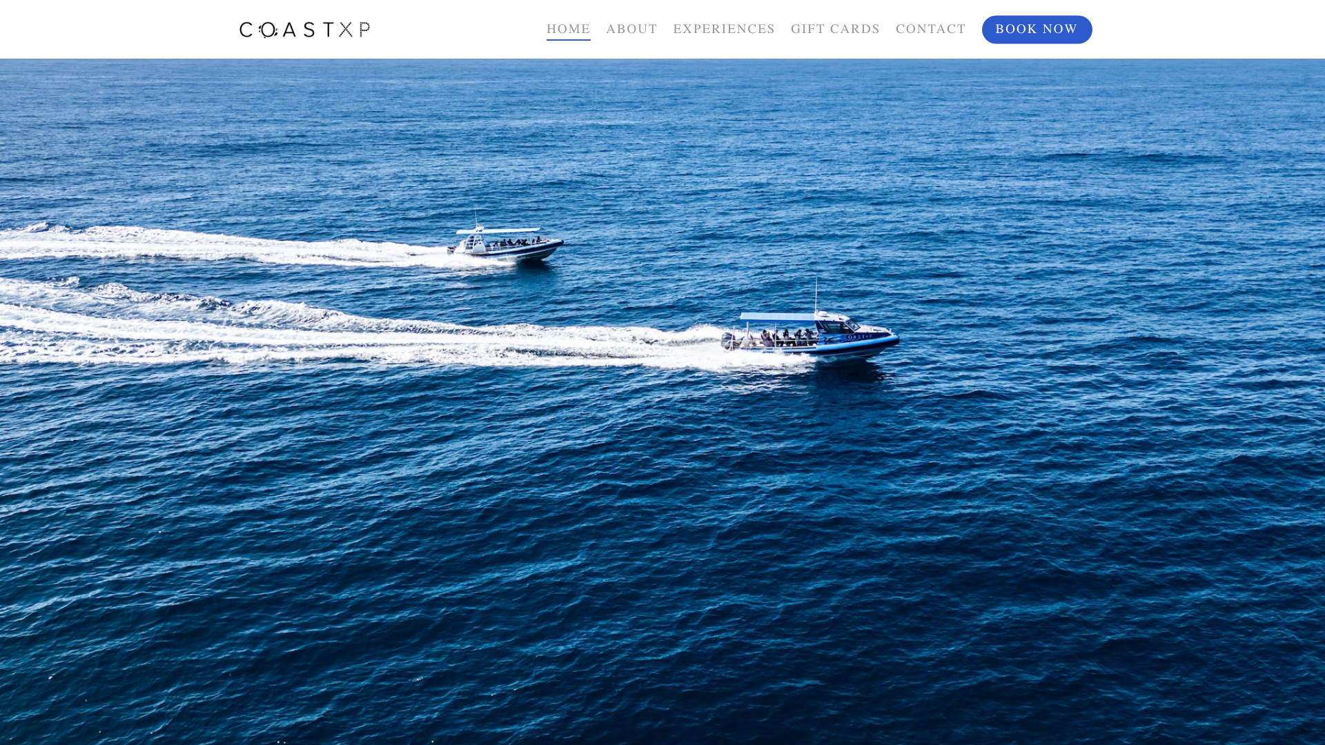
CoastXP opens with a full-width carousel showing their custom-built vessel “Atmos” with bold headlines about adventure boat tours and whale watching. Navy blue accents on white. Quicksand font family. Two CTAs immediately: “Depart from Newcastle” or “Depart from Lake Mac.”
The dual departure location CTAs in the hero make the booking decision immediately clear. Instagram feed integration and embedded video testimonials add social proof without cluttering the layout. NSW EcoPass certification badge displayed prominently. That kind of specificity in the first scroll is what converts browsers into bookers on a Newcastle tourism website.
4. Whales in Paradise Gold Coast
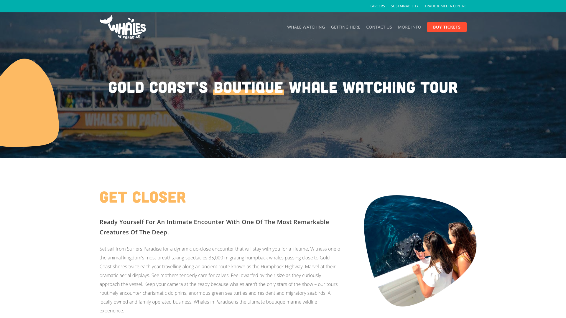
Whales in Paradise uses deep ocean blues and white accented by coral-orange CTAs. Hero tagline “Get closer” with copy about humpback whale encounters. Full-width sections with sticky header navigation. High-quality wildlife photography throughout the site.
The 100% Whale Sighting Guarantee featured prominently is a bold trust-builder. Feature icons highlight unique selling points: guaranteed railside viewing, expert commentary, onboard bar. When your tour offers something other operators do not guarantee, leading with that promise is exactly the right move for a Gold Coast tourism website.
5. Localing Tours Melbourne
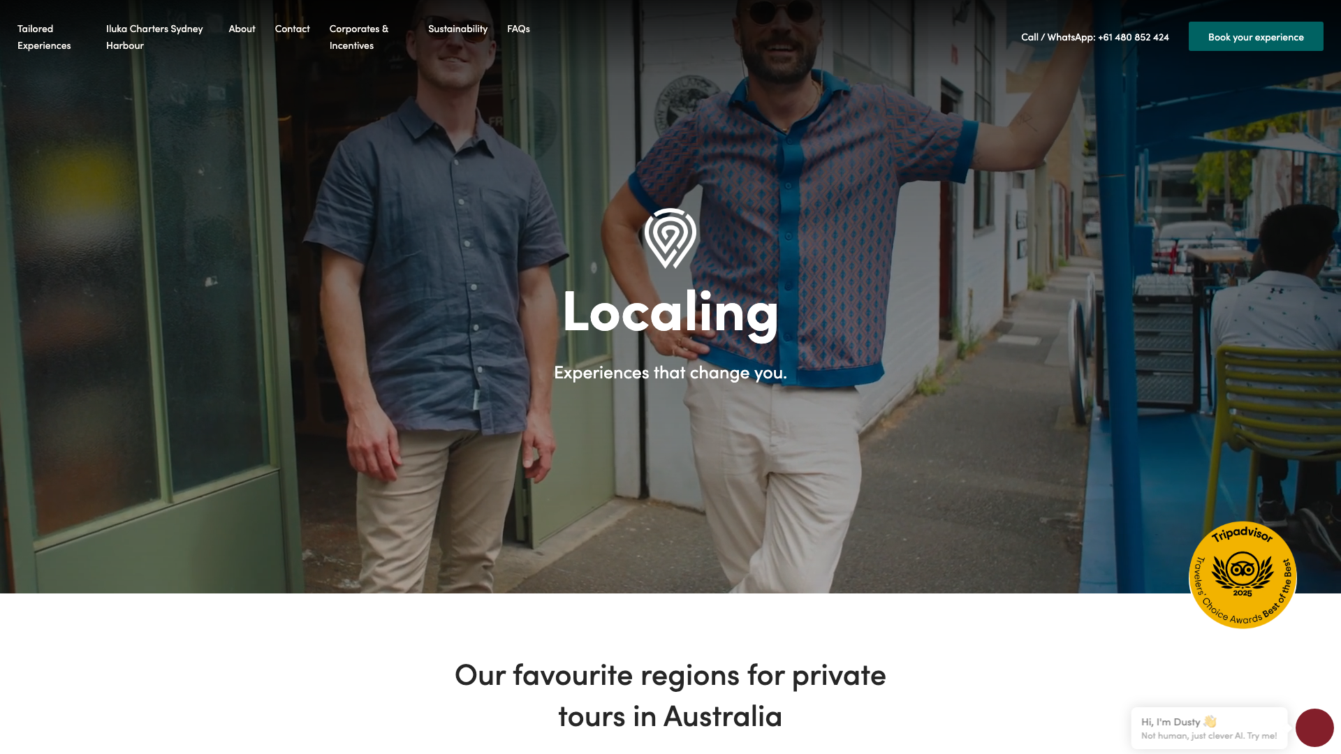
Localing Tours runs a sophisticated palette of white, black, and pale pink with cyan blue accents. The hero shows Melbourne imagery with “Experiences that change you.” Grid-based region cards organise destinations (Melbourne, Tasmania, Sydney). Sticky header with phone and WhatsApp contact.
The region-based navigation with descriptive subtitles on each card lets users browse by destination or trip style rather than scrolling a generic tour list. That UX decision makes the site feel curated rather than catalogue-like. Multi-day tours, urban experiences, and masterclasses all have their own pathways. A sophisticated approach for any Melbourne tourism website.
6. Illawarra Fly Treetop Adventures Wollongong
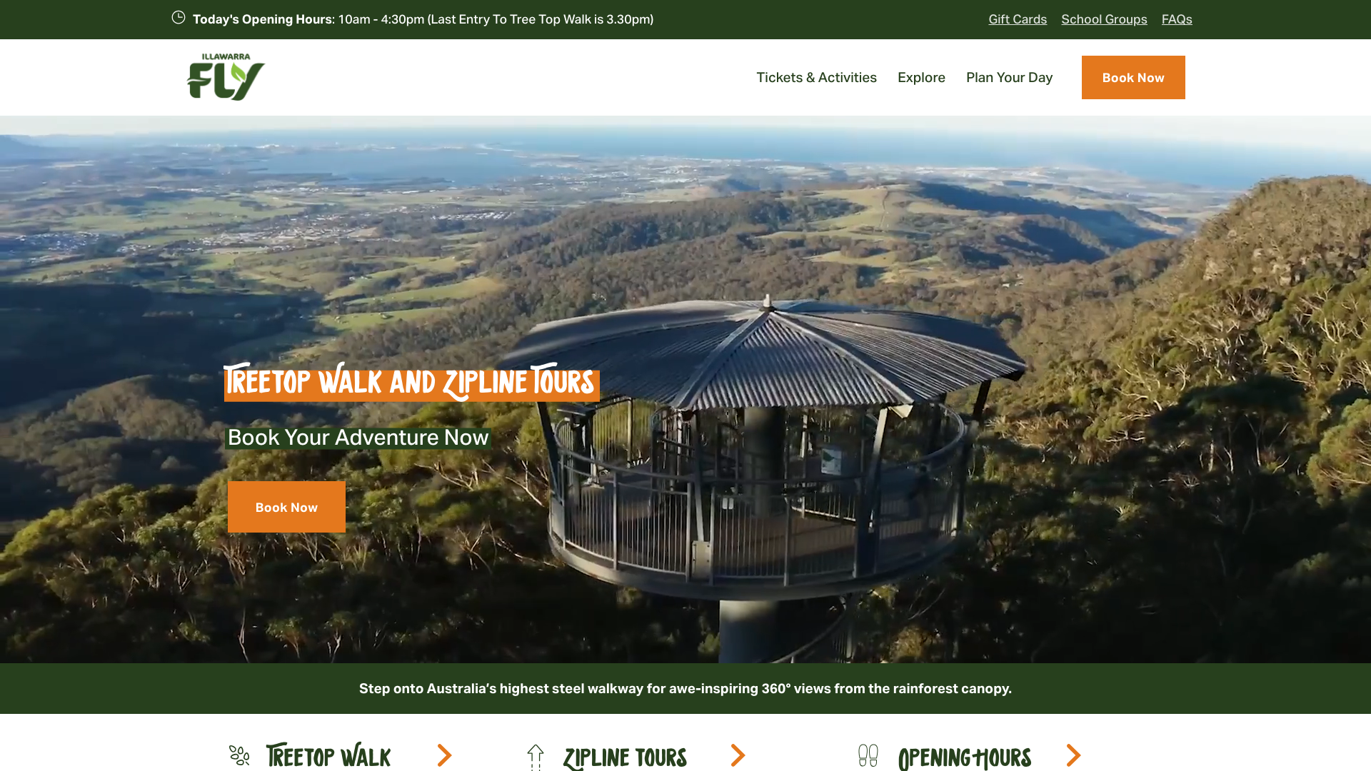
Illawarra Fly opens with a dramatic aerial shot of the elevated steel walkway suspended above rainforest canopy. “Treetop Walk and Zipline Tours” with a subheading about Australia’s highest steel walkway. Earthy, natural tones. Fixed header with “Tickets & Activities,” “Explore,” and “Plan Your Day” navigation plus a persistent “Book Now” button.
The hero image does all the selling. A single photograph of visitors on the elevated walkway above dense rainforest communicates the experience more effectively than any paragraph of copy could. Clean separation between the Treetop Walk and Zipline offerings lets visitors self-select. When your product is visual, let the visuals lead. One of the stronger Wollongong tourism websites we found.
7. TrailHopper Adelaide
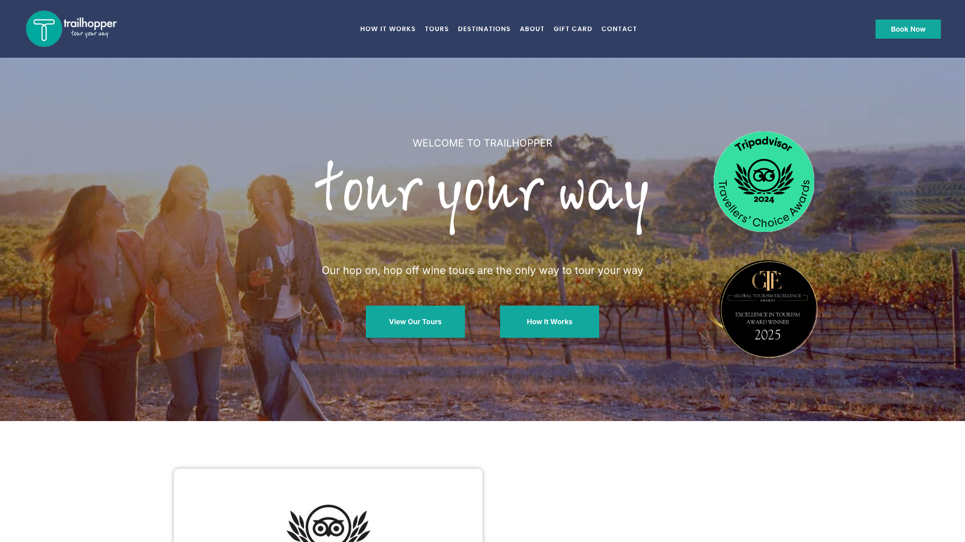
TrailHopper uses a modern teal accent palette against dark navy backgrounds. Poppins headings with Inter body text. Clean, professional design built around their hop-on, hop-off wine tour concept for McLaren Vale and the Barossa Valley. Responsive layout with CSS Grid.
The hop-on, hop-off concept reflected in the site UX is the standout. The design centres on flexible itinerary building rather than presenting a rigid schedule. Visitors can see the route, the stops, and plan their own day. That mirrors the real-world product, which is exactly what a tourism website should do. A good model for any Adelaide tourism website.
8. Terrigal Ocean Tours Central Coast
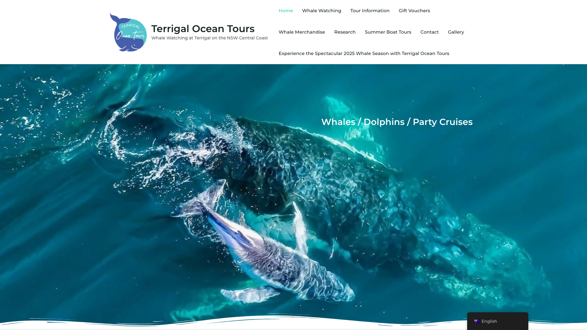
Terrigal Ocean Tours runs a coastal teal palette with off-white backgrounds and dark charcoal text. Centred logo with clean Montserrat typography. Rounded pill-style CTA buttons. Family-oriented hero imagery. Built on Astra theme with a breathable, upscale design.
The teal colour palette that mirrors the ocean is a simple choice that works. Rounded pill-shaped buttons and generous spacing create a premium, relaxed feel that matches the coastal experience they are selling. Sometimes the best design decision is matching your environment. Clean and effective for any Central Coast tourism website.
9. Your Sydney Guide Sydney
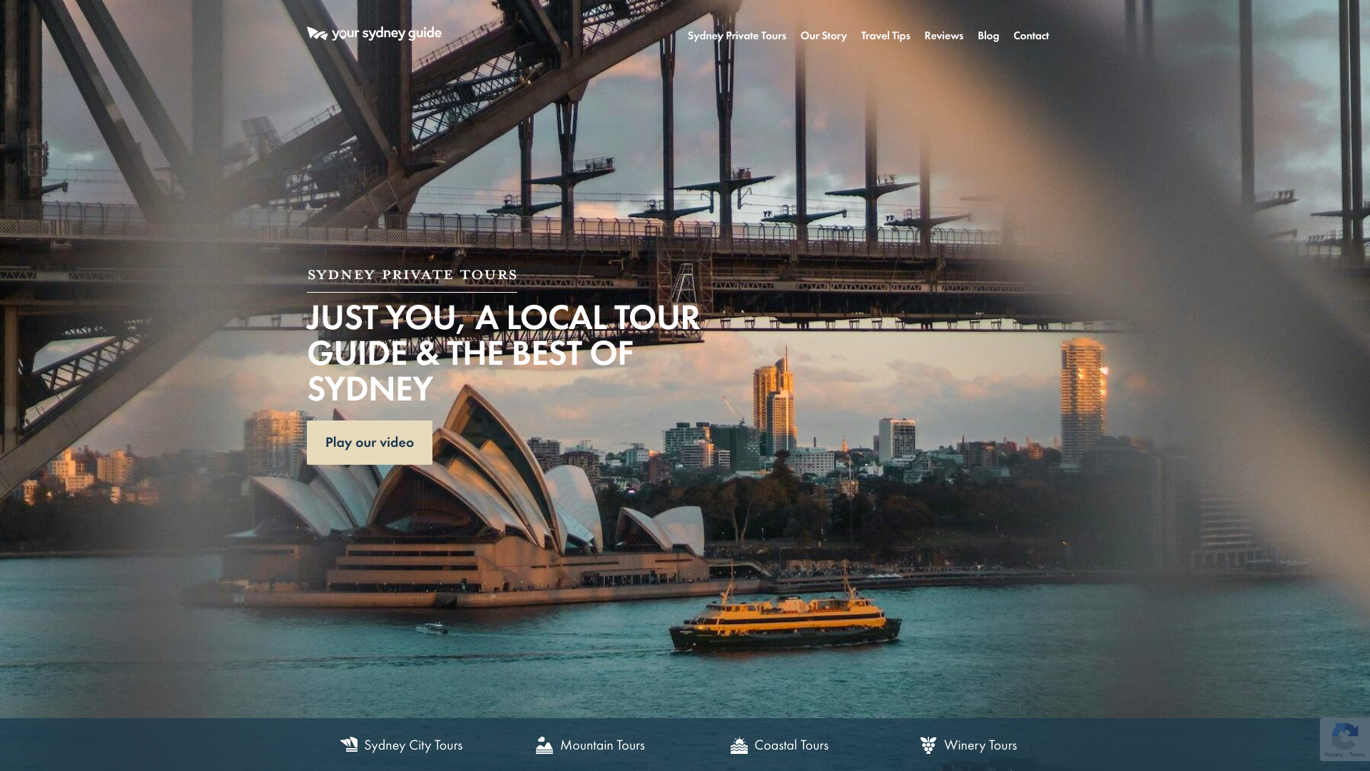
Your Sydney Guide keeps things clean with white backgrounds and navy blue accents. The hero features a large image of a tour guide with “Sydney Private Tours” and an embedded video player. Multiple “Book Now” CTAs throughout. Generous whitespace and a responsive layout.
The TripAdvisor 5.0 rating badge with 440+ reviews displayed near the hero creates immediate trust. Instagram feed integration showing real guest experiences backs that up. When you have that level of social proof, putting it front and centre is the smartest design decision you can make. A focused approach for any Sydney tourism website.
10. Visit Geelong and The Bellarine Geelong
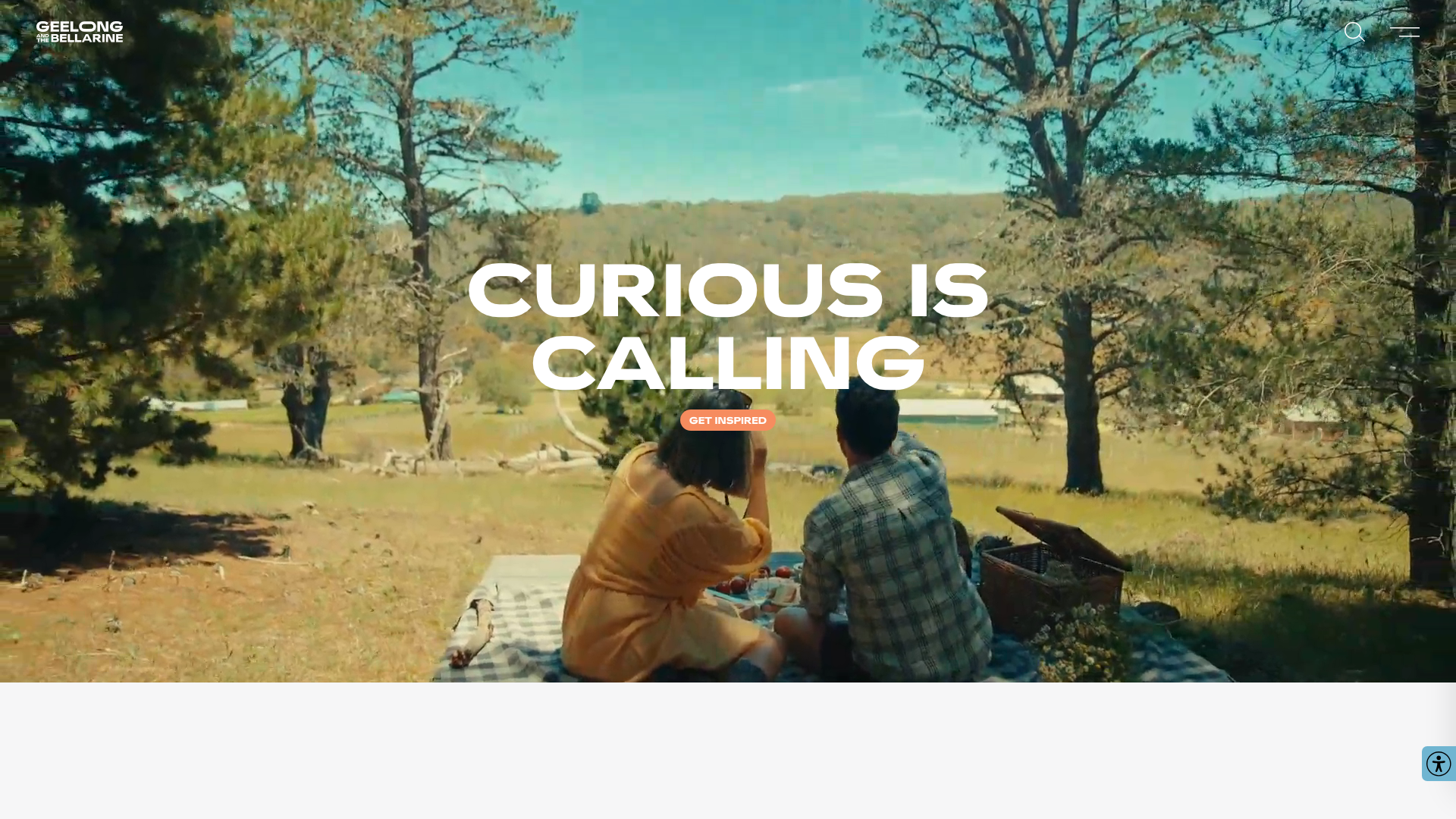
Visit Geelong and The Bellarine uses a sophisticated neutral palette with white backgrounds, dark text, and high-quality lifestyle photography. The hero features a space photo with “Curious is Calling.” Content is organised into themed sections: Highlights, Things to Do, Eat & Drink, Makers & Growers.
The copywriting tone is the standout here. “Geelong and The Bellarine doesn’t shout. It doesn’t have to.” That understated, editorial approach sets it apart from tourism sites that oversell with exclamation marks and superlatives. The design matches the tone: calm, confident, and visually rich. A different approach for a Geelong tourism website.
11. Oh Hey WA Perth
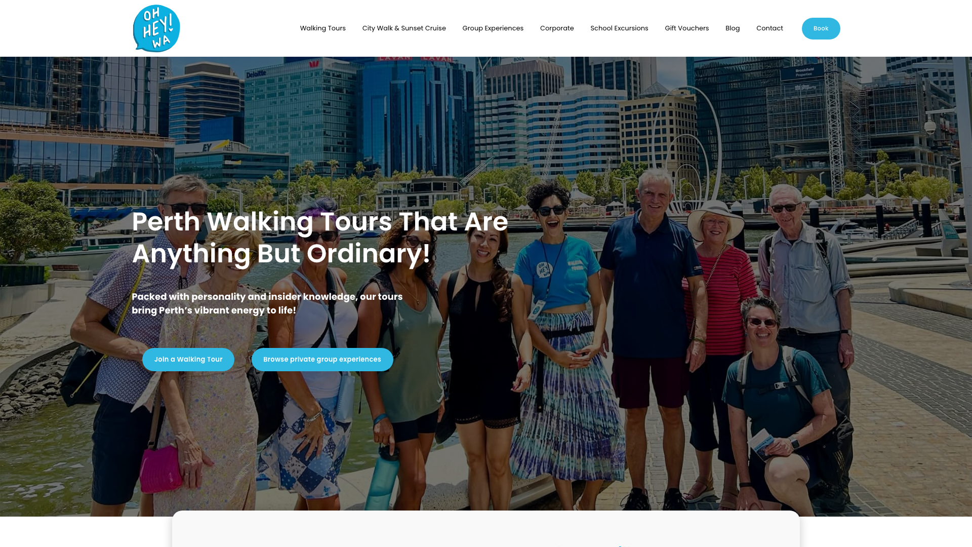
Oh Hey WA leads with a full-width group tour photo and “Perth Walking Tours That Are Anything But Ordinary!” Clean minimalist palette with dark text on light backgrounds. Grid layout with generous whitespace. Fixed header with multi-level navigation for walking tours, group experiences, and corporate packages.
The media credibility logos (National Geographic, Sydney Morning Herald) displayed alongside guest testimonials add a level of social proof that reviews alone cannot match. QTAB and sustainability certifications in the footer round out the trust signals. When a publication that big has featured you, showing it is worth more than any design trend. A credibility-first approach for any Perth tourism website.
12. Experience Tasmania Hobart
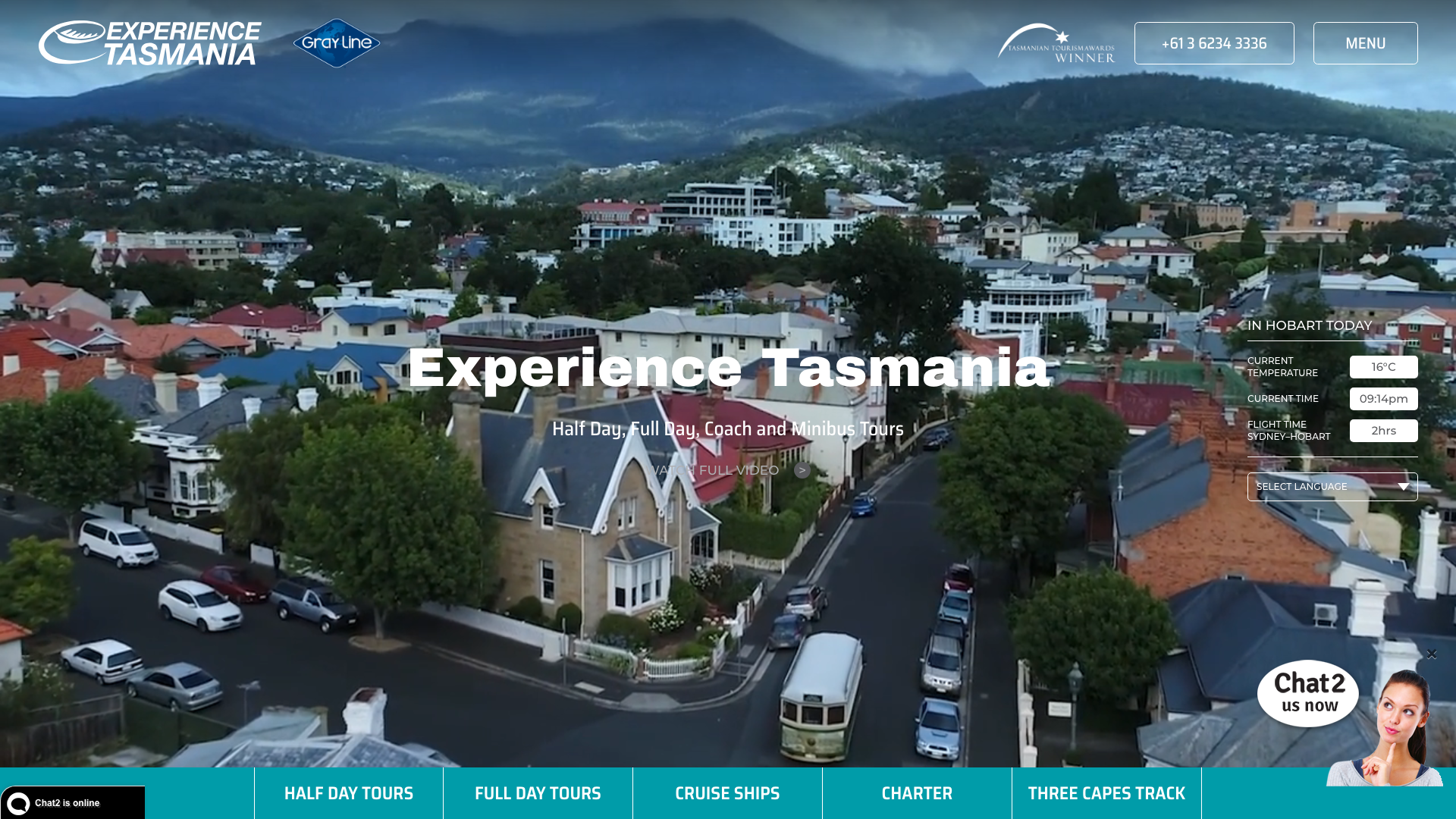
Experience Tasmania opens with a full-width video background hero and “Half Day, Full Day, Coach and Minibus Tours” subheading. Professional blue accents on white with charcoal text. Card-based tour listings with consistent image styling and “Times & Bookings” CTAs.
The real-time weather widget showing current Hobart temperature, time, and Sydney-to-Hobart flight duration in the hero section is a practical, dynamic touch. It makes the destination feel immediate rather than abstract. Small details like this show a tourism operator who thinks about the visitor journey before they even arrive. Clever thinking for any Hobart tourism website.
13. Riverlife Adventure Centre Brisbane
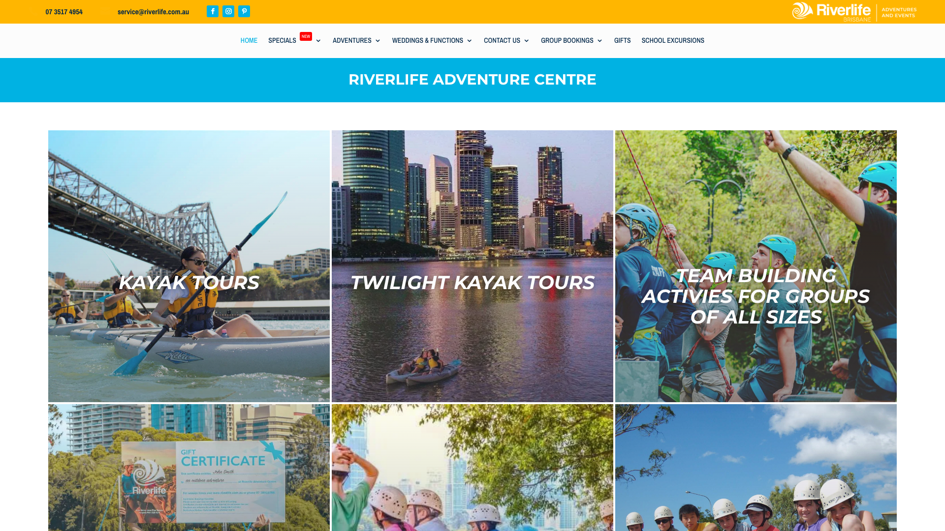
Riverlife focuses on outdoor adventure at Brisbane’s Kangaroo Point. Kayaking, rock climbing, abseiling. Multiple booking forms integrated throughout. Montserrat and Archivo Narrow typography. 15+ years of operation and positioned as Brisbane’s one-stop adventure hub.
The range of day and night experiences centred on a single iconic location is the differentiator. Twilight kayak with wine and a grazing board sits next to rock climbing and abseiling. That variety from one venue gives visitors options without overwhelming them. The site organises it all clearly. A good example for any Brisbane tourism website.
14. Coast to Hinterland Tours Sunshine Coast
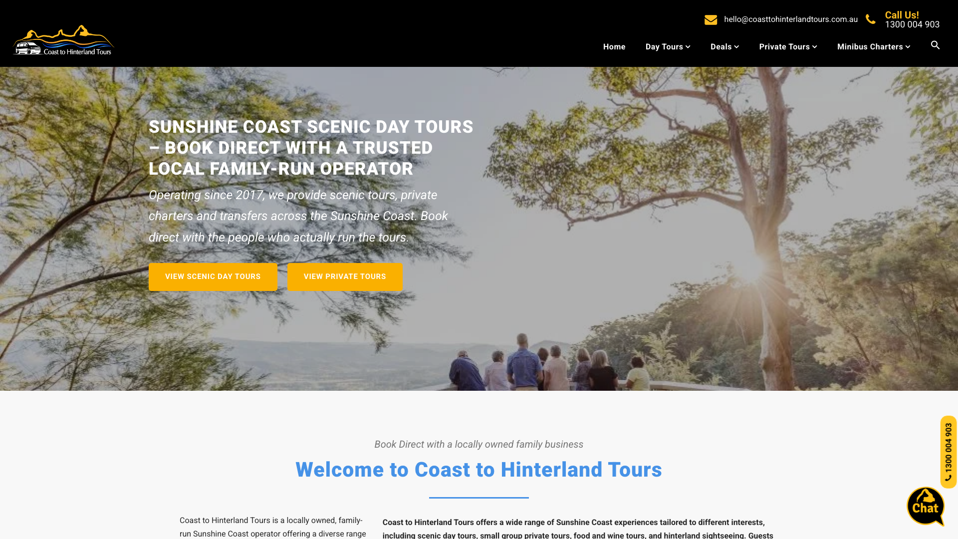
Coast to Hinterland Tours uses a full-width banner hero with hinterland imagery. bold gold CTAs against deep blue accents and black navigation. “Book Direct with a Trusted Local Family-Run Operator” in the headline. Multi-level dropdown navigation by tour type.
The community-focused section displaying supported local charities alongside a 4.9/5 Google rating with 516+ reviews creates strong local trust signals. The “family-run operator” positioning in the headline itself is a deliberate play against larger corporate tour companies. That transparency converts. A locally rooted approach for any Sunshine Coast tourism website.
15. Canberra Guided Tours Canberra
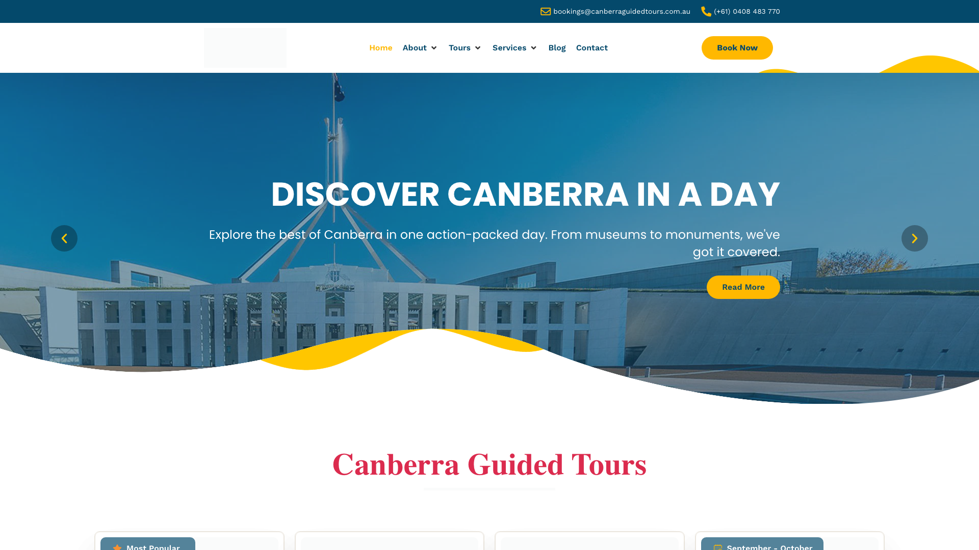
Canberra Guided Tours runs an image carousel hero with multiple Canberra attraction backgrounds. Deep blue, magenta, and bright yellow CTAs. Card-based layout with decorative wave and shape dividers between sections. Oleo Script headings with Work Sans body text.
The decorative wave dividers and shape elements between sections give the site visual personality that flat-coloured sections cannot. Star ratings and inclusion icons on tour cards make comparison easy at a glance. The playful typography with Oleo Script headings adds warmth without sacrificing readability. A colourful approach for any Canberra tourism website.
16. Bendigo Guided Tours Bendigo
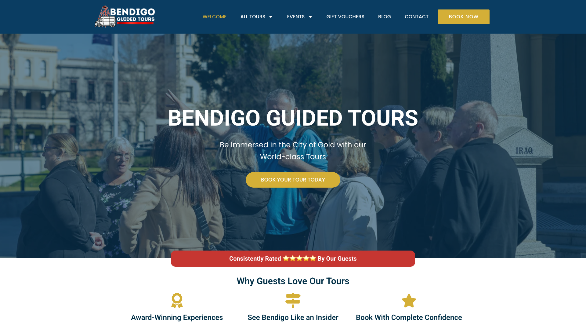
Bendigo Guided Tours uses a deep teal primary colour with light blue-grey backgrounds and dark slate text. “Things to do in Bendigo” as the hero caption. Modern modular layout with fixed header and responsive grid. Won GOLD at the 2025 Australian Tourism Awards for Best New Tourism Business.
The performance-optimised build with lazy loading and rich schema markup shows someone thinking about search visibility as much as visual design. The teal-and-slate palette feels premium and editorial. A Gold award from the Australian Tourism Awards is the kind of credential that belongs front and centre. Clean and authoritative for any Bendigo tourism website.
What Makes a Good Tourism Website?
Across all 16 examples, these patterns separate the tourism sites that fill bookings from the ones that get browsed and forgotten.
- Hero imagery that sells the experience. Video backgrounds, dramatic space photos, or action shots of guests on the tour. The hero should answer “what will this feel like?” not just “what do you offer?”
- Booking with zero friction. The best sites put booking CTAs in the header, the hero, and on every tour card. If someone has to navigate to a separate page, fill out a contact form, and wait for a reply, you are losing bookings to the operator with an instant checkout.
- Social proof above the fold. TripAdvisor badges, Google ratings, media logos, certification badges. Tourism is a trust business. People are handing over money for something they have not experienced yet. Third-party proof reduces that hesitation.
- Organised tour options. Card-based layouts with clear pricing, duration, and included features. Let visitors compare and self-select. A wall of text describing every tour in sequence does not work on mobile.
- Local identity. The strongest sites on this list feel like they belong to their city. Teal for coastal operators, earthy tones for hinterland tours, dark moody palettes for ghost experiences. Generic tourism templates do not convert as well as a site that reflects its destination.
If your tourism website is not converting the traffic it gets, one of these five areas is likely the problem.
Need a Tourism Website?
If your website does not match the quality of the experience you offer, you are losing bookings to operators with better sites. Visitors decide within seconds whether your tour looks worth it, and a dated or generic site sends the wrong message.
We build tourism websites that look like the examples on this list. striking visuals, smooth booking integration, and a design that sells the experience. See our tourism website design service or view pricing to get started.
Looking for a tourism website that fills your bookings? Talk to us about tourism website design.