
The best restaurant websites make menus, bookings and location details easy to find on a phone.
We reviewed 16 Australian restaurant websites and judged how well each one handles the jobs diners arrive to do. We looked at menu access, booking flow, mobile layout and whether the design feels like the venue it represents.
We have assessed how each design supports real diner decisions. For every example, we have picked the strongest idea to borrow and, where useful, the trade-off we would question on a client project.
How we assess restaurant web design
Good restaurant web design removes doubt before it tries to impress. These checks come from our practical process for auditing a business website, adapted for the way diners choose a venue.
- Can a diner open the menu without hunting through the navigation?
- Is the booking action obvious and does the hand-off feel trustworthy?
- Do the page layout, menu and booking controls remain usable on a small screen?
- Does the visual direction set an honest expectation of the venue?
The examples below reflect the versions we reviewed. Restaurant menus, booking tools and website features can change after publication.
Best restaurant website design examples in Australia
1. Saint Peter, Sydney
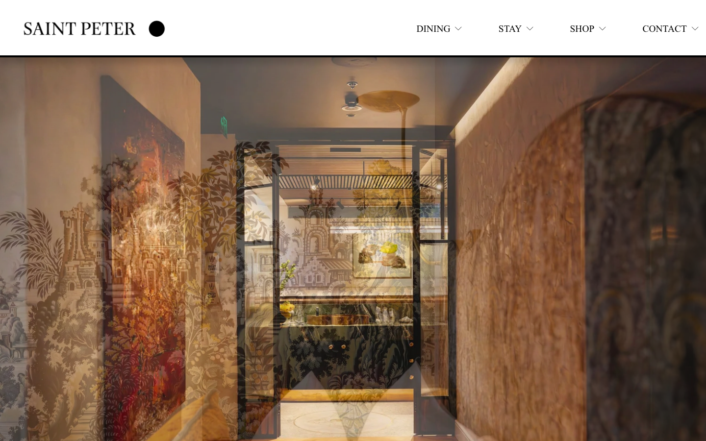
Saint Peter uses monochrome styling and editorial serif type across dining, accommodation, a bar and events. Clear navigation and an embedded booking option keep those offers manageable. That structure is what makes it a strong Sydney restaurant website example.
2. Attica, Melbourne
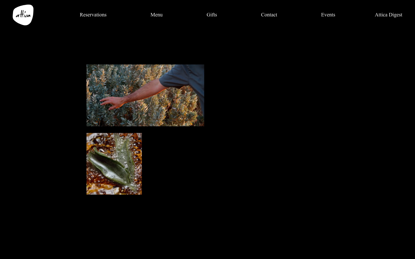
Attica treats its food photography as part of the visual system, pairing carefully staged dishes with burnt orange, green and gold sections. The site feels authored. Its strongest idea is the consistency between photography and page colour; the dark palette works because it suits Attica’s established character. That discipline between imagery and palette is what lifts a Melbourne restaurant website above a template.
3. Restaurant Dan Arnold, Brisbane
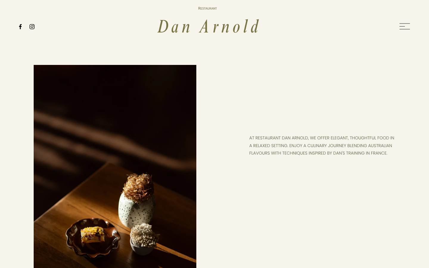
Restaurant Dan Arnold pairs a dark olive background with restrained white type and full-width photography. The responsive grid rearranges the composition for mobile without flattening the atmosphere. Booking, events and vouchers still feel like parts of one coherent Brisbane restaurant website.
4. Arkhe, Adelaide
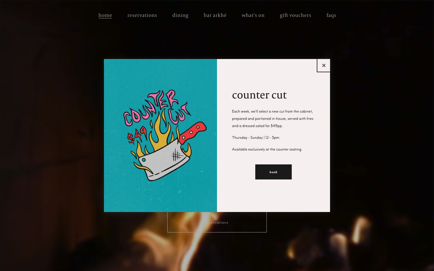
Arkhe keeps the navigation short and lets photography carry the visual weight. Reservations remain easy to reach without competing with every other option. Strong venue imagery and a clear booking path establish the experience without elaborate animation. Restraint like that is often the right call for an Adelaide restaurant website where the room is the drawcard.
5. Wildflower, Perth
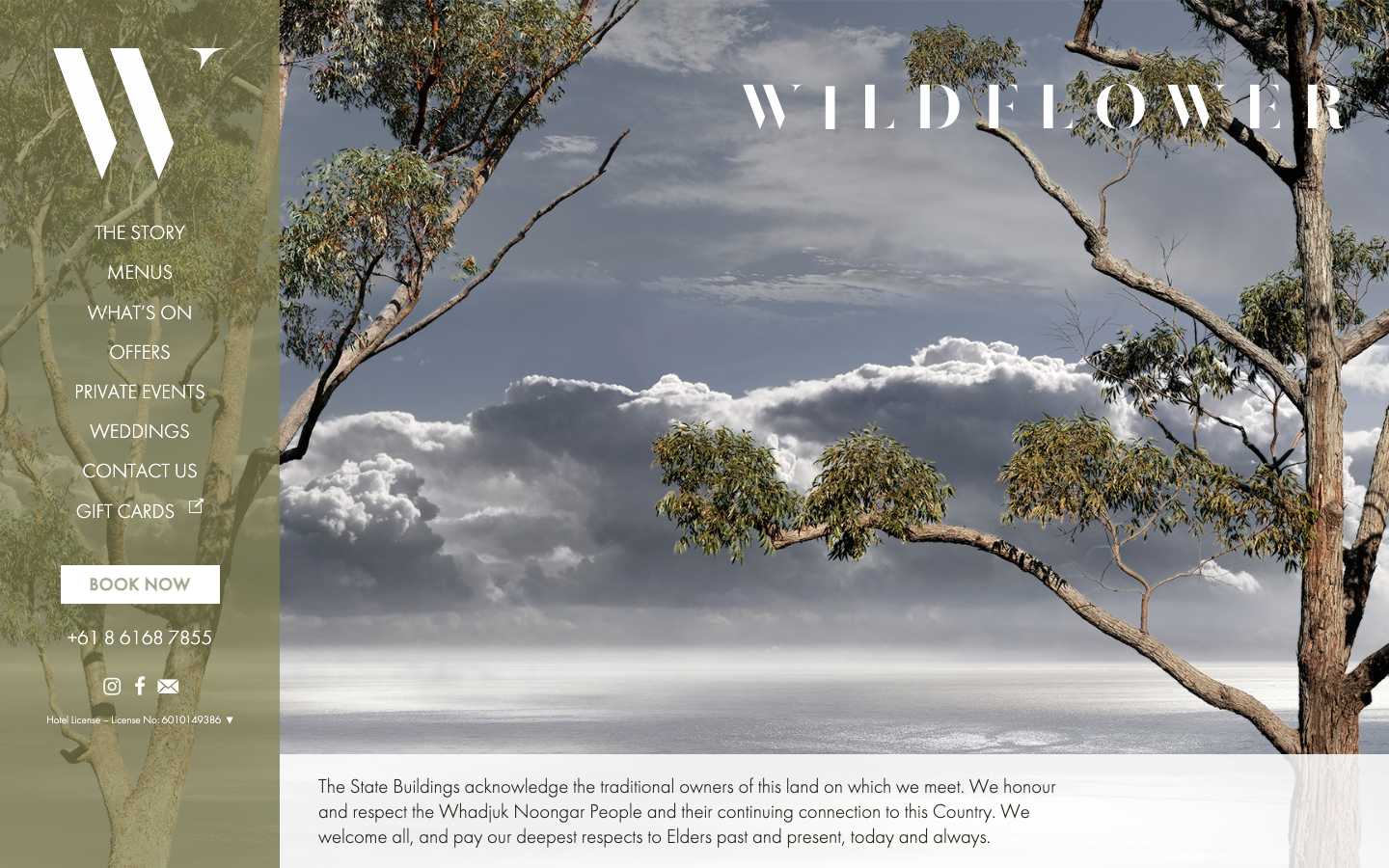
Wildflower has to distinguish restaurant reservations from accommodation enquiries inside a hotel website. It handles that choice early, then uses focused overlays for bookings and enquiries. This is a good model for venues with several customer journeys: ask what the visitor wants before sending them into a third-party form. Sorting that decision early is worth planning for on any Perth restaurant website with more than one offer.
6. Restaurant Labart, Gold Coast
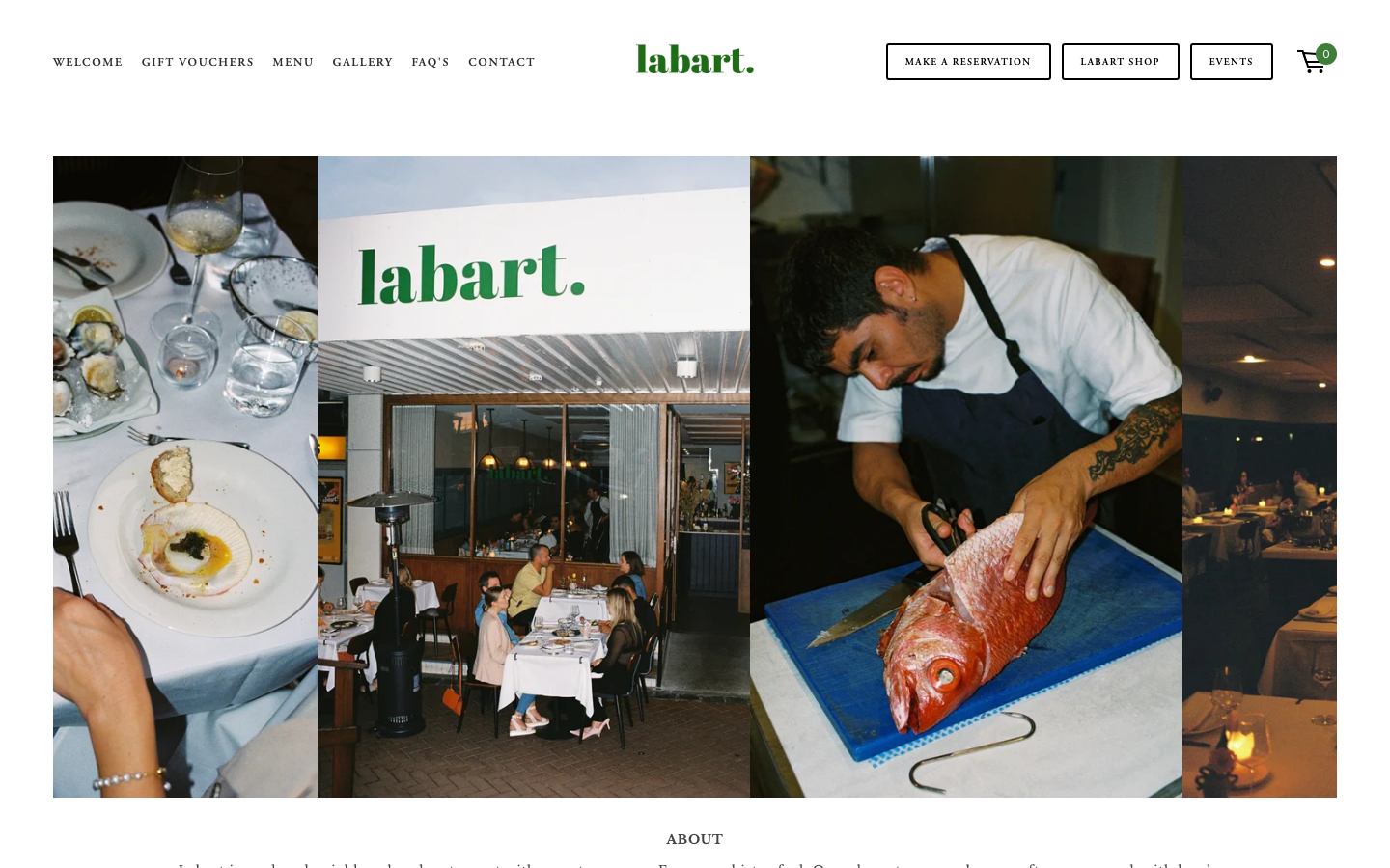
Restaurant Labart uses a neutral frame so the food and dining-room photography provides the colour. Reservations, events and gift vouchers are separated into obvious actions. The shop integration is tidy, although I would keep the booking action visually dominant because that is the main task for most visitors. That hierarchy is worth settling before anything else on a Gold Coast restaurant website.
7. Water’s Edge, Canberra
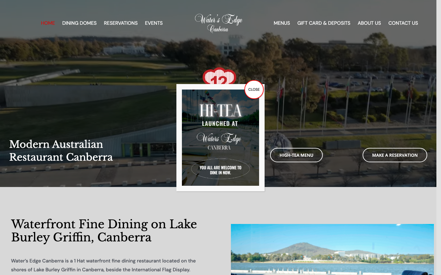
Water’s Edge gives reservations and events priority, then keeps menus and gift cards available in a second navigation row. Two rows can become busy, but here the grouping makes the hierarchy understandable. Essential visit information appears before the decorative content. Putting the practical details ahead of the decorative ones is a sound default for a Canberra restaurant website.
8. Templo, Hobart
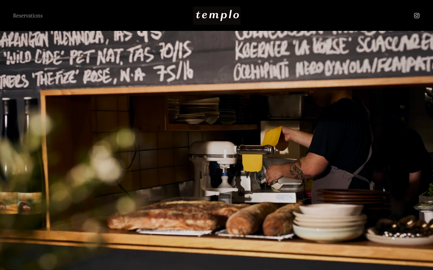
Templo introduces itself as a small neighbourhood restaurant and builds the page around that promise. The menu copy is brief because the offer is deliberately focused. I like the honesty: the site explains the style of dining before it asks for a booking, without padding the page with generic claims. Being straight about the offer earns more trust on a Hobart restaurant website than a longer page would.
9. Pee Wee’s at the Point, Darwin
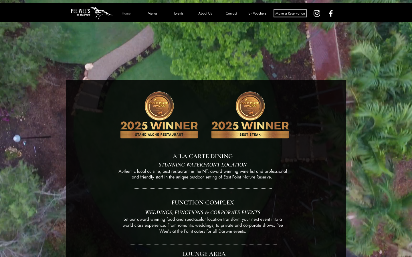
Pee Wee’s at the Point sells its waterfront setting before the food. Spacious layouts and venue photography make that a sensible choice because the location is part of the dining decision. The page leads with the venue’s strongest reason to visit and lets that choice shape the layout. When the setting is the reason people come, a Darwin restaurant website should lead with it exactly like this.
10. Spirit House, Sunshine Coast
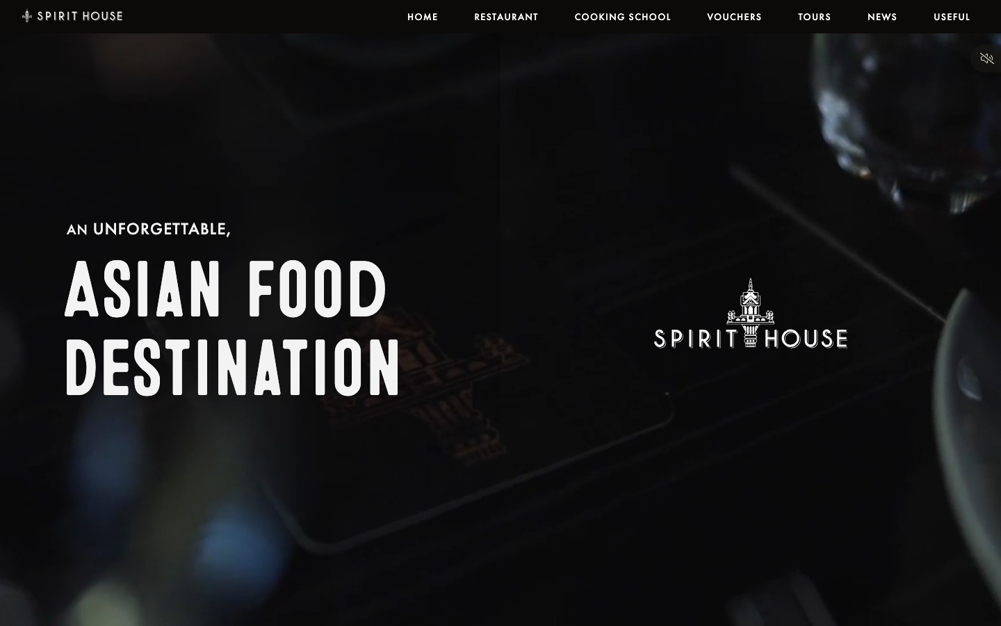
Spirit House has more to organise than a standard restaurant: dining, a cooking school, tours and a bar. Its modular homepage gives each offer a distinct image and booking path. The separation matters because a person booking a class should not have to work out whether the restaurant reservation form is the right place. Separating the booking paths matters once a Sunshine Coast restaurant website carries more than one business.
11. Yellowtail, Central Coast
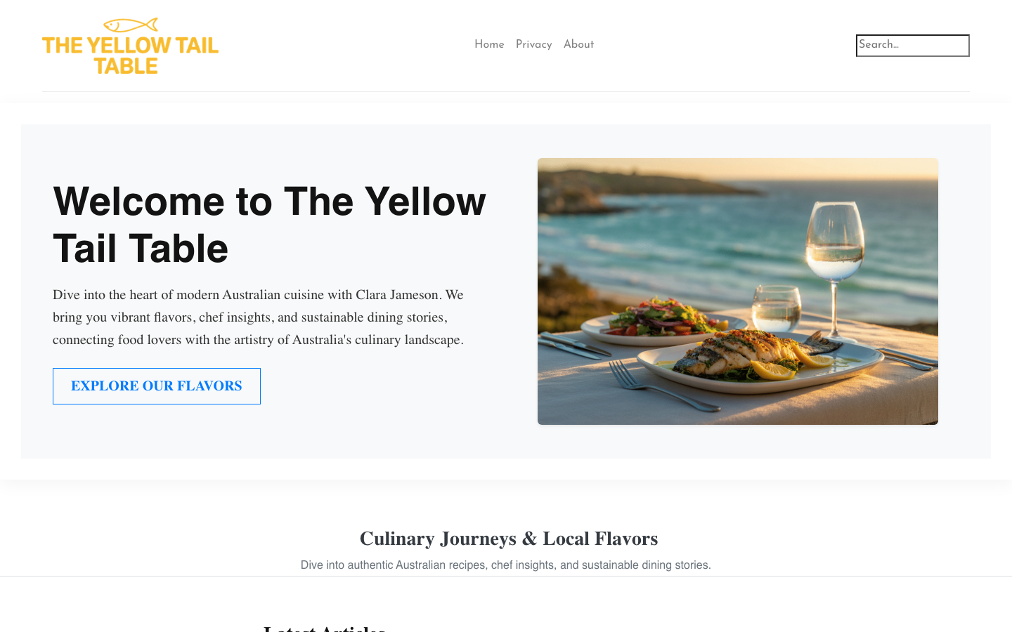
Yellowtail combines the expected menu and booking pages with editorial pieces about food and wine. That can give regular customers a reason to return, but it only works if the restaurant can maintain the content. An abandoned news section would weaken the same sense of care the design is trying to create. Only commit to that kind of section on a Central Coast restaurant website if someone will genuinely keep it current.
12. The Flotilla, Newcastle
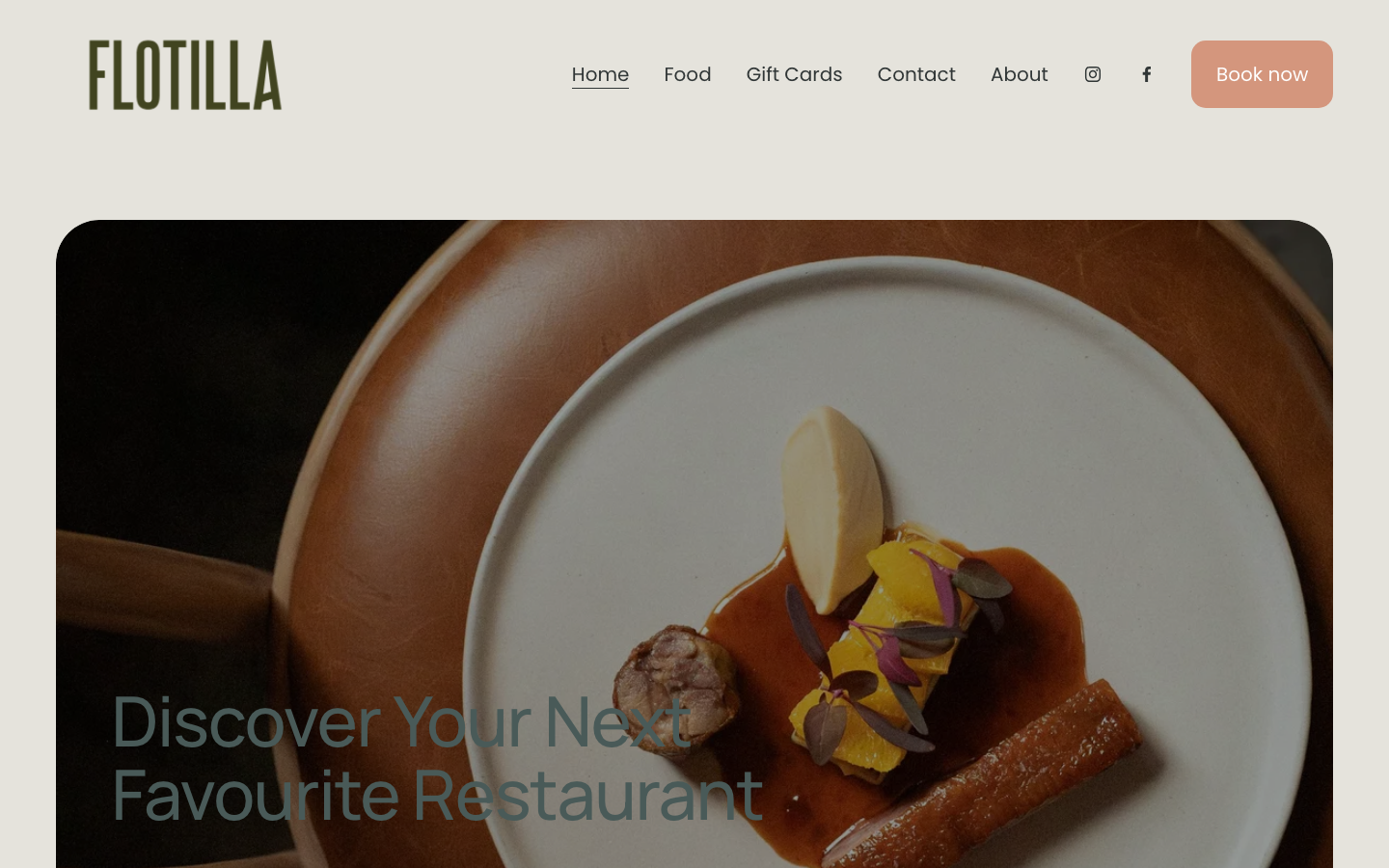
The Flotilla puts its location and service details on the main page instead of hiding them behind a contact link. A frosted panel keeps the headline legible over photography, while the navigation stays short. This is a useful reminder that ordinary information can be more persuasive than another oversized brand statement. Plain, findable information beats a bigger headline on a Newcastle restaurant website nearly every time.
13. Caveau, Wollongong
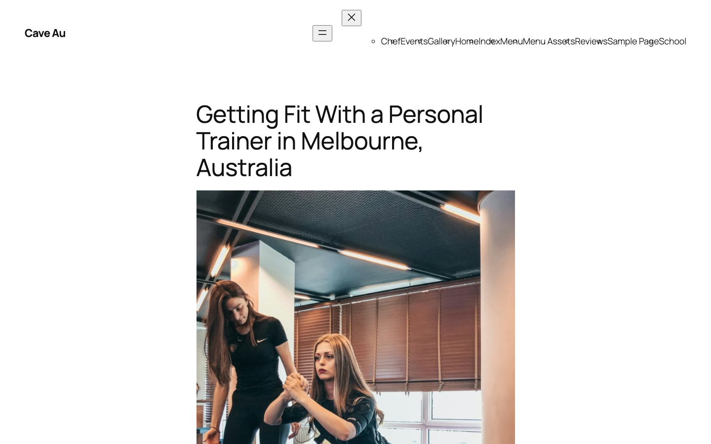
Caveau uses a dark, warm palette and a full-screen interior image to establish the room before showing the menu. More importantly, Caveau keeps the menu on the webpage instead of burying it in a file. Diners can scan sections quickly, and the booking action remains close by. Publishing the menu as a page rather than a download is the single biggest win available to a Wollongong restaurant website.
14. Tulip, Geelong
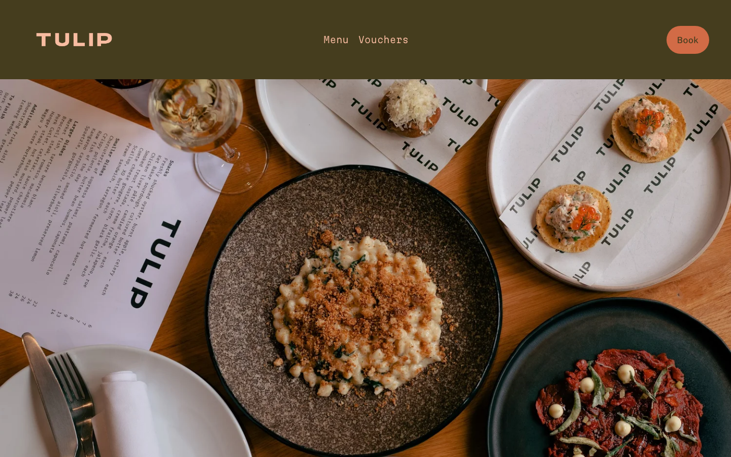
Tulip uses cream, bisque and olive tones with interior photography to sell the feel of the wine bar. Its three-item navigation is admirably direct: menu, vouchers and bookings. The trade-off is a file-based menu, which adds friction on mobile and can leave old filenames circulating in search results. That trade-off is worth avoiding on a Geelong restaurant website, where most visits happen on a phone.
15. Arrana, Blue Mountains
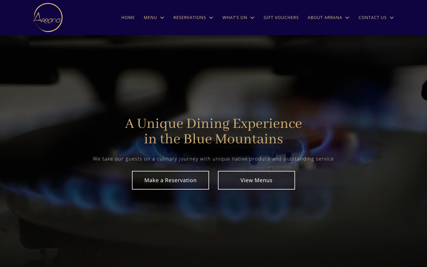
Arrana presents two useful actions immediately: make a reservation or view the menus. Awards support credibility, but they do not replace those practical routes. The anchored menu sections are especially useful because diners can jump between lunch, dinner and wine without repeatedly loading new pages. That pattern suits a Blue Mountains restaurant website, where people usually check the offer before committing to the drive.
16. The Stunned Mullet, Port Macquarie
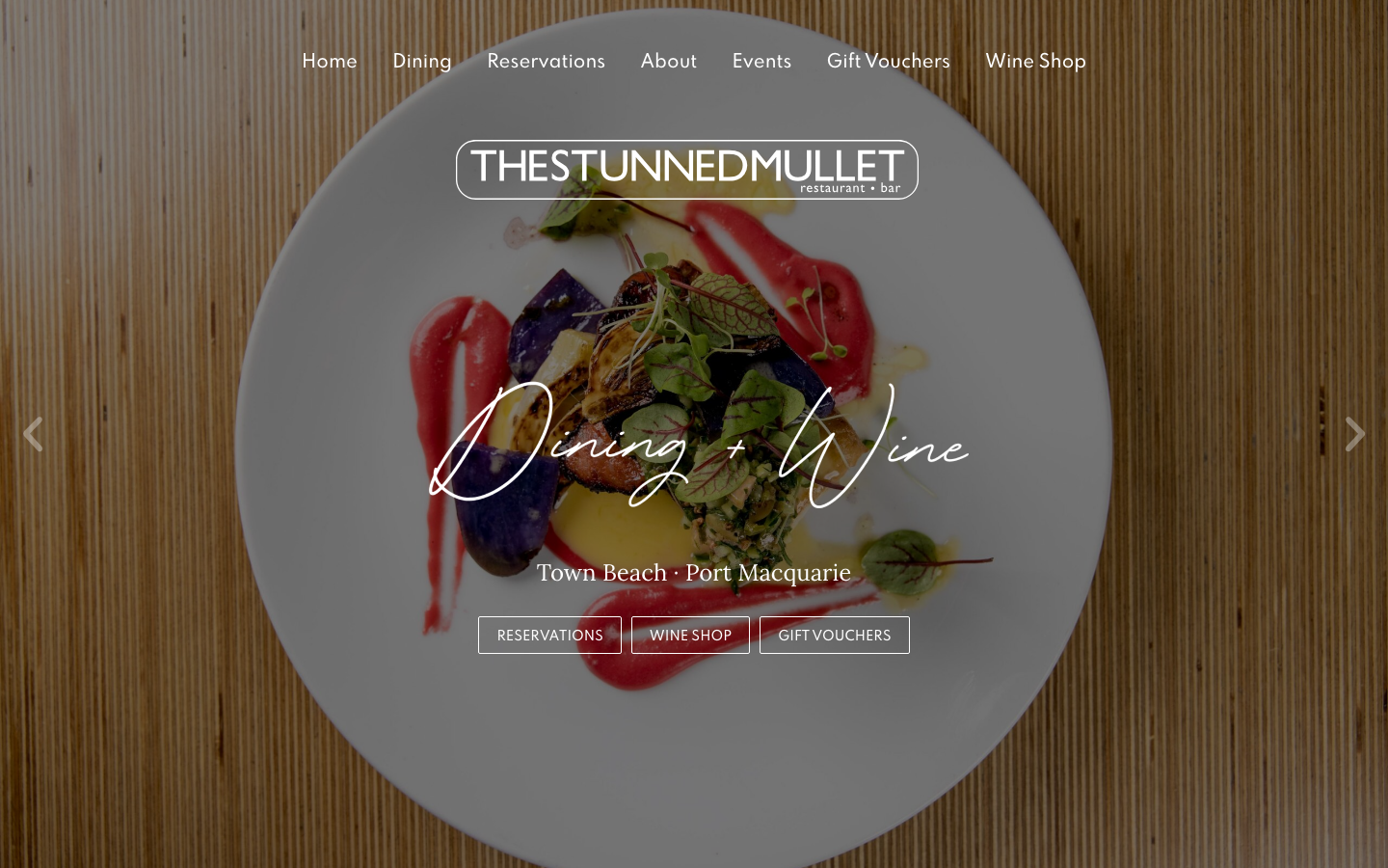
The Stunned Mullet uses system fonts, a neutral palette and consistent image ratios. Generous spacing and predictable containers make the content comfortable to scan. The result is quieter than several sites above and fits an established venue with a straightforward offer. Restraint of that kind reads as confidence on a Port Macquarie restaurant website with a long-standing reputation.
What good restaurant web design needs to do
Good restaurant web design helps a diner decide, then makes the next action obvious. Across these 16 examples, four details matter more than novelty.
Keep the booking path short
- Use one clear booking label throughout the site.
- Tell diners when they are leaving for a third-party booking service.
- Keep the restaurant name, date and party size clear during the hand-off.
Make the menu easy to scan
- Prefer a real webpage to a PDF where possible.
- Separate food, drinks and set-menu options with descriptive headings.
- Include useful dietary and pricing information beside the relevant items.
Design for the phone in a diner’s hand
- Keep tap targets large enough to use without zooming.
- Avoid video or animation that delays the menu and booking controls.
- Test the entire booking flow on a small screen, not only the homepage.
Set an honest expectation of the venue
- Use photography that reflects the actual food and room.
- Choose type and colour that fit the restaurant’s character and service style.
- Write plainly about the style of dining so guests know what they are booking.
Restaurant website design FAQs
What should a restaurant website include?
At minimum, include the menu, opening details, location, contact information and a clear booking action. Add private dining, gift vouchers or events only when they are real parts of the business and easy to keep updated.
Should a restaurant menu be a webpage or a PDF?
A webpage is usually easier to read on a phone, update and find in search. A downloadable PDF can still be useful for printing, but it should not be the only way to view the menu.
How should online bookings work?
Keep the booking button consistent and explain any hand-off to an external service. Test the full journey on mobile, including date selection, special requests, confirmation and returning to the restaurant website.
How much does restaurant website design cost in Australia?
Cost depends on the number of pages, menu management, booking integration, photography and any event or voucher features. Our website design pricing explains the starting packages, but a useful quote should reflect the restaurant’s actual booking and content requirements.
Can an existing restaurant website be redesigned without changing its domain?
Yes. A redesign can keep the existing domain and important URLs while replacing the layout, content system and booking experience. Redirect any page whose address must change so diners and search engines do not hit a dead end.
Need a restaurant website?
If you are opening a venue or fixing a site that makes bookings harder than they should be, see our restaurant website design service. We design menu pages and booking flows around your service model, content updates and reservation system.
You can also compare our website design services or contact KC Web Design to talk through the project.