
NDIS web design that works puts services first and makes the next step obvious.
This collection compares 16 Australian NDIS provider websites through their layouts, service navigation and contact options. The examples range from illustration-led sites to team-photography-heavy builds, and from single-office providers to multi-location organisations.
Use them to identify choices worth discussing in your own website brief. A visual review cannot establish accessibility conformance, service quality or how many enquiries a website generates.
Best NDIS Website Design Examples in Australia
1. Aeon Disability Services Adelaide
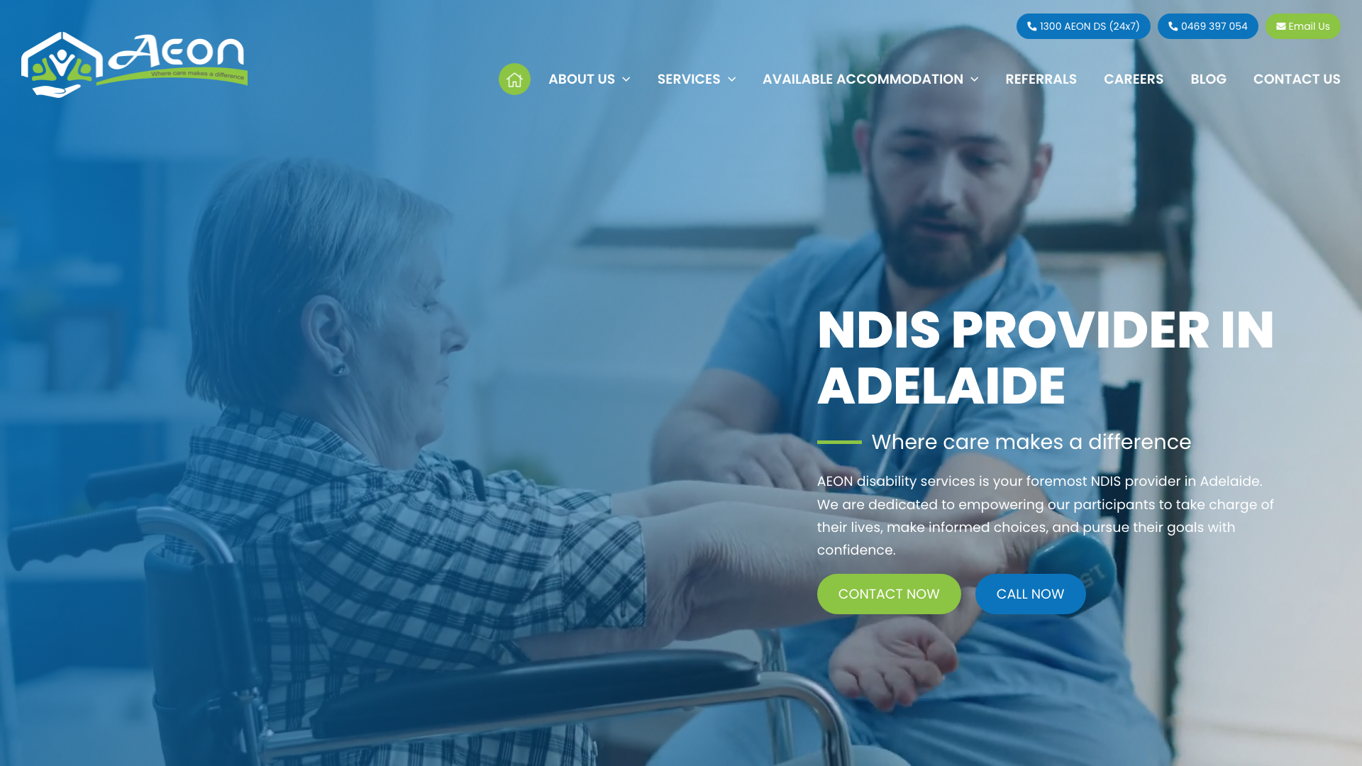
Aeon Disability Services pairs a primary blue with an accent green on white backgrounds, with bold Poppins headings. The hero leads with “Where care makes a difference” and section separation using subtle grey backgrounds.
Large headings with generous spacing between sections. Contrast and keyboard access still need testing.
Blue and green accents separate the white and grey sections, while heavy headings mark the main topics. The useful reference for website design in Adelaide is that separation between content areas; colour choices still need a contrast check.
2. Dynamic Ability Support Newcastle
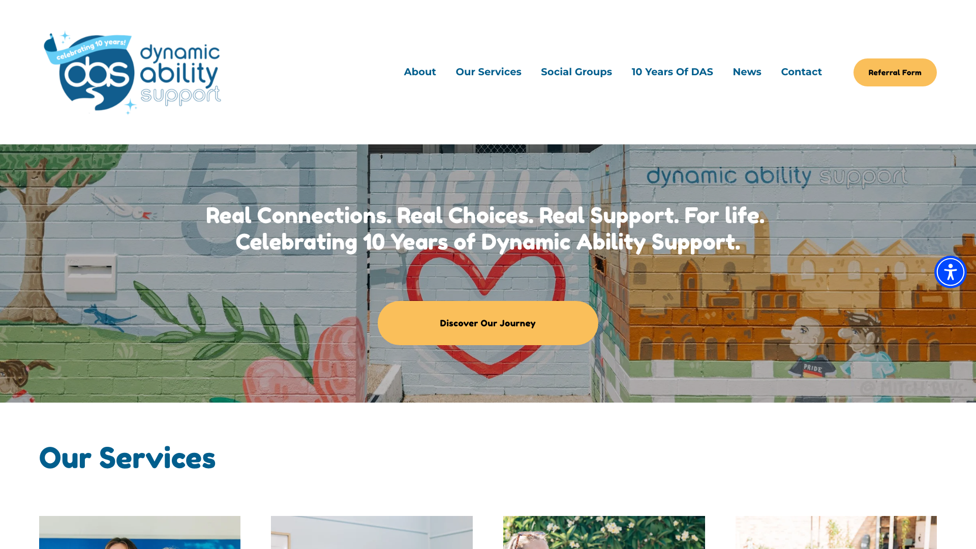
Dynamic Ability Support opens with “Real Connections. Real Choices.
Real Support. For life.” over activity imagery.
Warm coral and salmon accent tones with dark navy text on off-white backgrounds. Asymmetrical grid layout with generous breathing room.
Photography showing activities like grocery shopping, painting, and group gatherings.
The offset images and text blocks vary the layout between sections. Photographs of grocery shopping, painting and group gatherings give visitors examples of the activities described. Those activity details are worth including in a brief for website design in Newcastle.
3. Inspire.ly Gold Coast
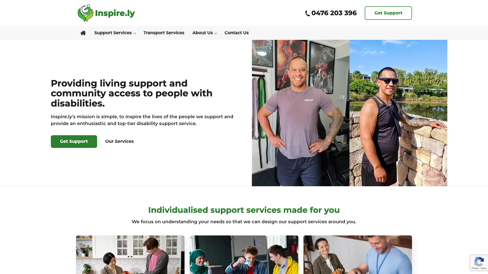
Inspire.ly opens with a rotating image carousel that fades between photographs of support workers and participants in action. “Providing living support and community access to people with disabilities” as the headline with paired “Get Support” and “Our Services” buttons.
Deep teal and warm cream palette on white. Below, three service cards lead into a broader six-card grid covering life skills, employment support and community access as separate entries.
The six-card grid gives life skills and employment support separate entry points. For website design on the Gold Coast, this is a reference for organising several support services without putting their full descriptions on the homepage.
4. Making IT Happen Support Hobart

Making IT Happen Support leads with a full-width beach scene hero and “Welcome to Making IT Happen Support” with “YOUR WAY” emphasised. Bold orange buttons with deep blue-purple navigation accents on white.
Poppins and Open Sans fonts. Service category cards and a five-star testimonial carousel.
Orange buttons stand out against the white background and blue-purple navigation. The beach photograph occupies the full width of the hero. When discussing website design in Hobart, consider how a similarly prominent image would relate to your own service and its setting.
5. Teuila Brisbane
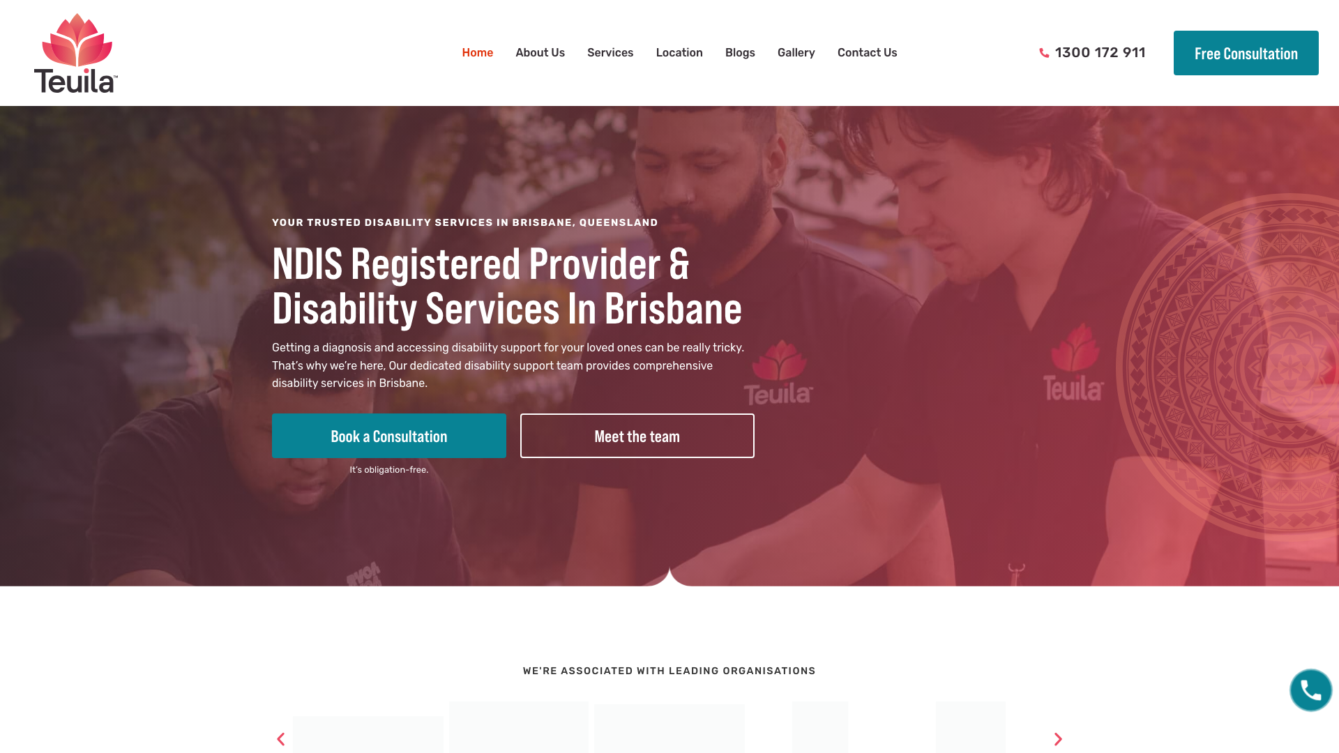
Teuila opens with a dark-to-red gradient overlay on a team photo. Bold Bebas Neue Pro headings with Rubik body text, so the heading weight does most of the visual work.
Teal accent colour on CTAs and FAQ icons. Multi-section vertical layout with alternating image-text blocks and oversized animated counter statistics.
The flip-box service cards reveal descriptions on hover. Before borrowing this treatment for website design in Brisbane, check that those descriptions also work with a keyboard and on touchscreens. Animated service counters draw attention, but figures need a source and reporting period.
6. Catalyst Ability Bendigo
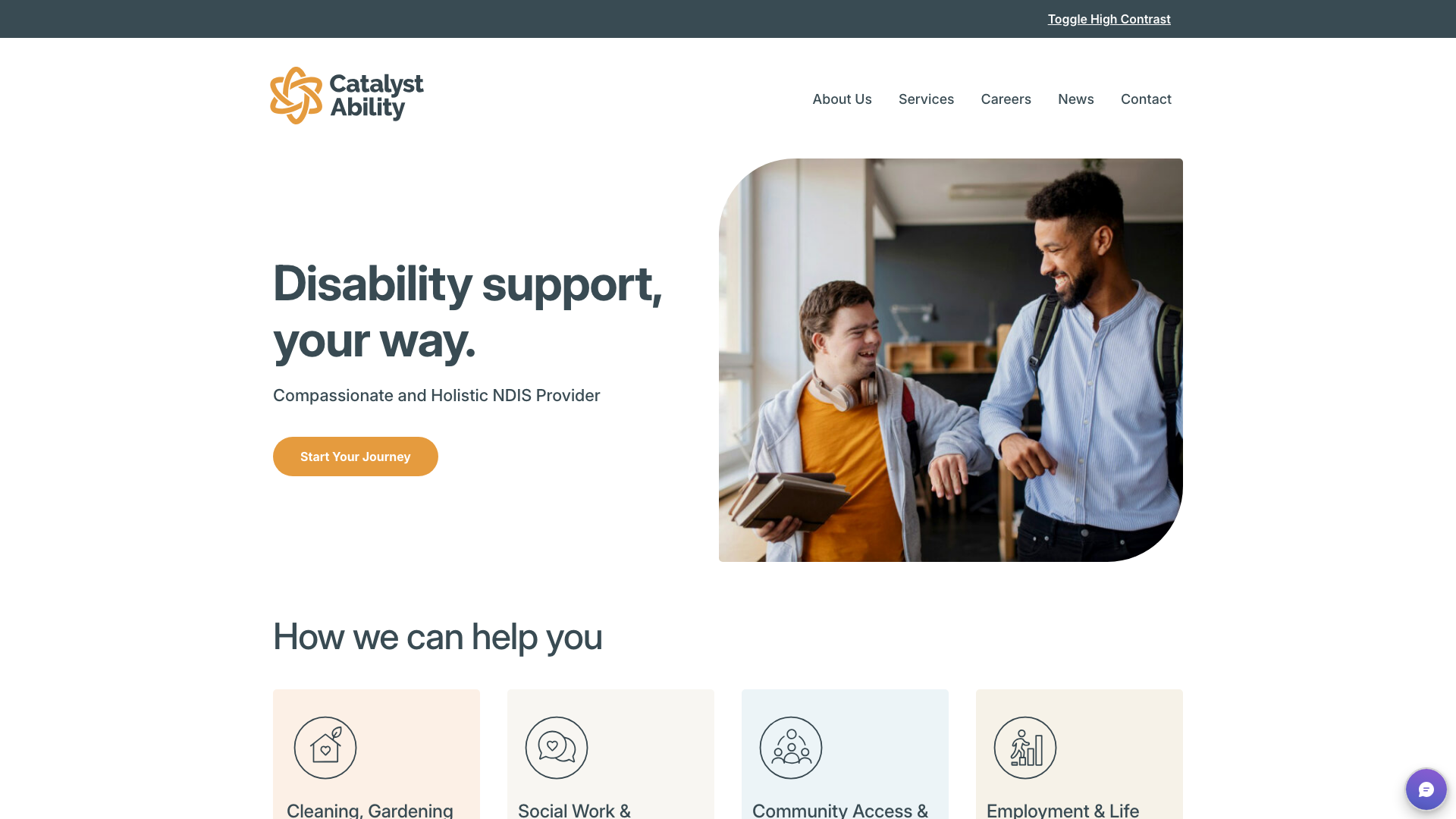
Catalyst Ability uses a warm orange primary accent with deep navy on soft neutral backgrounds. The hero features “Disability support, your way” with an photograph of two people together. Custom SVG icons for service cards, including a leaf-topped house and community group illustrations.
The service icons repeat a consistent illustration style across the cards. The leaf-topped house and community group symbols are specific details to discuss when planning website design in Bendigo. Keep explicit service labels beside icons so visitors do not have to guess their meaning.
7. Ark Support Coordination Perth
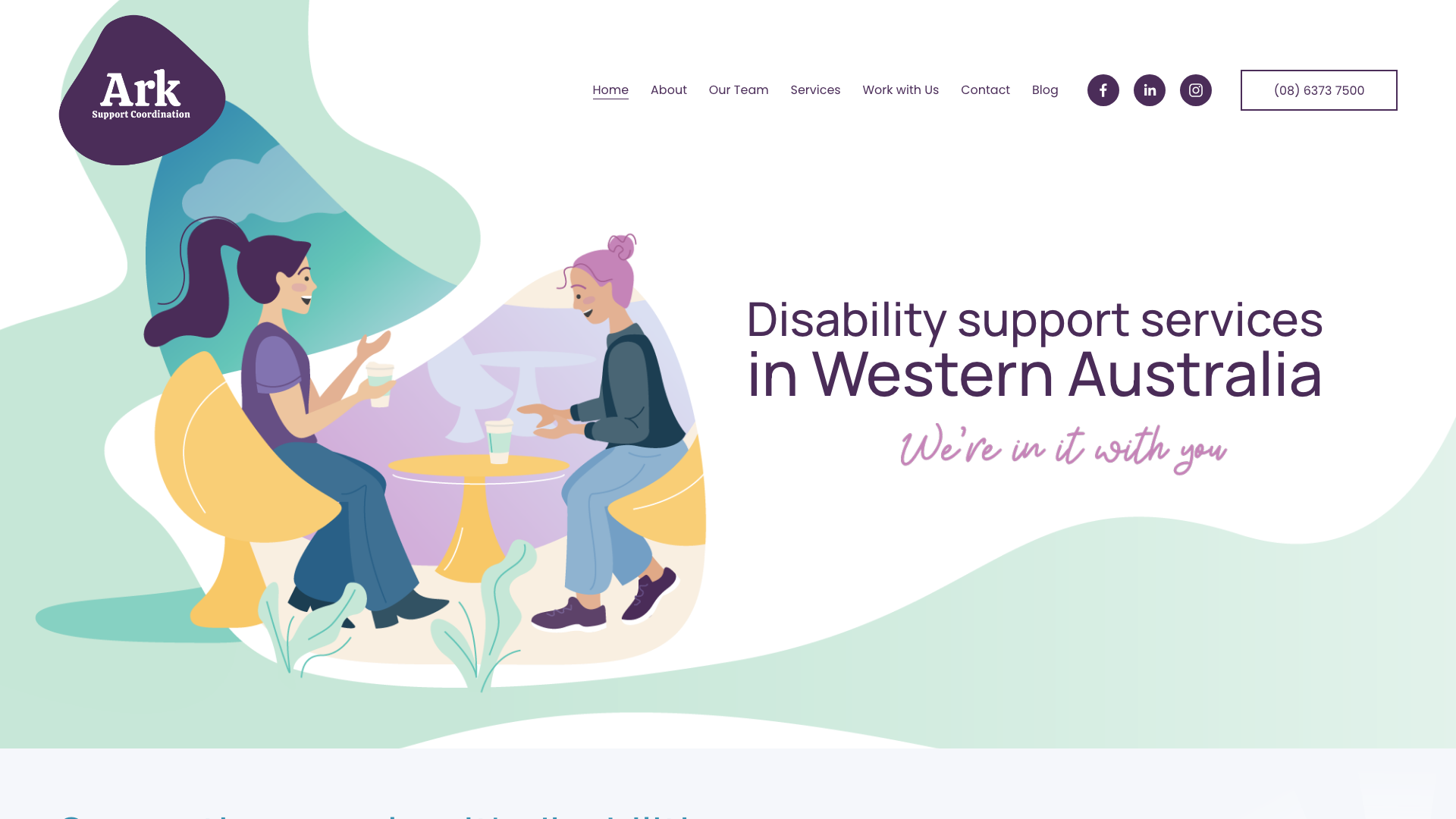
Ark Support Coordination takes an illustrative approach with a semi-transparent white overlay and rounded corner text blocks. Clean grid layout with generous whitespace throughout.
Neutral pastel palette with a warm, non-clinical feel. Straightforward navigation with a dropdown services menu.
Illustrations carry the visual identity, with rounded text panels and a pastel palette. This is a useful reference for website design in Perth when illustration will play a larger role than photography. Decide which service details the illustrations should explain before choosing a style.
8. Assist Lifestyle Sunshine Coast
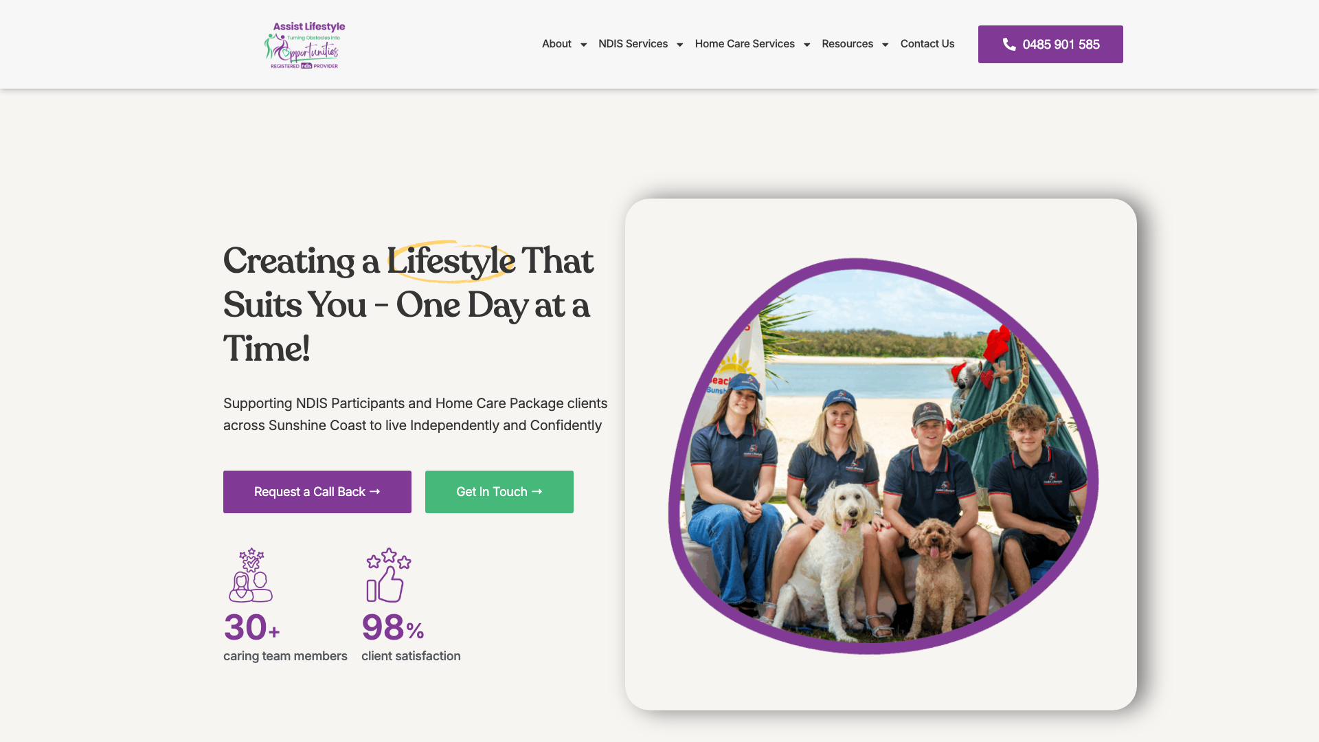
Assist Lifestyle runs a purple and green colour palette on clean white backgrounds. The hero leads with “Creating a Lifestyle That Suits You” alongside employee collage imagery and photographs of participants at outings and group activities. Card-based service sections and a three-step process visualisation show how a new participant gets started.
The review and feedback section gives visitor feedback a prominent place on the homepage. For website design on the Sunshine Coast, borrow the placement but include the source and date of any rating. A satisfaction percentage also needs an explanation of who was surveyed.
9. Dynamic Support Services Sydney
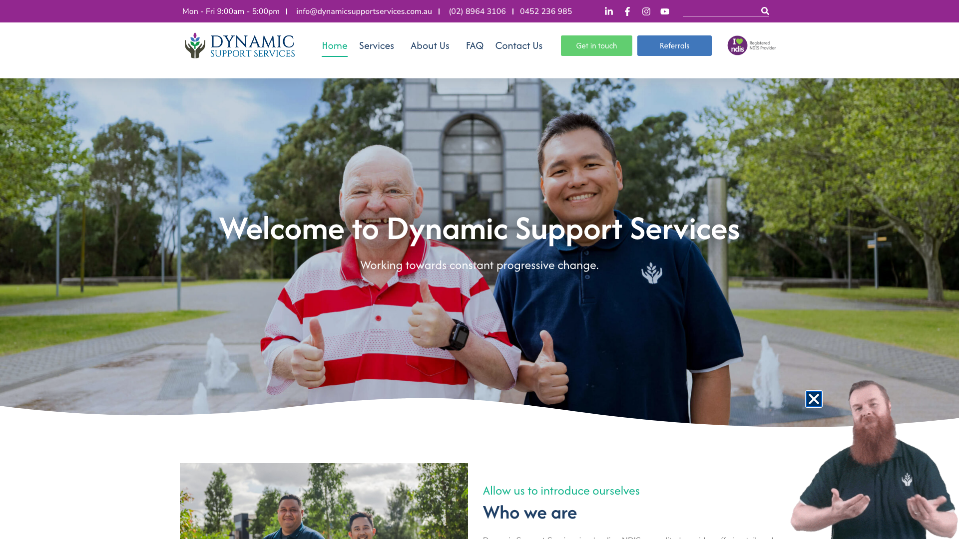
Dynamic Support Services opens with a group photo of support workers and participants in a park. Professional blue and green palette with generous whitespace.
Clear navigation with service categories (Respite, SIL, SDA, Social Participation) in a secondary menu. Award badges appear in a carousel.
The site places award recognition in a dedicated carousel. Its inclusion statements are also given space outside the footer. For website design in Sydney, separate award details from general values statements and provide a way for readers to verify the award and its year.
10. Marco Polo Supports Geelong
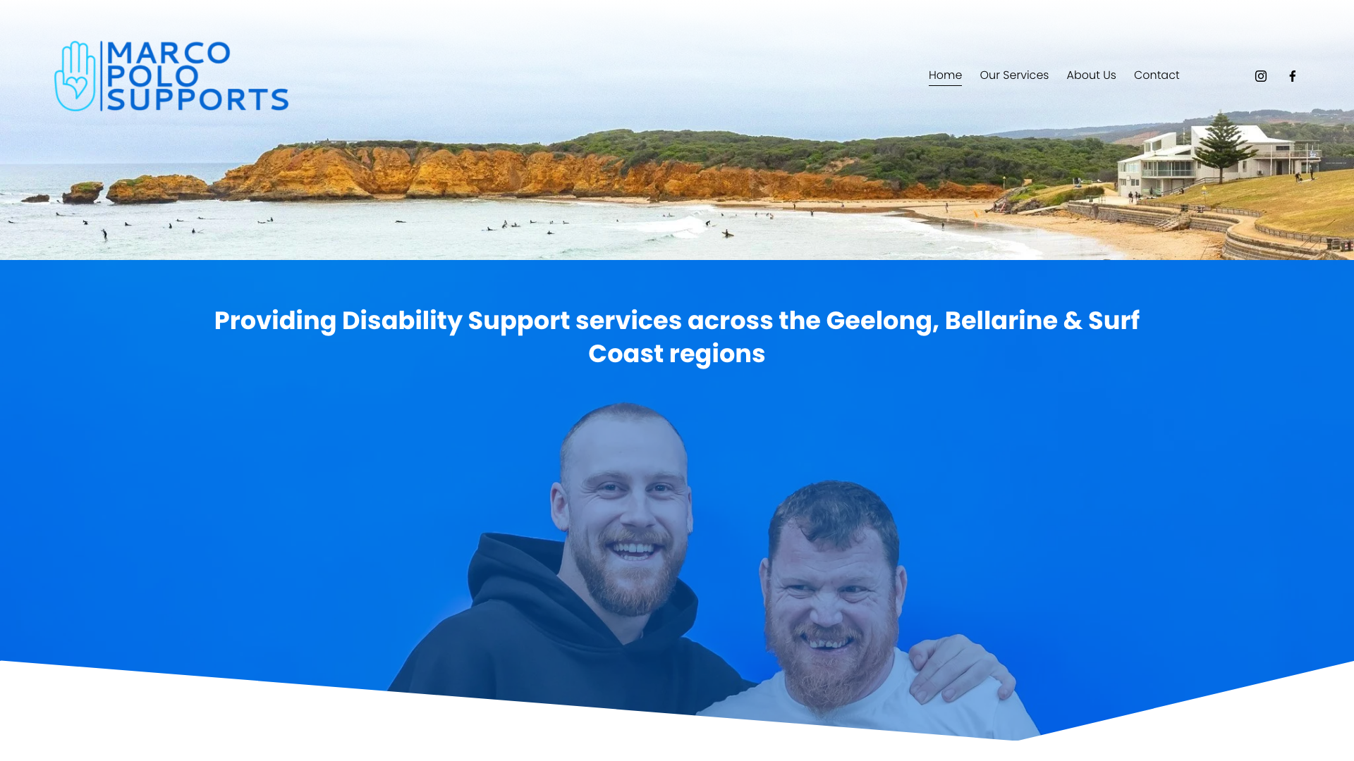
Marco Polo Supports leads with a full-width hero, layered imagery, and “You call, we care” as the headline. Minimalist navy palette against clean backgrounds. Multiple high-quality photographs of team members and candid moments with alternating content and image rhythm across sections.
Team photographs appear throughout the alternating image and text sections, introducing the people pictured alongside the service information. A brief for website design in Geelong could use this layout to plan where team profiles belong and which photographs are needed.
11. Bunji Wollongong
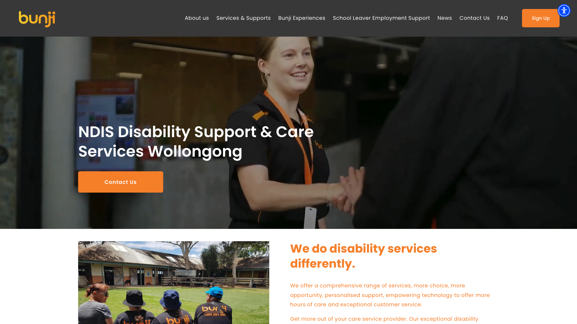
Bunji pairs orange and teal in a grid-based layout with generous whitespace. Large lifestyle photography showing community engagement, group activities, and people spending time together.
Layered content blocks with blur effects creating visual depth. Alternating image-text positioning throughout.
Layered blur effects separate overlapping content blocks from the background. These effects are a possible reference for website design in Wollongong, provided they remain decorative. Keep text and controls clear of the blurred areas.
12. BDMS Community Services Darwin
BDMS Community Services runs a clean, minimalist layout with white backgrounds and a three-colour accent system: green, cyan-blue, and coral-red. Montserrat body text with Philosopher for buttons.
Full-width hero with large headings. Dark footer with white text.
Green, cyan-blue and coral-red accents recur across the white layout. The restrained background leaves room to explain services. For website design in Darwin, take the consistent use of accents as the reference, then check their contrast against the actual background colours.
13. Central Coast ARAFMI

Central Coast ARAFMI leads with deliberate restraint: a solid teal hero background and the centred headline “We are here for you,” supported by a short statement about community support. Below, four service cards (NDIS, The Trust, Yakkalla, Respite) sit in a row.
A testimonial carousel auto-advances with fade transitions. Deep teal, cream, and light grey throughout.
The two-column location layout puts Bateau Bay and Narara office details side by side. For website design on the Central Coast, this is a useful way to present more than one office. Include the services and contact details for each, so visitors have more than an address to compare.
14. WellVibe Melbourne
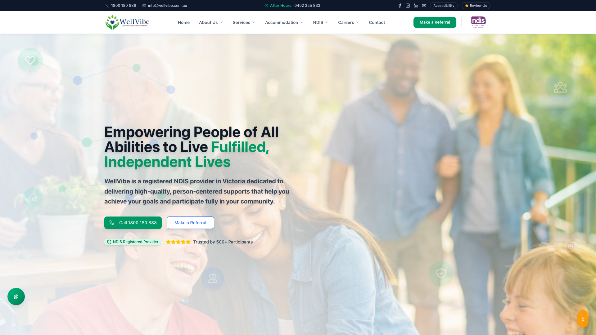
WellVibe leads with “Helping People of All Abilities to Live Fulfilled, Independent Lives” alongside diverse community imagery. Colour-coded service pillar sections in teal, emerald, orange, and yellow.
Card-based layout with clean information hierarchy. Persistent contact sidebar with phone number and social links.
The service sections each have a distinct colour. When borrowing this pattern for website design in Melbourne, keep written labels alongside the colours so navigation does not depend on colour perception. The contact sidebar is another detail worth examining on both wide and narrow screens.
15. Calacare Ballarat
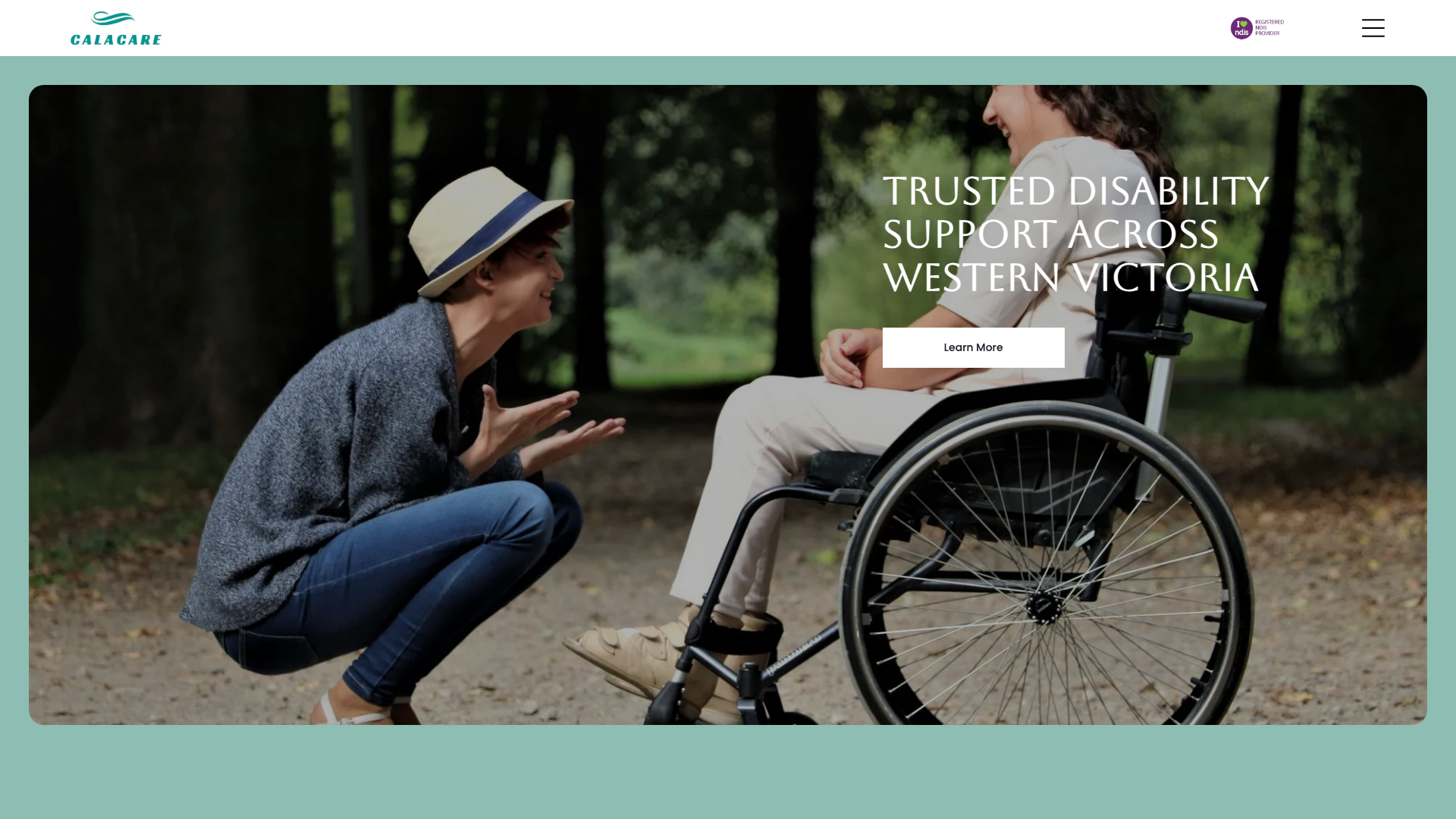
Calacare uses a teal and cream colour scheme with Aboreto serif for headers, a bold typographic choice. Work Sans and Poppins for body text. The hero shows an outdoor accessibility scene with “Trusted Disability Support Across Western Victoria.” Spacious layout with generous padding throughout.
The Instagram gallery shows social posts on the homepage. For website design in Ballarat, consider whether an embedded feed adds information visitors need. It still needs checking when platform settings or account permissions change.
16. Support Living Canberra
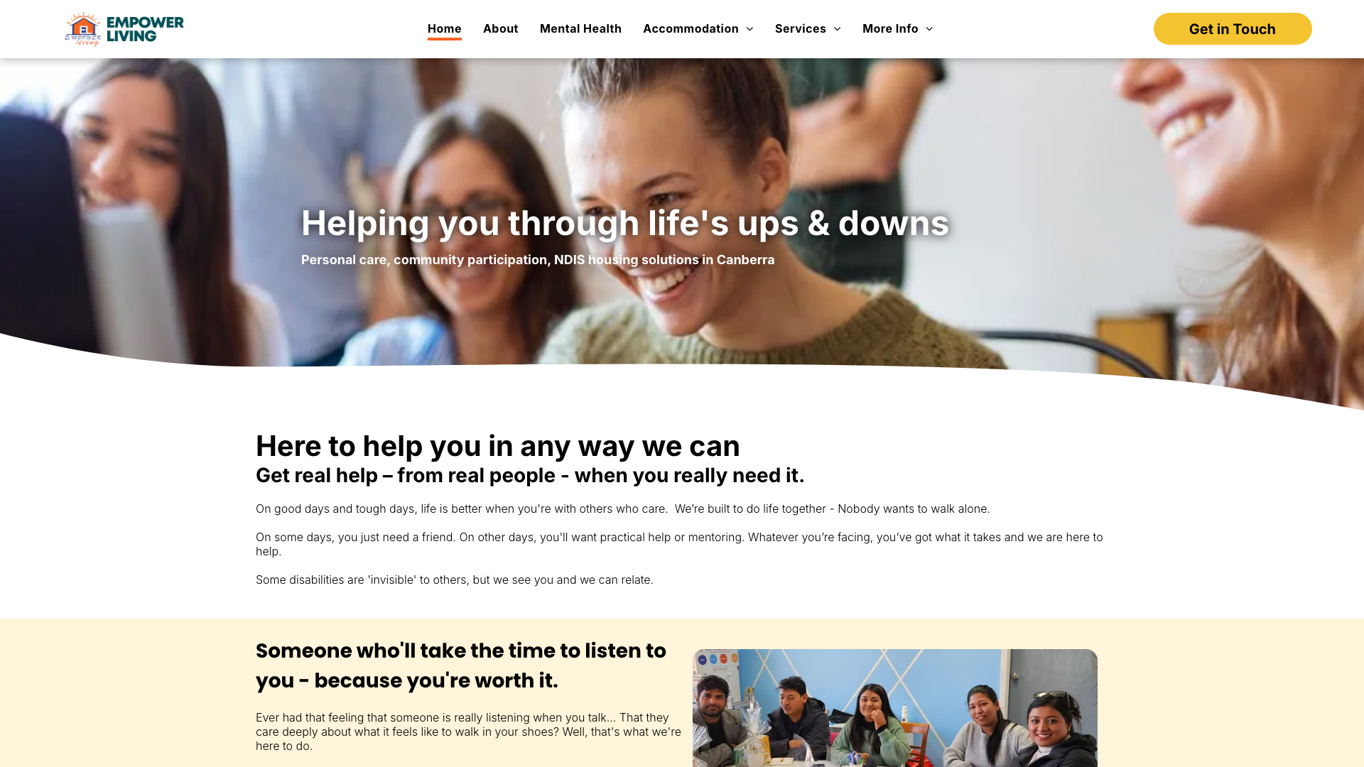
Support Living leads with “Helping you through life’s ups & downs” over a semi-transparent image overlay. Golden yellow and orange accents against deep navy create a warm, distinctive palette.
Inter and Poppins fonts. Six prominent service cards for SIL, Mental Health Care, MHFA and more.
Yellow and orange accents stand against navy, while the founder message and participant testimonial have their own space. A brief for website design in Canberra could use this as a reference for placing a personal introduction alongside service information. Include only testimonials you have permission to publish.
What separates good NDIS web design from a generic provider site
An NDIS provider website has a job that most business websites do not: it needs to make support categories understandable to people who may be encountering the NDIS for the first time, while also serving participants who already know exactly which service line they need.
Looking across all 16 examples, a few things keep showing up on the stronger sites:
- Service cards that name the NDIS category directly. Inspire.ly’s six-card grid and WellVibe’s colour-coded pillars both label their services using the terms participants will recognise from their plans (SIL, SDA, community access). Vague labels like “Our Services” leave visitors guessing.
- A visible path from any service description to an enquiry form or phone number. WellVibe’s persistent contact sidebar keeps that path open while the visitor reads. ARAFMI’s location layout pairs office details with their service areas so the visitor can self-select.
- Real photography or purpose-built illustration, not stock. Marco Polo and Dynamic Ability both use photographs of their actual teams and participants. Ark takes the opposite approach with illustration, which still works because the illustrations are drawn specifically for their service types rather than pulled from a generic icon pack.
How to compare the NDIS web design examples
Compare a complete task, such as finding a service and reaching its enquiry form. The homepage is the least important part of this exercise; the pages and controls behind it determine whether someone can finish that task.
- Pick one service your organisation also offers and follow its route from the homepage.
- Check whether the service page explains its coverage area and who to contact.
- Repeat the route on a phone. Most NDIS participants and their families will reach your site on a mobile device, and layouts that look structured on a wide screen can collapse into a single scrolling column where service cards lose their grouping.
- Try the same route using only a keyboard. Tab through the navigation, open a service page, and reach the contact form without touching the mouse. If a step requires a hover (like Teuila’s flip cards) or a click target smaller than your fingertip, the route has a gap.
W3C’s preliminary accessibility checks cover headings, contrast, keyboard focus, zoom and form labels. W3C explicitly cautions that passing these checks does not establish full accessibility; a screenshot cannot establish it either.
- For Teuila-style hover cards, check that the same information is available without hovering.
- For WellVibe-style colour grouping, keep service names visible in text.
- For rotating banners or testimonials, check the controls as well as the appearance.
A useful brief for our website design services names the feature you want to borrow and the task it should help a visitor complete. Include the relevant service page in your reference, rather than supplying only a homepage screenshot.
Keep these notes with your chosen examples:
- The exact service or location task you want to improve.
- The feature you would use, and any keyboard or mobile behaviour still to check.
- The copy, photographs or contact details needed to make it useful.
Questions about NDIS website design
Which example should I start with for service navigation?
Start with Inspire.ly’s service-card layout and WellVibe’s grouped service sections. They offer two ways to separate support options; the better fit depends on how many services you need to explain and whether visitors recognise their names. If your organisation covers fewer than four service lines, cards may be enough. Beyond that, colour-coded sections with anchor links let visitors jump straight to the category they need.
Which example makes location information useful?
Central Coast ARAFMI’s side-by-side location layout is the clearest location comparison described here. It gives each office its own space, a useful pattern when visitors need to decide where to enquire. List the services available at each location, not just the address, so the comparison helps the visitor make a choice rather than just find a map pin.
Can an NDIS website template reproduce these design patterns?
A template can give you service cards, team profile blocks and a contact section as starting components. Where templates fall short is in the information architecture: how your service categories map to menu items, what each card links to, and whether the enquiry form captures the right details for your intake process. Check the template’s actual navigation and form handling before committing. Reproducing the visual layout of these examples will not reproduce their service structure.
Do these examples prove that animation improves enquiries?
No. The collection describes animated counters, hover cards and carousels, but includes no conversion data establishing their effect. Keep essential service information available even when an animation is paused or a hover interaction is unavailable. Teuila’s flip cards, for instance, hide descriptions behind an interaction that does not exist on a touchscreen unless a tap fallback is coded in.
What should I check after adopting a design feature?
Check the finished service-to-enquiry route end to end, then repeat that check after any change to forms, plugins or embedded feeds. An Instagram widget that loads today can break silently when the platform changes its embed rules. Ongoing website management for updates and maintenance helps keep those moving parts working after launch.
Does NDIS web design need to meet specific accessibility standards?
The NDIS Practice Standards require providers to communicate in ways that are accessible to participants, but they do not prescribe a particular web accessibility standard such as WCAG. In practice, participants include people using screen readers, switch devices and magnification, which means the same WCAG guidelines that apply to any public-facing site matter more here than on an average business page. Test keyboard navigation, heading structure and colour contrast as a starting point, and treat W3C’s preliminary accessibility checks as a floor rather than a ceiling.
Should an NDIS website use photography or illustration?
Both work. Ark and Catalyst Ability use purpose-drawn illustrations that explain service types without requiring a photo shoot. Marco Polo and Dynamic Ability use photographs of real team members and participants, which builds trust in a sector where the relationship between worker and participant matters. If you can photograph your actual team in genuine settings, that will carry more weight than stock imagery. But well-made illustrations are stronger than generic stock photos pretending to be your staff.
For a broader critique of the sector, our audit of 20 NDIS websites is a separate companion to this collection of design references.
Need an NDIS Website?
Bring a shortlist of the examples you like and the service information your visitors need. That gives us a concrete starting point for discussing your NDIS website.
Our NDIS website design service covers the next step from reference ideas to a provider website. You can also review our website design pricing before discussing the scope.