
The best construction websites prove capability before asking a visitor to make contact.
After more than 10 years building business websites, we reviewed 17 Australian builder and contractor sites for the things prospective clients can judge online. We looked for clear service scope, project evidence, specific credentials and a sensible path to enquiry.
This is an editorial review, not an official awards program or a paid ranking. The examples include home builders, commercial contractors and renovation specialists, with notes on the design decisions worth borrowing.
What earned a place: useful project galleries, clear service scope, specific trust signals and an enquiry path that suits the work.
How we reviewed the 17 construction websites
We assessed the public-facing pages in August 2026 rather than private analytics or enquiry data, so features may change after this review. These are the practical checks we use to audit a business website, adapted for builders:
- Can a visitor tell what the company builds and where it works?
- Does the project gallery show enough detail to prove relevant experience?
- Are licences, awards, reviews or team credentials specific and easy to verify?
- Is the next step clear without forcing every visitor into the same generic form?
Best construction website design examples in Australia
1. JOSCON Tasmania, Hobart
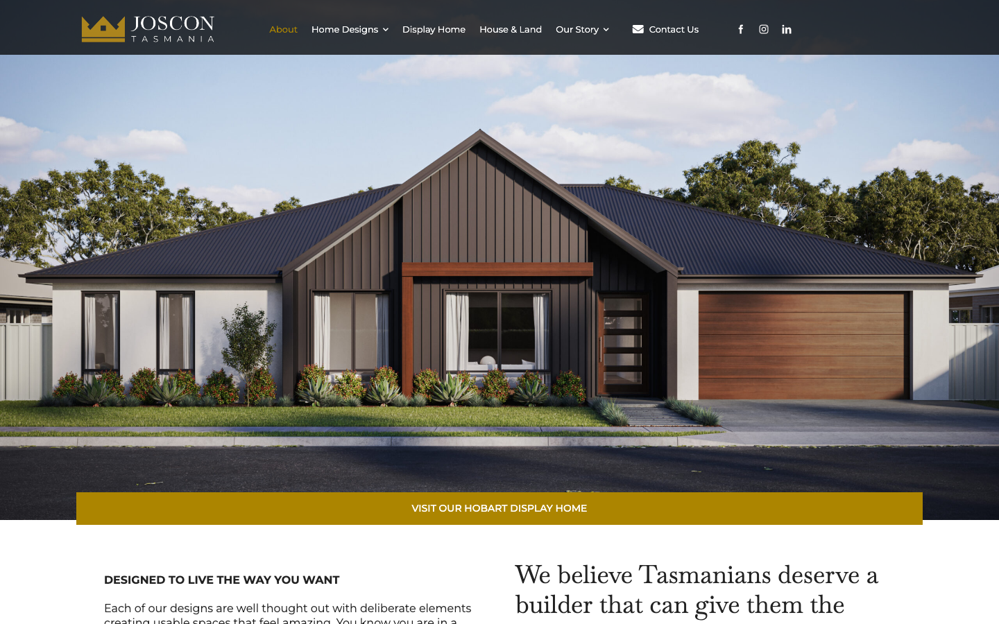
JOSCON Tasmania opens with a photorealistic render of one of its home designs and a tagline that does real work: “Designed to live the way you want.” White backgrounds with burnt orange and emerald green accents give the site a recognisable look.
JOSCON’s 3D tours let buyers inspect a design before it is built, an unusual feature in this sample. The site also displays its Tasmanian builder’s licence number and HIA-CSR Australian Housing Awards. This Hobart construction website is strongest when it turns an unbuilt design into something buyers can explore.
2. Rustic Touch, Central Coast
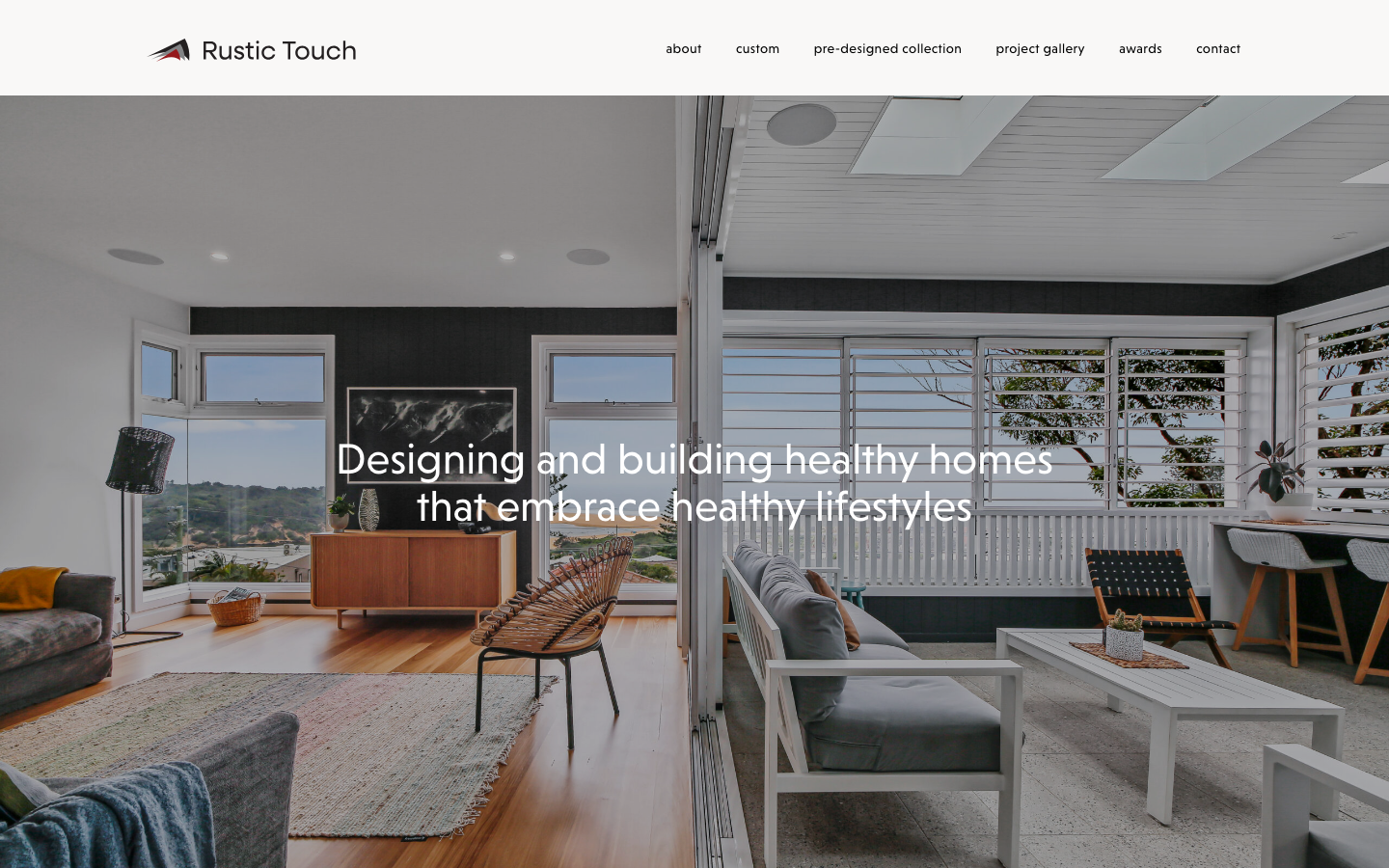
Rustic Touch has a minimalist black-and-white palette with niveau-grotesk typography that feels more like an interior design studio than a construction company. The hero proposition, “Designing and building healthy homes that embrace healthy lifestyles,” gives them a clear angle that no other builder on this list uses.
The project gallery uses flip cards to reveal details for builds such as “Pulbah View” and “Casa Al Mare”. Rustic Touch says it has operated for more than 35 years and lists awards from the HIA and Master Builders. The Central Coast construction website earns its premium feel through real project detail rather than decorative effects alone.
3. Symcorp Design & Build, Gold Coast
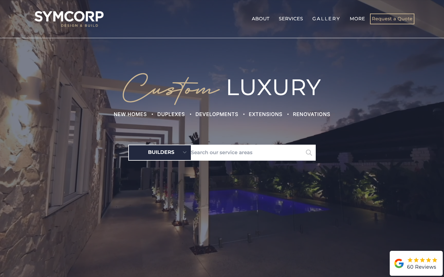
Symcorp uses navy and gold to signal a premium coastal market without overdoing it. The hero splits into service buttons for new homes, duplexes, developments, extensions and renovations, so visitors can self-direct from the first screen.
We like the architectural renders placed beside finished project photos because the comparison shows whether the built result matches the plan. A structural guarantee, Master Builders QLD and HIA badges, and named award logos make this one of the most complete Gold Coast construction websites in the review.
4. Monarch Building Solutions, Canberra
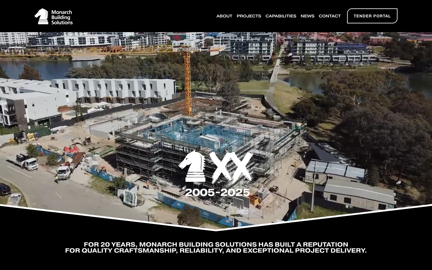
Monarch Building Solutions takes a different approach. This is a commercial builder, and the dark palette with an asymmetrical grid feels closer to an architecture practice than a residential display-home site. The homepage also leads with the firm’s years in business, giving visitors an immediate sense of history.
The portfolio covers education, recreation and multi-residential work, shown as linked tiles with aerial photography. The site also introduces its MBS Residential and MBS FM businesses for clients who need related services. This Canberra construction website handles a broad commercial portfolio without losing its hierarchy.
5. Vaughan Homes, Port Macquarie
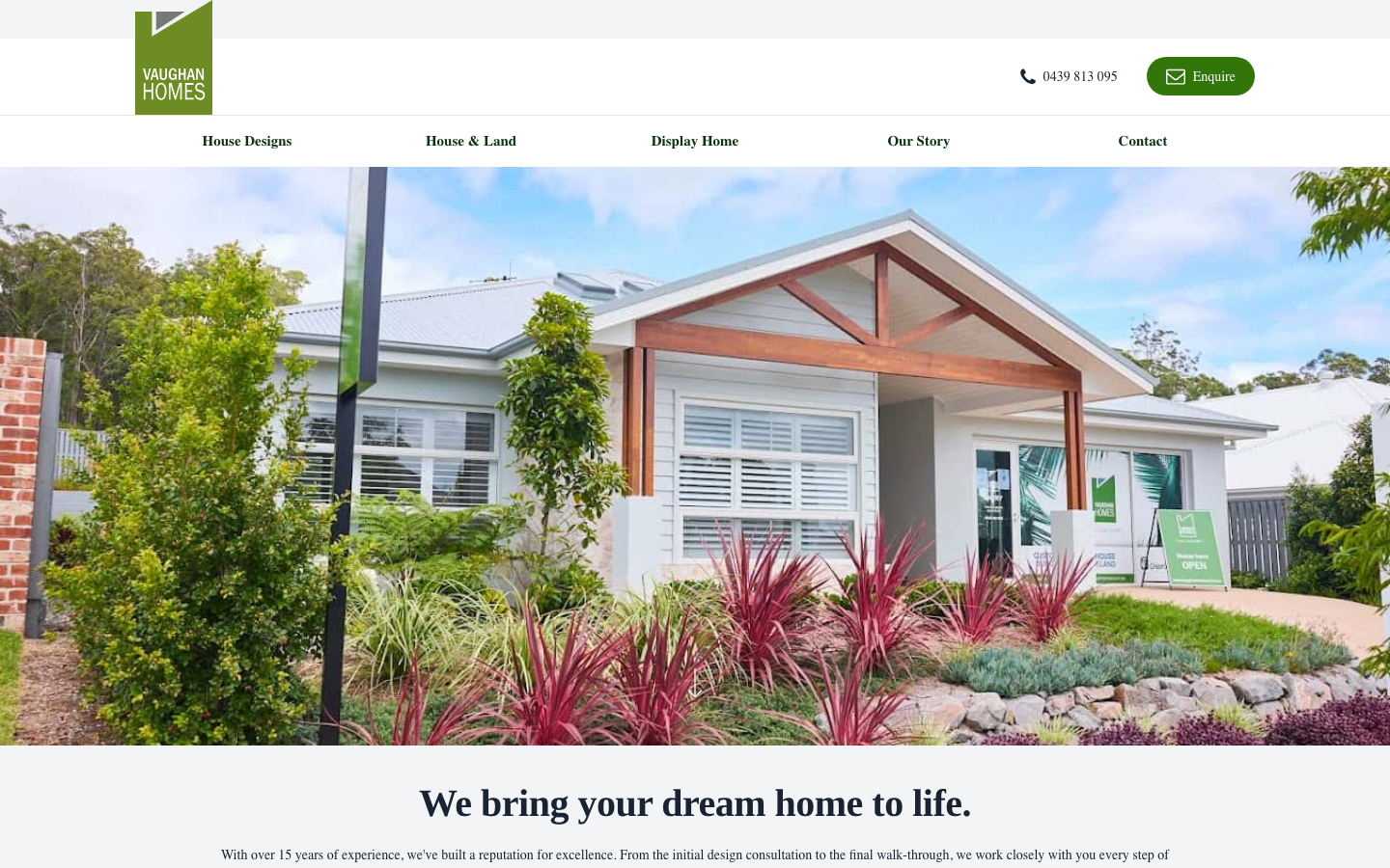
Vaughan Homes uses a restrained neutral palette, while the Cardo headings soften an otherwise corporate layout. The hero carousel rotates through completed builds, and the logo-centred header keeps navigation minimal.
Four distinct design ranges (Millennial, Lifestyle, Entertainer and Rural) let visitors self-select based on how they live, not only what they can spend. HIA Greensmart accreditation, years of experience and pricing information all reinforce the trust. It is a well-structured Port Macquarie construction website.
6. Lightscape Building, Blue Mountains
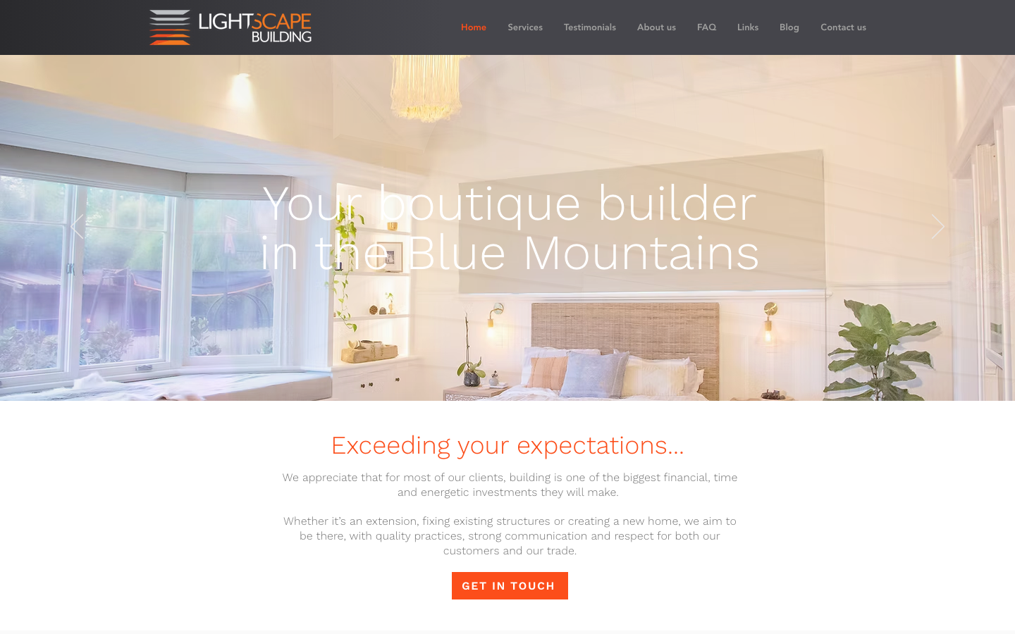
Lightscape Building is built with Wix rather than a custom WordPress setup. Its grid, blue accents and rounded buttons scale cleanly from desktop to mobile in our manual review.
The services are easy to find, and the phone and enquiry links stay visible. This Blue Mountains construction website is a useful reminder that clarity can matter more than custom effects.
7. Derbyshire Homes, Geelong
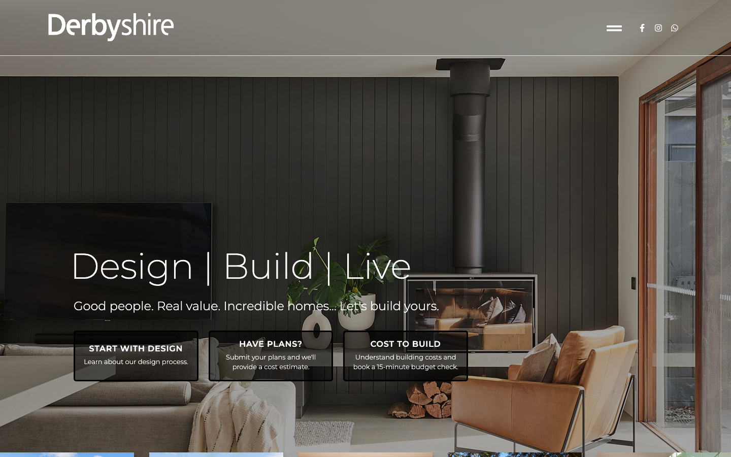
Derbyshire Homes keeps things clean with a black-and-white palette, Montserrat typography, and the tagline “Design | Build | Live.” Featured projects span Barwon Heads, Point Lonsdale, and Greater Geelong, each with large-format photography that fills the screen.
The standout was an on-site capacity indicator showing available design and build slots when we reviewed it. Publishing availability sets expectations and positions the company as a boutique builder rather than a volume operator. Master Builders Green Living accreditation also supports the sustainable homes category. It is one of the better Geelong construction websites in this sample.
8. J Co Constructions, Sunshine Coast
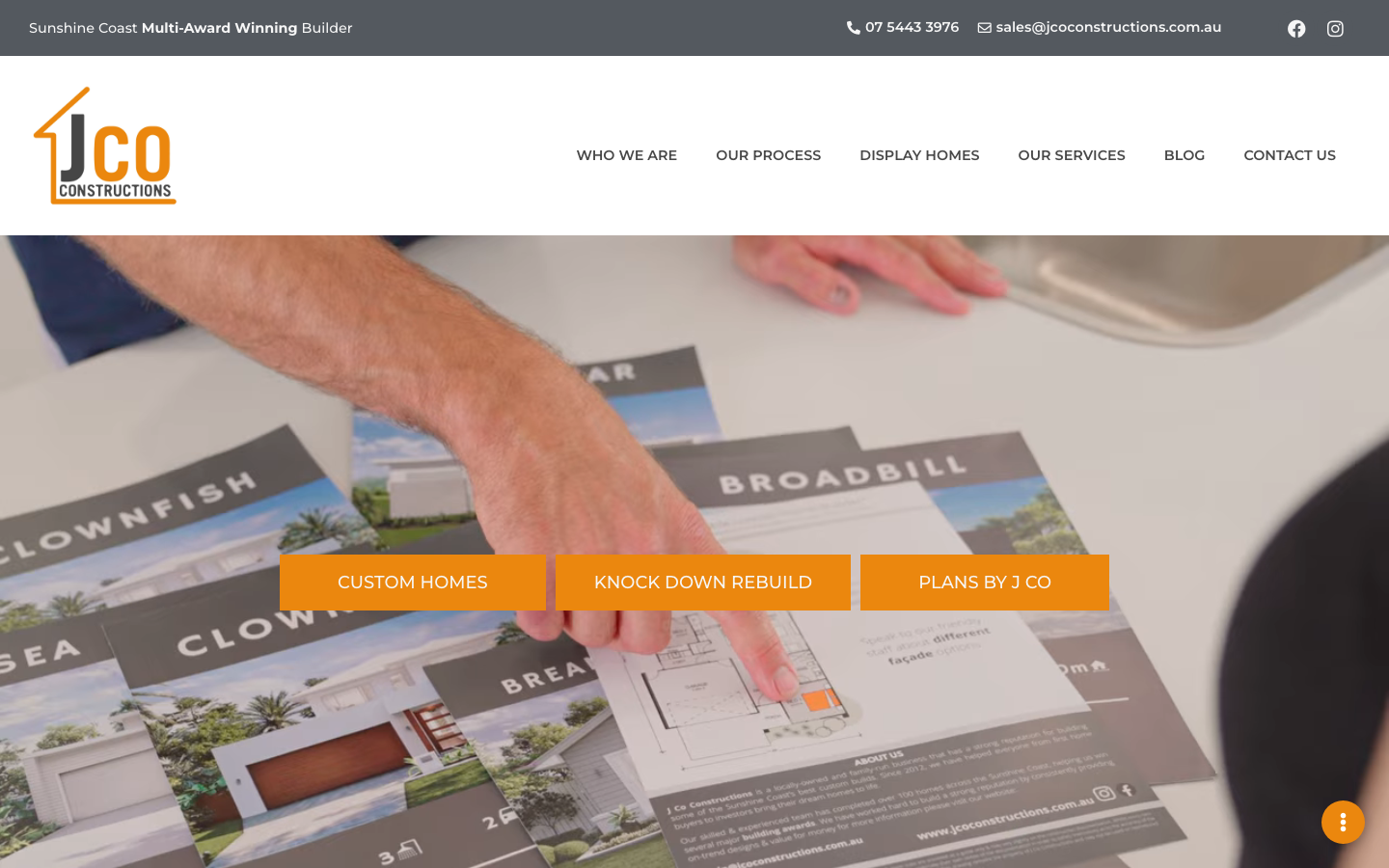
J Co Constructions leads with a lifestyle photograph of a completed luxury home, and the hero text gets straight to the point: Sunshine Coast builder, luxury custom homes, knockdown rebuilds. The sticky navigation keeps core pages within reach at all times.
The detail that stands out is the stated cap on annual build volume. That transparency sets expectations and positions the firm as quality-focused rather than volume-driven. Combined with a QBCC licence, named Master Builders awards and a detailed process page, this is a confident Sunshine Coast construction website.
9. M+J Builders, Darwin
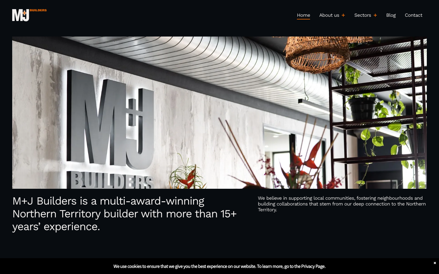
M+J Builders uses orange type against a dark background. Separate links take visitors to its commercial, defence, government and residential work, while the hero carousel shows completed projects rather than stock photography.
The site states that M+J is majority Indigenous-owned and connects that identity to the company’s history. It also attributes testimonials to Palmerston and Darwin City Councils. The Darwin construction website gives each client sector a clear route into relevant work.
10. Woodsman Projects, Melbourne
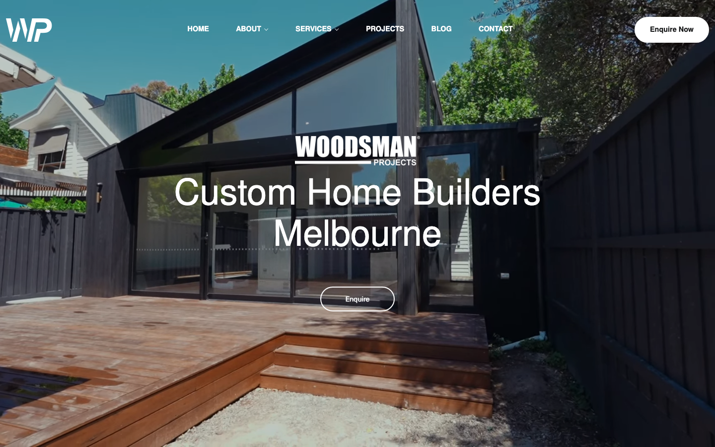
Woodsman Projects leads with a video background hero, which is a smart move for a builder. You see real construction footage before you read a single word. Below the fold, an eight-project carousel with location names and project types lets visitors self-select by interest.
VMIA, VBA and WorkSafe logos are visible alongside a testimonial feed from Google and Facebook. The founders are also named with personal biographies. On this Melbourne construction website, those biographies add a human layer to the licence and review evidence.
11. Saunders Building Company, Brisbane
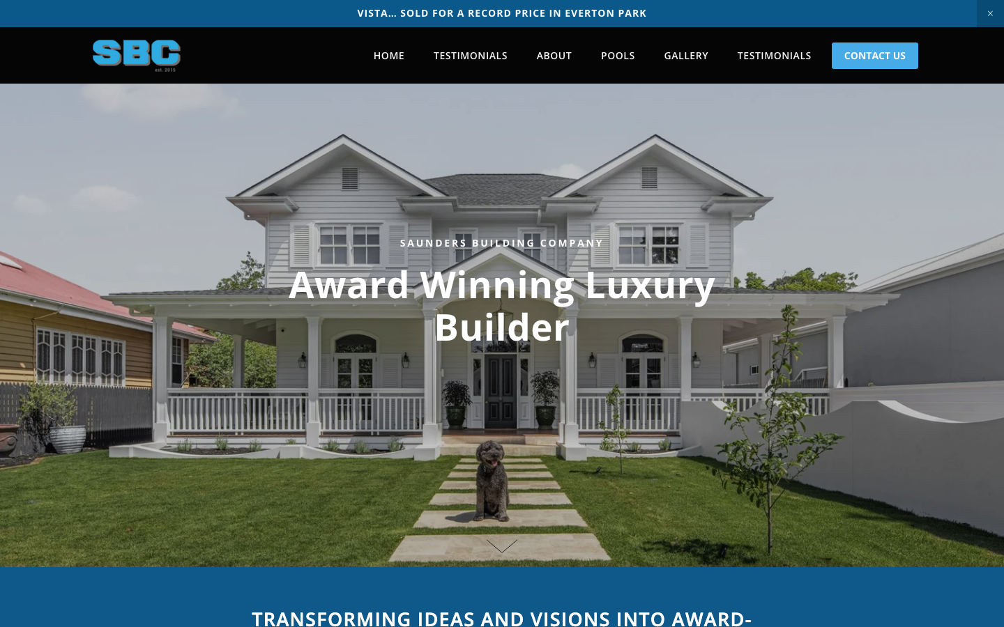
Saunders Building Company uses full-width architectural photography with plenty of white space, and the result is a site that feels like flipping through a design magazine. The hero carousel auto-rotates through luxury home projects with thumbnail navigation, putting their best work front and centre.
The QBCC licence number sits in the footer, and the site names its Channel 10 “Australia by Design” feature so visitors can verify it. The contact form asks about budget and timing before an enquiry reaches the inbox. This Brisbane construction website qualifies enquiries without hiding the contact path.
12. Contractors United, Wollongong
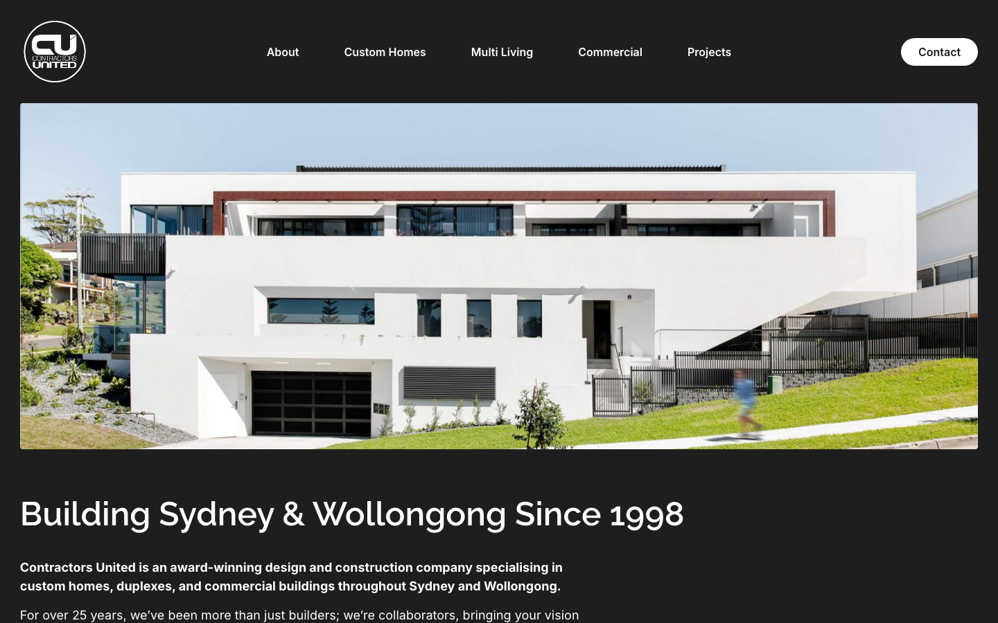
Contractors United goes with a dark-theme design that most builders avoid. Deep charcoal backgrounds with white Raleway headings and Inter body text give it a moody, architectural feel. The hero states “Building Sydney & Wollongong Since 1998,” establishing local authority and longevity in one line.
The project grid mixes residential work such as The Manhattan with commercial projects including Gerringong Medical. This Wollongong construction website shows the firm’s range without needing a long services explanation.
13. BLE Building, Forster
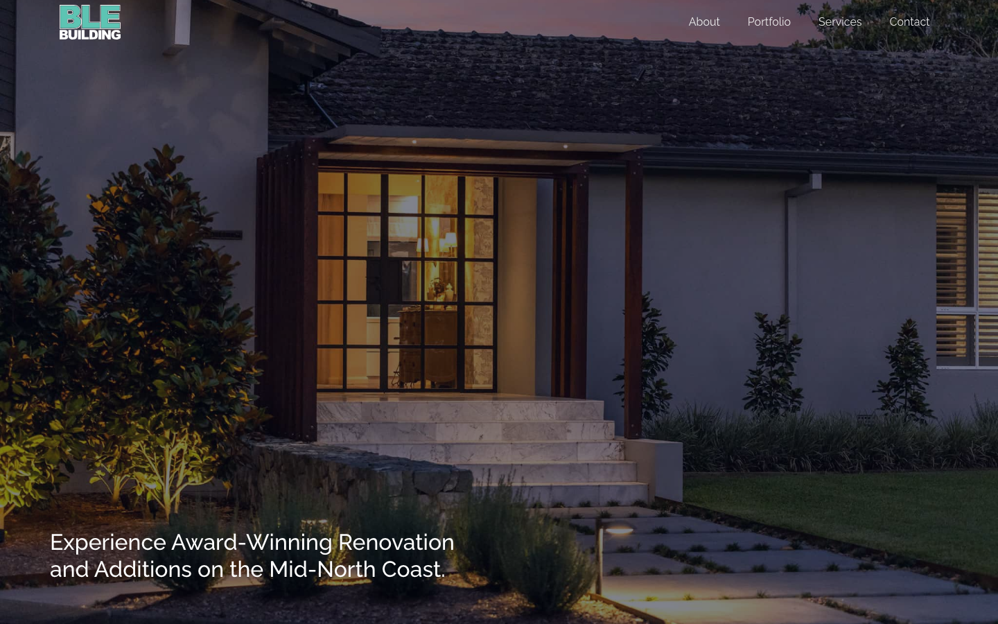
BLE Building opens with a full-screen hero slider and a headline that leads with credentials: “Experience Award-Winning Renovation and Additions on the Mid-North Coast.” The dark navy palette with Raleway typography gives it a polished, modern feel without overcomplicating things.
The site displays named award badges and keeps the portfolio and quote request close together. That focus suits a renovation-led Forster construction website, where completed work is the most useful proof.
14. Webb & Brown-Neaves, Perth
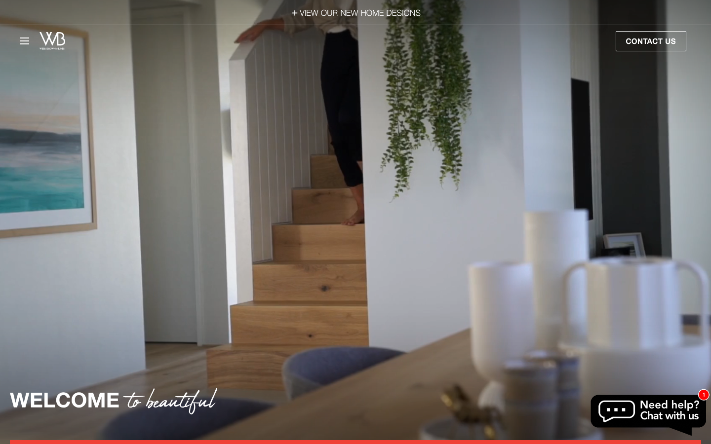
Webb & Brown-Neaves is one of the larger builders in this sample, and the site reflects that scale. The hero directs visitors to home designs, while the homepage embeds its ProductReview.com.au rating and Instagram posts.
The standout feature is the display centre, “The Home Collective,” which gets its own section on the homepage. Smaller builders may not have a comparable physical space, but the way this site connects an in-person visit with the online journey is worth studying. It is a premium Perth construction website.
15. Muse Built, Newcastle
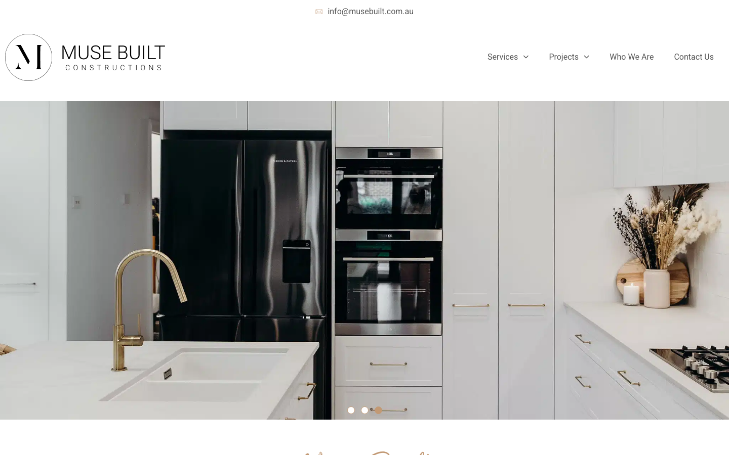
Muse Built uses bronze and black with light Heebo headings. It is one of the more restrained designs in this 17-site sample, with project photos filling the viewport rather than competing with dense copy.
Wide spacing keeps headings, images and calls to action visually separate. The bronze “Get in Touch” buttons sit at section breaks. That restraint makes this Newcastle construction website easy to scan despite its image-heavy layout.
16. Buildrite Sydney, Sydney
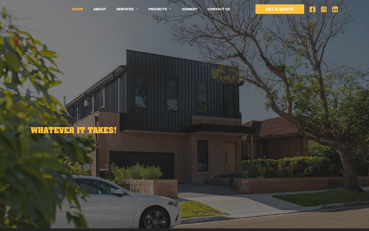
Buildrite Sydney opens with a bold gold-and-charcoal palette that immediately sets a premium tone. The transparent header overlays the hero image, and heavy Montserrat headings give the page real presence. Navigation is uppercase, tight and out of the way.
The gold calls to action remain obvious against the charcoal background. On this Sydney construction website, they direct attention without covering the custom-home and duplex imagery.
17. BTF Constructions, Adelaide
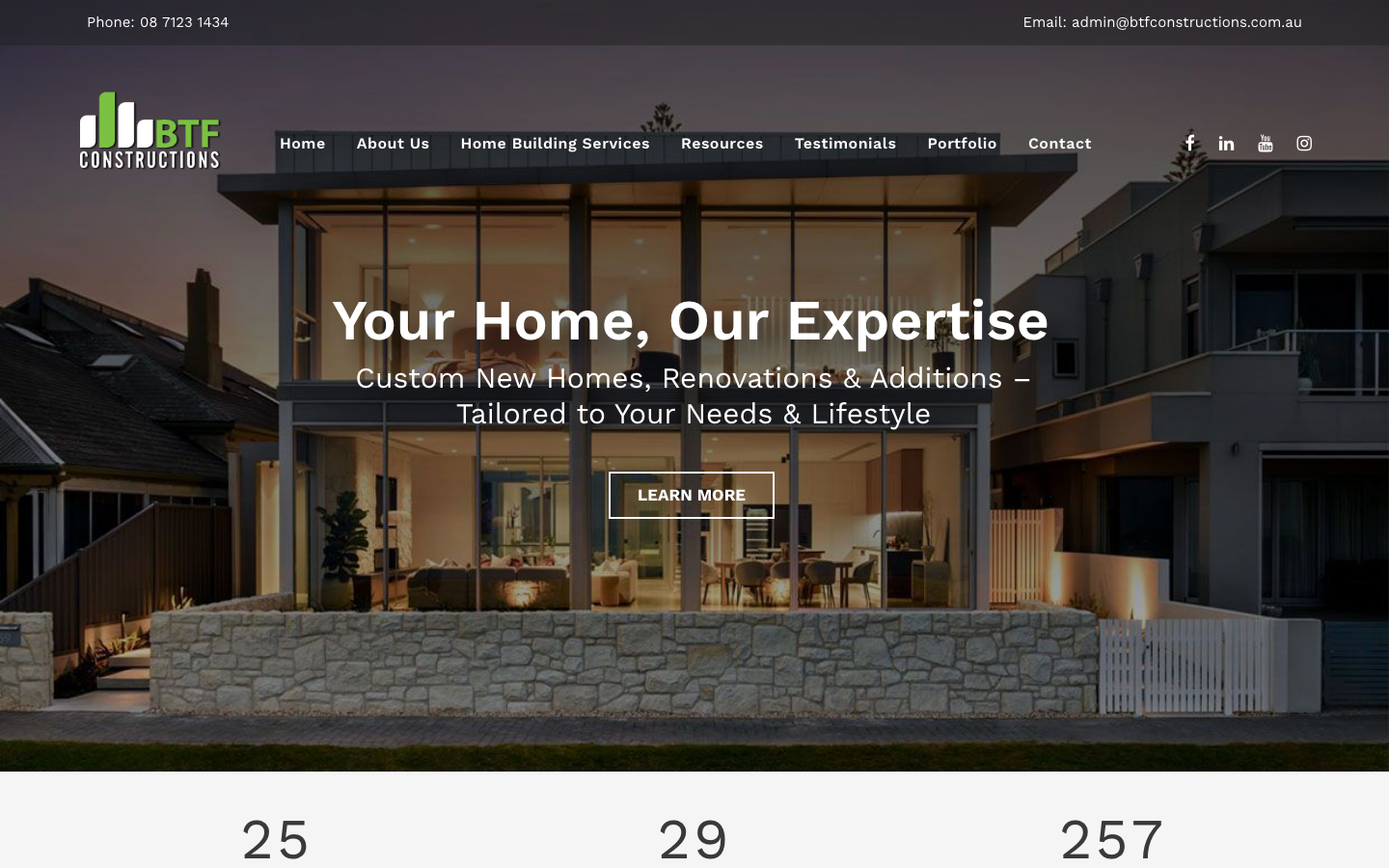
BTF Constructions positions itself as Adelaide’s bespoke builder, and the site backs that claim with a deep burgundy accent colour against dark backgrounds. It reads more like a boutique studio than a volume builder, which is exactly the point when you’re targeting custom home clients.
The project gallery supports zoom and filtering, so visitors can inspect joinery details and finishes rather than only wide exterior shots. For an Adelaide construction website selling craftsmanship, that close view provides useful proof.
What good construction company web design has in common
Good construction company web design makes the firm’s work, service scope and credibility easy to check. Across these 17 sites, the strongest pages give visitors useful evidence before asking for an enquiry.
Project galleries should answer “Can they build my kind of job?”
Every strong site in this review leads with completed work, but the best galleries add context. Woodsman Projects labels projects by location and type, BTF Constructions lets visitors inspect joinery details, and Muse Built gives each image room to breathe.
- Show completed work rather than generic stock photography.
- Name the project type and location where the client permits it.
- Include detail shots that support claims about workmanship.
Specific credentials beat “trusted builder” claims
Licence numbers, named awards and attributable reviews are stronger than a broad promise. Saunders and JOSCON show licence details, Webb & Brown-Neaves displays a third-party review score, and Symcorp identifies the organisations behind its awards.
- Display the relevant builder licence number.
- Name the awarding body and year beside each award.
- Attribute reviews to the client or review platform.
Home builder website design must help buyers self-select
Home builder website design should quickly show whether the company handles custom homes, project homes, renovations or duplexes. Vaughan Homes organises designs around different lifestyles, while Symcorp puts its major service categories in the first screen. That sector-specific structure is part of our broader website design work for service businesses.
Commercial and civil contractor website design needs the same clarity, but the proof changes. Sector experience, tender capability, safety credentials and comparable completed projects matter more than a catalogue of home designs.
The enquiry path should match the way the builder qualifies work
Saunders asks about budget and timing, while J Co and Derbyshire publish capacity information. Those choices filter unsuitable enquiries and help serious prospects understand what happens next.
- Ask only for information the team will use to assess the project.
- Explain the next step and likely response process.
- Offer a phone path for visitors who are ready to talk.
A clear market position is easier to remember
Rustic Touch focuses on healthy homes, M+J Builders explains its Indigenous ownership, and BLE Building centres renovation work. Each gives a prospective client a concrete reason to remember the company after comparing several builders.
Construction website design FAQs
What should a home builder website include?
A home builder website should include completed projects, the types of homes offered, service locations, licence details and a clear enquiry process. Floor plans or design ranges can help, but they should not replace photographs and details from finished work.
Is construction web design different from ordinary business web design?
Yes. Construction web design has to carry more proof because clients are comparing large, high-trust purchases. Project galleries, credentials, service boundaries and the qualification process deserve more space than generic brand claims.
Are these award-winning construction websites?
This is our editorial selection, not an official award program. Several featured builders display industry awards on their own sites, and we have identified those claims in the relevant reviews rather than labelling every site “award-winning”.
Does a civil contractor website need different content?
A civil contractor usually needs to foreground sectors served, project scale, safety and compliance credentials, and tender capability. The design principles are similar, but residential floor plans and lifestyle copy should give way to evidence that procurement teams can assess.
How often should a construction website be updated?
Update the site whenever the company adds a service, changes its operating area or finishes a project that strengthens the portfolio. Licence details, team information and enquiry forms should also be covered by regular website management.
Need a construction website?
Builders choosing between a DIY platform and professional help can compare a website builder with a web designer before setting a budget. If you want a proof-led site built for the industry, view our construction website design service or check our website design pricing.
Your website is where prospective clients decide whether to call or keep comparing builders. The useful sites make their claims checkable. They show finished work, identify their credentials and explain how to enquire.